The longer I'm here at INO I find myself in contact with some of the most knowledgeable, yet unheralded, trading minds. John Foreman is one of those trading minds. He will be a speaker at the LA Traders Expo in June, he's written books, and he focuses on teaching all levels of traders! I've been a fan for a while and I will be at the Traders Expo to hear him speak. Oh yeah his site is TheEssentialsofTrading.com.
All that being said, I invited John to teach on something that's been on my mind...and the mind of EVERY trader out there, volatility. So read the article, post comments and questions for John, and then check out his site...in that order!
====================================================================
As a market observer I have to say its kind of funny that a year ago after the Bear Stearns meltdown the question on everyone’s lips was whether that was the bottom in the stock market and now, as so many folks have thrown their hands up in disgust, we just might have seen it. There are several different things which lead me to think the bottom has either been put in or will be soon. In this article I’m going to outline one of them - one that helped me stay bullish into 2007, but warned me that things were changing midway through the year – and show you how you can use it.
Reading the Volatility
Volatility is one of the most useful metrics for any trader. Many have learned to use it to help in money management – to help size their positions, set their stops, or to just plain stay out of the market when it’s getting hairy. Volatility can also let us know when the market is getting ready to change states. There are two readings I look for that purpose, closing price volatility and ranges.
Closing price volatility is simply looking at how widely dispersed period closes are over a given period of time. It’s going to be high when the market is trading across a wide range or when it’s moving quickly in one direction. It will be low when the market is in a tight range or trending slowly. In my experience, this type of volatility is most interesting when at extreme readings.
Ranges are exactly that – looking at the high to low spacing. More volatile markets produce wider period ranges. Less volatile markets have narrow period ranges. Where I find this volatility most useful is when it’s transitioning from declining to rising or vice versa.
Measuring the Volatility
Each type of volatility noted above can be pretty easily tracked. Closing volatility is the subject of the extremely popular Bollinger Bands. Similarly, Average True Range (ATR) is the metric which measures period ranges. Both can be found included in many technical analysis charting packages.
Now, having said that, I need to insert an additional layer over the top of the normal studies. Recall that I said that closing price volatility is most interesting at extremes. How do we see an extreme reading for the Bollinger Bands? We look at how wide or narrow they are, then we look for extremely tight or extremely wide Bands. In terms of ATR, remember that I said turning points were important, which means looking for those times when the study is turning up from a low reading for turning down from a high one.
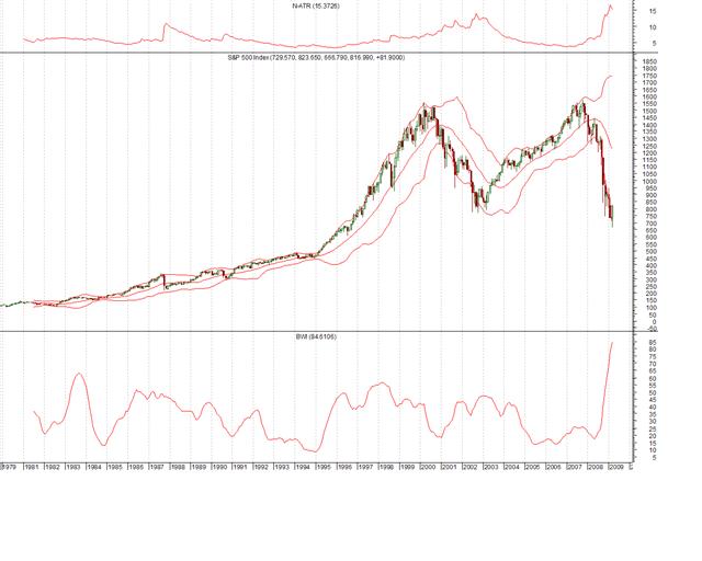
Take a look at this chart of the monthly S&P 500 to see the volatility in action.

Let me break down the different plots here.
The top line is a normalized version of ATR (N-ATR). That means I’ve taken the base ATR reading and divided it by the 14-period moving average to express it as a percentage. That way I can compare it historically. If I didn’t do that, we wouldn’t be able to look at it with any kind of perspective. Notice the sharp rise in N-ATR from 1987 at the point of the Crash. If I didn’t normalize the study that would only be a little bump in the line because the S&P was only in the 200s-300s at that point.
In the middle of the graph above is the monthly S&P 500 candlestick chart with Bollingers Bands overlaid.
On the bottom of the graph is the Bollinger Band Width Indicator (BWI) which does something similar to N-ATR in that it normalizes the width of the Bands so they can be viewed in a historical context. BWI is the distance between the upper and lower bands divided by the 20 period moving average (or whichever one is being used to plot the Bands). That gives us the Band width expressed as a percentage, just like the N-ATR. It lets us look for those extreme readings mentioned previously which can tell us that something very interesting is probably coming.

Dear Sir,
Thank you very much for the enlightening write up on 'Volatility'.
As a matter of fact I have been tabulating daily equity ranges in Excel sheet and then finding/observing the 10, 14 and 30 day SMA's. With this I could only infer whether the ATR (volatility) was increasing or decreasing on the particular day. I had no idea to draw any valid conclusion during transistion. Now I have drawn the charts to get a clear view.
Sir one thing I could not comprehend in the writeup as to how to calculate 'N-ATR'. "I've taken the base ATR reading and divided it by the 14-period MA to express it as a percentage".
My question: If I am taking the values on daily basis, then 14-period MA is the 14 day simple moving average of the closing prices and what is 'base ATR'? is it average of 14 day true ranges (TR).
Hope to hear form you in the matter soon.
Regards,
Narendra.
What you are expressing MUST be marked with arrows!!
Graphs NOT clear enough.
Liked it. Never noticed availability of band width indicators on charts.