My Big Trend Analysis For Silver Investors - Part 2

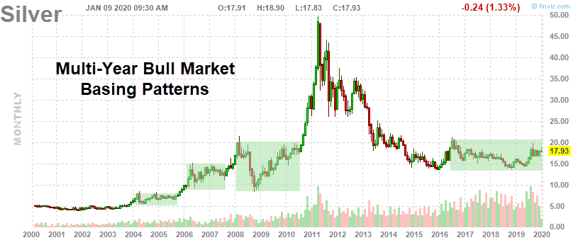
This, the second part of our Silver research article suggesting Silver may be forming a massive price base in preparation for an explosive upside move, will continue from Part I of this research series.

Our research team believes Silver is setting up in a price pattern that may already be “ripe” for an explosive upside move. Our researchers have poured over the data and believe the disparity between Gold and Silver is already at excessive levels.

Historically, anytime the disparity between Gold prices and Silver prices (rationalized into comparative Gold price levels) breaches 30% to 60% and Gold begins an upside price advance, Silver typically begins to move higher with 4 to 8+ months. This setup pushes the Gold to Silver ratio back below 50 or 60 as Silver rallies substantially higher, and faster than the price of Gold.

Comparatively, Silver continues to trade within a sideways price range after basing in early 2016. This price range has been fairly consistent between $14.50 and $21.0. With Gold recently starting to move higher because of the US/Iran military conflict, this raises an early warning flag for our research team because Silver has continued to trade below $18 – and well below recent highs near $20.

The price disparity between Gold and Silver is currently greater than 200% based on our proprietary modeling system. Remember, anytime this disparity level is greater than 30% to 60% and Gold breaks out in a rally, Silver will break to the upside within just a few months.

Silver Gold

The second stage rally in Silver, the real money-maker, will come when investors pile into Silver and Silver Miners as the breakout in Silver becomes explosive. The time to get into this trade is/was now or 4 months ago. Still, there is plenty of opportunity for skilled traders right now because the breakout move in Silver and Silver Miners has not really begun yet. Continue reading "My Big Trend Analysis For Silver Investors - Part 2"

My Big Trend Analysis For Silver Investors - Part 1

Everyone seems to be focused on Gold recently and seems to be ignoring the real upside potential in Silver. With all the global economic issues, military tensions, geopolitical issues, and other items continually pushed into the news cycles, it is easy to understand why traders and investors may be ignoring Silver.

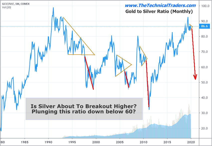
Silver has really not started to move like the other precious metals. Gold is up over 45% since 2016. Palladium is up over 350% since 2016. Silver is up only 29% since 2016. The Gold to Silver ratio is currently at 86.7 – very near to the highest level on record going back over 25 years.

Silver

Historically, Silver rallies 6 to 12+ months after Gold begins a price rally. The big break in the Gold to Silver ratio comes at a time when Gold rallies by more than 30% to 60% faster than the price of Silver. In other words, when a major disparity sets up in the price of Gold compared to the price of Silver, then Silver explodes higher – which results in a drop in the Gold to Silver ratio. Continue reading "My Big Trend Analysis For Silver Investors - Part 1"

Current Equities Rally Similarities To 1999

Euphoria is a type of market rally where valuations, real market expectations, and global market concerns are pushed away from view while a trader based rush to rally takes place. One of the clearest examples is the 1995 to 2000 DOT COM US stock market rally. As the Internet burst into homes and businesses across the world, the US-led the way with dozens of new Internet-based IPOs touting glorious expectations, potential earnings and more. Everyone had the idea this new medium would dramatically change the economy for the better and breakthrough traditional economic boundaries.

The rally that took place in 1995 through 2000 was incredible. The S&P 500 rallied from 463 to 1535 – +235.57%. What we find interesting is the “price wave formation” that took place within that rally. There were a number of key price rotations that took place as the market continued to rally, we’ve labeled them A, B, and C. The first rotation, A, took place in July~Dec 1997. The second, B, took place from May 1998 to November 1998. The last, C, took place between January 1999 and November 1999. Technically, these rotations are significant because they represent “true price exploration” related to price advancement. The price must always attempt to identify true support/resistance levels while trending.

When we compare the rally from 1995 to 2000 with the current rally in the US stock market, we can see a defined level of euphoric price advance after the 2016 US elections. We must also pay attention to the previous price advance from the 2009 price lows as the global markets were struggling to recover from the Credit Crisis. Our research team identified the A, B, C rotations in the current price and associated them to the similar rotations in the 1995-2000 price rally as “key components of the current rally and a potential warning sign of a pending top formation”.

Our researchers believe the QE processes of the global central banks have set up a similar type of euphoric price rally in the current global markets even though current economic metrics are warning of weakening economic activity and weakening global market output. The US Fed and global central banks seem to want to keep pumping money/credit into the global markets to keep the rally going – most likely because they are fearful of what a crash/correction may do to the future growth opportunities around the planet. Continue reading "Current Equities Rally Similarities To 1999"

Is A Real Estate Crash Coming?

Does history repeat itself? Are price patterns and chart patterns reliable enough to suggest that a global Real Estate market collapse may be set up? What would it take for another Real Estate collapse to take place in today’s global market?

First, let’s start with this simple chart highlighting the “Bear Flag” setup from 2007 and the current 2019 Bear Flag setup. This price pattern was enough of an early warning sign for our research team to run into our offices and tell us of the exciting pattern they just identified regarding Real Estate and what they thought could happen. We listened to them share their ideas and concepts of how we have 11 months to go before the 2020 US Presidential election takes place and how higher risk delinquencies and foreclosures are starting to spike. They suggested the political theater of the global markets and US election cycle will likely distract from the weakening economic cycle which could present enough “smoke and mirrors” to keep investors’ attention away from this potential collapse in the housing market.

Much like a magician attempts to distract you just long enough to pull of their new trick, could the political theater, global economic news cycles and the never-ending battle in Washington DC be just enough of a distraction that skilled traders miss this critical setup? We hope not.

The peak that occurred in 2007 setup about 19 months before the 2008 Presidential election took place. The 2019 peak occurs about 13 months before the 2020 Presidential election. In both instances, a highly contentious political battle is taking place which may distract traders and investors from really paying attention to the underlying factors of the global markets. Continue reading "Is A Real Estate Crash Coming?"

VIX Warns Of Imminent Market Correction

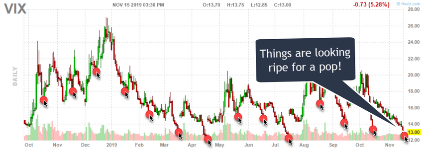
The VIX is warning that a market peak may be setting up in the global markets and that investors should be cautious of the extremely low price in the VIX. These extremely low prices in the VIX are typically followed by some type of increased volatility in the markets.

The US Federal Reserve continues to push an easy money policy and has recently begun acquiring more dept allowing a deeper move towards a Quantitative Easing stance. This move, along with investor confidence in the US markets, has prompted early warning signs that the market has reached near extreme levels/peaks.

VIX Value Drops Before Monthly Experation

When the VIX falls to levels below 12~13, this typically very low level is usually associated with an extreme peak in price. Throughout history, after the VIX has collapsed to these types of low price levels, the markets have a tendency to revert/correct in ranges that are typically in excess of 3.5% to 5.5%. In some cases, these corrections have been as large as 11% to 18% or more.

VIX
Continue reading "VIX Warns Of Imminent Market Correction"