Today, we're going to be looking at classic Japanese candlestick charts. Candlestick charts were first used in Japan over two centuries ago by rice traders to chart rice prices. This system of charting has been around for a long time and can be valuable to traders everywhere. Japanese candlestick charts are now widely available on the web and in most software packages.
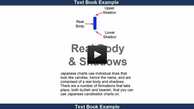
Candlestick charting shows, in a very visual way, a powerful picture of what's going on in the markets. Candlestick charts use individual lines that look like candles, hence the name, and are comprised of a real body and shadows. There are a number of formations that take place, both bullish and bearish, that can provide traders with valuable information.
I first discovered candlestick charting during a speaking engagement in the early 90s in Japan. Up until that time, I had used traditional Western bar charts and point and figure charts, which I also like. When I first saw a chart that had been drawn in candlesticks, I was immediately hooked, as I could see how candlestick charts show a visual image of what is going on in any market. In this tutorial on understanding candlestick charts, you will see some of the most powerful setups and learn all about the various candlestick formations and how you can use them successfully in various markets.
This short video shows you not only classic textbook examples, but also real world examples. I hope you find the video lesson interesting and of value to your own investment knowledge.
Every success using candlestick charts in the future,
Adam Hewison
President, INO.com
Co-Creator, MarketClub

