Are You Buying This Pullback In Stocks?

After hitting the magical 17,000 level just around the time America was celebrating our country's 238th birthday, stocks and indexes have seen a pullback on quiet volume. The question is, are you seeing this as a buying opportunity?

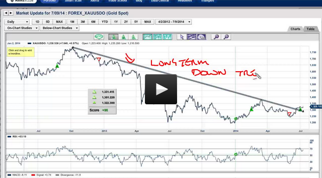
In today's video, I will be looking at the major markets, a couple of stocks, and gold (FOREX:XAUUSDO), which I still believe is going to move higher. I will also be examining what's going on in crude oil and the Dollar.

If you missed my post yesterday on our two winning portfolios, you may want to check it out.

As always, we welcome your feedback on this video or any markets that you are following.

Have a great trading day everyone,
Adam Hewison
President, INO.com
Co-Creator, MarketClub

Pullback off lows – The only pattern you need to know in downtrending markets


As we go through the charts of the daily indexes and individual names we see a lot of Pullback Off Lows (POL) patterns.

Much like in uptrending markets Pullback Off Highs (POH) patterns are the only pattern you need to know, in downtrending markets the opposite applies.  In downtrending markets POL's are the only pattern you need to know for shorting. Those POL's are also the what to watch out for if you are long. That all said below are the daily charts of the indexes.  Continue reading "Pullback off lows – The only pattern you need to know in downtrending markets"

Using Ratio Charts to Gain an Edge, Part 2

Last July I invited Gary from Biiwii.com to help us understand how to use ratio charts...properly! His first post can be found here, but I believe there were some missing examples and lessons. SO I asked Gary to come back and fill in the holes that I felt were missing, and more importantly, what our users felt was missing. Please enjoy the article, visit Gary's blog, and let the COMMENTS FLY!

====================================================================

In July of 2008 it was my pleasure to provide the INO Traders' Blog this look at ratio charts and the edge they can provide as they often tell a not readily apparent story regarding inter-market relationships.

Today, as we look at the market revival I have been calling Hope '09 and some ratios I consider of paramount importance, gold ratio charts are heavily in play.

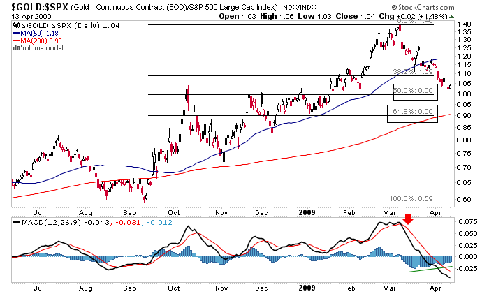
The first chart I want to look at is the price of gold divided by units of the S&P 500.

Continue reading "Using Ratio Charts to Gain an Edge, Part 2"