Market Management 101: Balance

I cannot profess to tell others how to effectively manage their accounts because I am a lowly participant who is learning all the time. The truth is that 2019’s learning is much different than 2018’s learning was, which was different than 2016, 2011, 2008/2009 and other pivotal market phases. So I’d say that the biggest lesson to learn has been the concept of marrying adaptability with discipline.

Cookie-cutter advisors and brokers have it easier. They’re the majority of market professionals and they’ve learned and set in stone the way of allocating into markets; 60/40 stocks to bonds or some such variant. But for something more effective than ‘cookie-cutter’, you need to keep learning, adapting and holding discipline as long as your signals remain valid.

As for the current situation and speaking personally, it usually does not work out like this, especially when anticipating a corrective phase in the precious metals. The way it usually works is that I underestimate the intensity of a correction that I am pretty sure is coming and either I don’t sell quite enough, don’t hedge correctly (timing-wise) or don’t balance the portfolios optimally, even if the balancing seemed logical at the time it was undertaken. Often that is because the last market situation is not going to be like the next one. Automatic, cookie-cutter thinking need not apply. Adaptability.

Well somehow today, with gold and silver stocks way off their highs (and GDX & GDXJ painting bogus looking engulfing candles) I am right at my personal portfolio’s value highs for the year despite 2019’s best trade having topped out a couple weeks ago. That is due to some combination of… Continue reading "Market Management 101: Balance"

A 'Carry Trade' Returns?

As I was charting long-term Treasury yields in NFTRH 241, I ran a chart of the ratio between the banks and the S&P 500 and what do you know?  The ratio had broken out to the upside right along with long-term interest rates.  'Hmmm…'said I, 'maybe this is relevant to the analysis.' ;-)

Excerpted from NFTRH 241:

bkx.spx.tnx

BKX-SPX ratio w/ 10 year yield, weekly

"The Bank Index ratio to the S&P 500 (BKX-SPX) is breaking out to the upside in defiance of a bear case in stocks.  The BKX has modestly led the SPX since 2011.  We have noted that this is a necessary bullish factor for the financialized economy, which is quite different from a real or organic economy. Continue reading "A 'Carry Trade' Returns?"

Updating the HUI-SPX Ratio

There were reasons for the mind numbing gold stock correction out of the hysterical events of the 2011 Euro-led meltdown and its aftermath.  Take your pick…

  • Too many lousy gold mining operations not keeping on top of costs and/or execution projections.
  • Too many scammy smaller operations doing little more than issuing stock and telling stories needed to be weeded out.
  • Over bullish sentiment was that this time the gold bug true believers really were going to take Hamburger Hill as Europe’s implosion would be taking down the rest of the civilized world.
  • Highly strategic yet indirect manipulation of the gold miners’ product – a barbarous relic not welcome in an economic discussion by today’s monetary policy setting intellectuals – by a very overt (publicized) manipulation of the Treasury yield curve in Operation Twist.  I will spare you another chart of gold’s correlation to the curve.

There are more reasons, but now is a time for planning for what comes next.  Not crying over spilled nuggets. Continue reading "Updating the HUI-SPX Ratio"

Using Ratio Charts to Gain an Edge, Part 2

Last July I invited Gary from Biiwii.com to help us understand how to use ratio charts...properly! His first post can be found here, but I believe there were some missing examples and lessons. SO I asked Gary to come back and fill in the holes that I felt were missing, and more importantly, what our users felt was missing. Please enjoy the article, visit Gary's blog, and let the COMMENTS FLY!

====================================================================

In July of 2008 it was my pleasure to provide the INO Traders' Blog this look at ratio charts and the edge they can provide as they often tell a not readily apparent story regarding inter-market relationships.

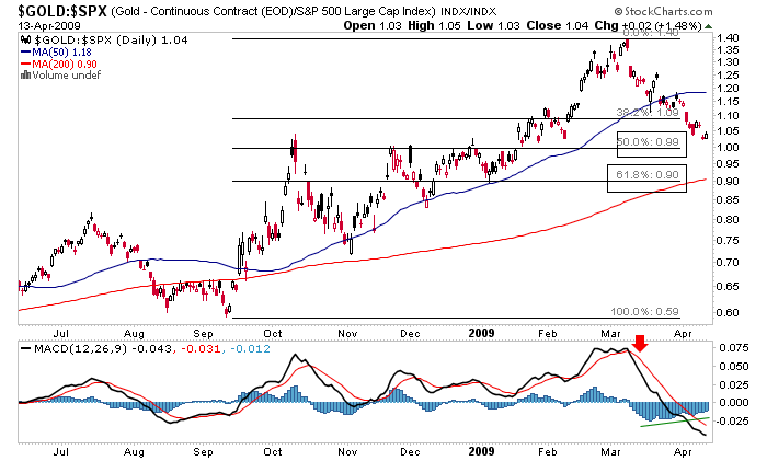
Today, as we look at the market revival I have been calling Hope '09 and some ratios I consider of paramount importance, gold ratio charts are heavily in play.

The first chart I want to look at is the price of gold divided by units of the S&P 500.

Continue reading "Using Ratio Charts to Gain an Edge, Part 2"