We should wait for the market to show us the way by moving the price on the chart with visible changes. I posted the fresh tactical map for both metals 2 weeks ago using the daily time frame. The market is moving within my expectations so far and I decided to post an update using lower time frame charts, which could supplement the picture as no big levels were triggered yet. It would be useful for those who are not yet in the game and are looking for fresh opportunities to enter.
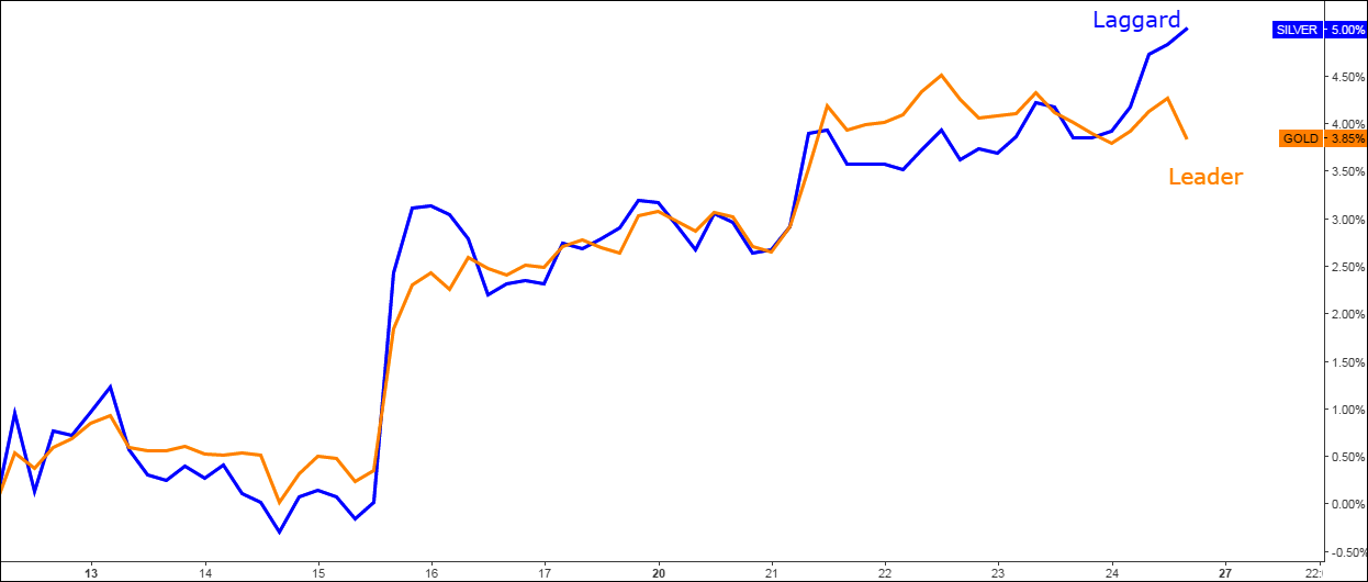
I dedicated the very first chart to the comparison of top metals’ behavior as several times before we witnessed that one top metal signals upcoming changes in the market earlier than the other. Putting them side by side clearly shows the differences in their price behavior, not seen in the separate charts.
Chart 1. Gold Vs Silver 4H: Leader Vs Laggard

Chart courtesy of tradingview.com
The starting period for the chart above was chosen for the low in gold price established on the 10th of March as silver dropped to a new 5 day low later on the 15th of March. It was the first good signal for silver bugs to keep the metal as gold didn’t confirm that drop.
For the part of the time both metals were moving in sync with light mutual overshoots. Last week gold took the lead and reached higher gains, but it was also the first to drop down later the same week. Silver used its time lag to book a higher gain and still keep the track. As we saw before, this divergence couldn’t last for a long time and we should be prepared that silver would follow gold.
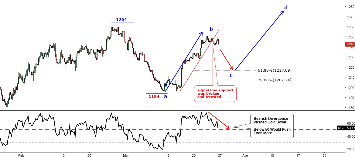
Chart 2. Gold 4H: Benched

Chart courtesy of tradingview.com
Gold advanced very well to the upside and almost reached the previous top peaking just $11 below it at the $1253 level with a nice $60 gain from the previous low. I labeled it as the ab segment using small letters to stress the lower degree of the move inside of the larger CD segment, which was set in the previous “Gold & Silver” post.
Every good move is followed by a correction and after gold broke below the red signal line support we could see more weakness ahead. The Bearish Divergence on the RSI sub-chart played out, pushing the price down below the red line. Once the RSI is below the 50 level the downside pressure for the price would start to increase.
Closely watch the Fibonacci retracement levels shown on the chart above at 61.8% ($1217) and 78.6% ($1207). Yes, it could be that deep. The low of correction would establish the c point for the new cd segment as shown by the second blue arrow with the assumed target within the $1270-$1280 area.
The current range is set between the $1194 and the $1264 marks. Only the breakout of this range would require the update of this map.
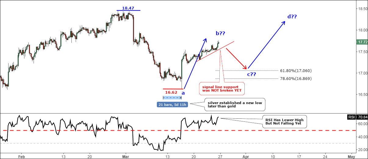
Chart 3. Silver 4H: Still In The Game

Chart courtesy of tradingview.com
As I mentioned in the first chart above, silver is lagging behind gold and I highlighted the time gap with the date range arrow (blue), which shows that the gap is equal to twenty-one 4-hour candles or almost 5.5 days. We can use it to calculate how long silver could stay upward amid falling gold – if we add 5.5 days to the top day in the gold (March 23rd) the deadline for silver expires on Tuesday, March 28th, forewarned is forearmed.
Silver has only the first warning signal on the RSI sub-chart which shows that the recent peak is lower than the previous establishing Bearish Divergence with the price chart where the current top is higher than the previous. The final confirmation requires the break below the red signal line support. Meantime the metal booked a nice gain of $1.12 (at $17.76 peak) from the previous low and could do more as we have a time lag reserve for more upside move. That’s why I labeled b, c and d points with question marks as they are yet to be established and therefore calculated.
I preliminary calculated Fibonacci retracement levels for visual guidance. We should recalculate it after b point is finally billed on the chart.
The current range for this metal is set between the $16.62 and $18.47 marks.
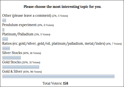
Dear readers, I am very grateful for the feedback you provided earlier as shown in the table below.

The top preference was given to “Gold & Silver” posts.
Intelligent trades!
Aibek Burabayev
INO.com Contributor, Metals
Disclosure: This contributor has no positions in any stocks mentioned in this article. This article is the opinion of the contributor themselves. The above is a matter of opinion provided for general information purposes only and is not intended as investment advice. This contributor is not receiving compensation (other than from INO.com) for their opinion.


Many gold bugs talk of a massive spike coming in gold and silver . Are then any historical charts that show this happening and if so can you explain if it was possible to predict such an event in the charts ?