Back in May, I posted an update for copper where I shared my concerns about the possible negative impacts of the cooling Chinese economy. At the same time the technical chart didn’t confirm those concerns and on the contrary, showed a possible upside move for the metal.
In this post, I would like to share some macro economic charts and an update of the technical chart.
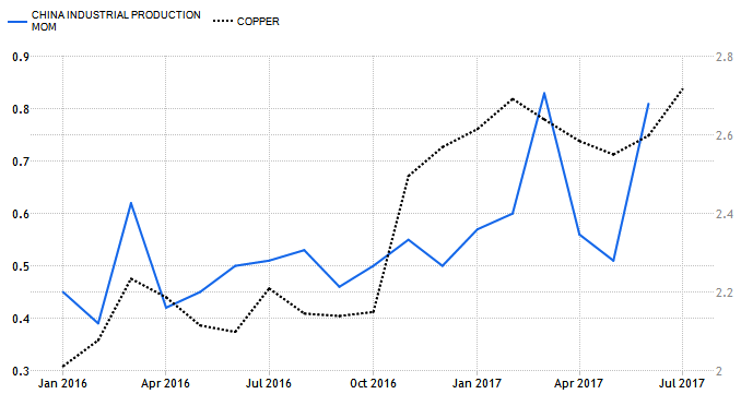
Chart 1. Copper Vs China Industrial Production (Monthly)

Chart courtesy of tradingeconomics.com
I chose the period of the chart above from the start of 2016 intentionally to highlight the time when the metal began to consolidate after a huge drop down.
As you can see, those two lines representing China’s industrial production and the copper price were moving hand in hand during the prolonged consolidation period until the start of the 4Q of 2016 when both lines made a strong move up. Then the two lines reflected the weakening data in Q1 of 2017, which brought concerns about the future dynamics of copper’s price to my mind this May.
But now, the summer months have brought a huge demand for the metal spurred on by the upbeat industrial production in China. Copper’s price overshot Chinese data as speculators are driving the price higher betting on a further data improvement..
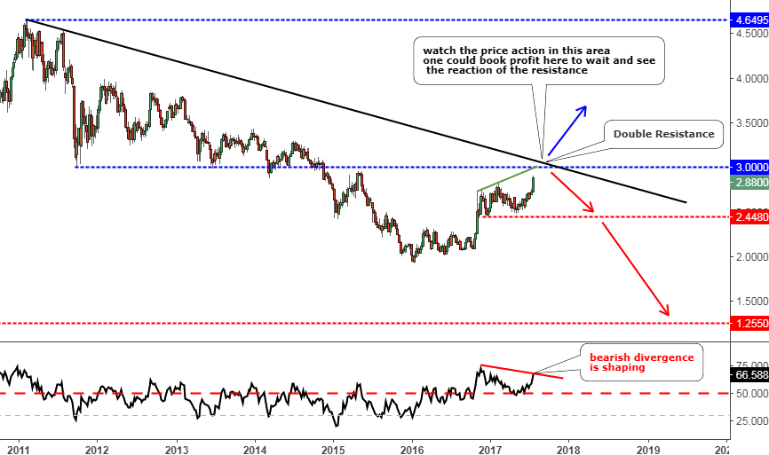
Chart 2. Copper Weekly: Almost Reached The Resistance

Chart courtesy of tradingview.com
Above, is an updated weekly chart of copper that was initially published in May. The key levels are still intact, and I just removed an up arrow, which indicated the possible upside move that became real and covered it.
First of all, I prepared this update as an alert to closely watch the price action in the area around the $3 mark as copper already hit the $2.9055 mark, and it is just shy away from the key resistance area. I think we will quickly know if it was just a consolidation and the price will be pushed off the barrier, or will we witness a strong breakout to the upside, which would be the first significant move up after a multi-year drop.
The 50 level of the RSI in May did its job very well to support the price. Now we can see that this indicator is not convinced with the recent strong upside move of the price (green line) as the RSI didn’t follow (red line on the RSI chart) it to establish a higher top shaping a bearish divergence. As I’ve said many times before, the divergence itself is not a signal for action, but it’s an important alert that warns us of an upcoming reversal ahead. The time of the possible reversal is not predetermined, but the divergence will let us be prepared for it. Therefore be cautious once the price enters the $3 area.
The next key levels are located on the opposite sides of $3 handle; they offer support at the $2.448 mark and resistance at the $4 level.
The copper is one of the major commodities as it represents the world’s infrastructure. If you watch the trends of the commodities sector, then the following bonus track could be interesting to you. I have prepared a separate chart to share my thoughts on the Thomson Reuters/Jefferies CRB Index, which tracks the futures prices of 19 commodities. The list of components is as follows: Aluminum, Cocoa, Coffee, Copper, Corn, Cotton, Crude Oil, Gold, Heating Oil, Lean Hogs, Live Cattle, Natural Gas, Nickel, Orange Juice, Silver, Soybeans, Sugar, Unleaded Gas, and Wheat.
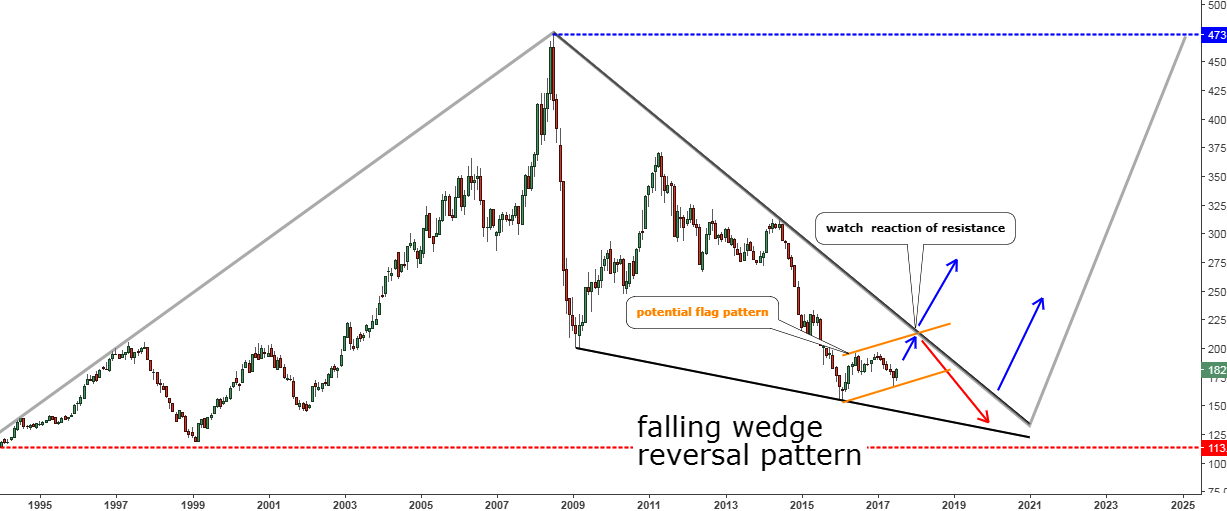
Chart 3. Thomson Reuters/Jefferies CRB Index Monthly: The Falling Wedge

Chart courtesy of tradingview.com
The CRB index lost much of its value amid the financial crisis. The huge drop from July 2008 to February 2009 alone slashed more than a half of the price. Then there was a prolonged period of consolidation until the summer of 2014. As I have said before, the consolidation period could be long, much longer than the primary drop/rise. This time it took more than five years after a significant drop in six months. After that, another significant drop occurred, and it hit the previous low ($200) and established a new trough at the $154 mark. The distance of the second drop was shorter - $158 Vs. $273.
The combination of the sharply lower tops and flattening bottoms shaped a Falling Wedge reversal pattern (black). The index is still inside of the pattern.
I see two possible scenarios for further price action. The first scenario keeps the price inside of the pattern. It implies the rise of the price up to the black resistance with the following failure there and reversal downside (red down arrow) towards the apex of the pattern. This move would shape the reverse flag pattern highlighted in orange.
The second scenario implies the break upside beyond the black resistance. The target for that move could be set at the highest point of the pattern at the previous major top at the $473 mark. It means the start of the long lasting growth of commodity prices as highlighted with gray zigzag.
Overall, the risk/reward ratio favors longs as a major low at the $113 level is much closer to the current market level than the top. But it is safer to wait for the breakout of the pattern.
Intelligent trades!
Aibek Burabayev
INO.com Contributor, Metals
Disclosure: This contributor has no positions in any stocks mentioned in this article. This article is the opinion of the contributor themselves. The above is a matter of opinion provided for general information purposes only and is not intended as investment advice. This contributor is not receiving compensation (other than from INO.com) for their opinion.


All speculation. If you think you know what's happening in China, you are fooling yourself.