Last August I posted a chart analysis of one particular commodity market index as I spotted an interesting pattern. As time goes by, we can see how my outlook emerged and after almost a year the market reached another crucial milestone or better yet a decision point.
This index is called The Thomson Reuters/CoreCommodity CRB Index (CRB). It is the gauge of the commodities market, which is comprised of 19 commodities: Aluminum, Cocoa, Coffee, Copper, Corn, Cotton, Crude Oil, Gold, Heating Oil, Lean Hogs, Live Cattle, Natural Gas, Nickel, Orange Juice, Silver, Soybeans, Sugar, Unleaded Gas, and Wheat.
So, if you watch commodities market, then the two charts below could be of strong interest to you.
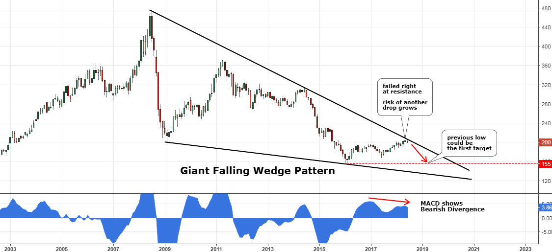
Chart 1. Thomson Reuters/Jefferies CRB Index Monthly: Failed At Resistance

Chart courtesy of tradingview.com
Above is an update of the earlier chart. The risk/reward that time ($182) favored a long position as the upside target at the major top ($474) promised to cover risk extensively amid oversold market conditions.
The call for the strength of commodities paid well as the index did indeed move higher without any menacing setbacks until it reached the recent top at the $207, where it failed to progress further. It’s amazing how accurately the long-term resistance worked there to block the rise of the CRB index as it dropped quickly from $207 to $200 last month. I also see another coincidence here. I recall an old trading saying that says: “Sell in May and go away.”
This drop of the index shouldn’t surprise those who read my post in 2017 as it described a second scenario of the possible price development. In the chart above, I added the MACD Histogram indicator, which shows the Bearish Divergence on the monthly time frame. The price didn’t find support from the MACD, therefore, the reversal should be expected. The previous low at the $155 mark could be targeted first.
This is the global map, and some minor price developments can’t be seen here. For a closer look, I tailored another chart for you with a shorter time frame to show you what is happening there!
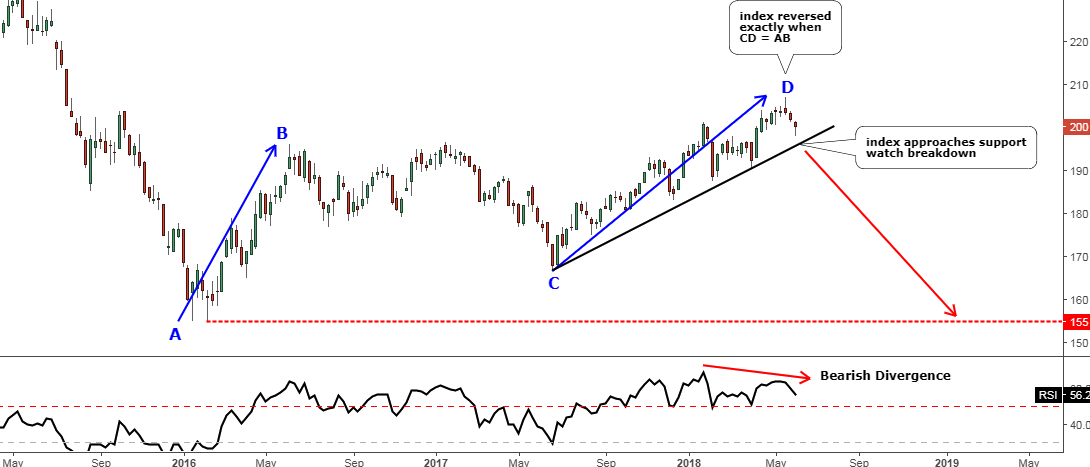
Chart 2. Thomson Reuters/Jefferies CRB Index Weekly: Consolidation Completed?

Chart courtesy of tradingview.com
This chart above is focused only on the last three years to spot how the price of the index emerged from the consolidation that could be over now.
I highlighted the two legs of a correction as the AB/CD segments and what was deemed to be a threshold of the new bullish cycle in the commodities market turned out to be just a second leg of a correction. It took the CD segment more time to unfold compared to the AB segment, but in spite of this, it has a weaker trend as the angle is flatter.
Usually, the CD is equal to the AB, and this time it worked amazingly perfect as the price reversed precisely at the equality point. Now it moves down to the black trendline support. The breakdown there could trigger a significant drop, so watch that area closely. The RSI, like the MACD Histogram on the monthly chart, also shows Bearish Divergence and is getting closer to the crucial 50 level, which could confirm the trigger to the downside once breached below.
So, if you entered long last year, it is the right time to think about booking profit here before it evaporates and wait to enter short on the signal.
As long as the index is inside of the giant Falling Wedge pattern, the odds are in favor of another drop with a tremendous profit potential ($155 Vs. $208).
Intelligent trades!
Aibek Burabayev
INO.com Contributor, Metals
Disclosure: This contributor has no positions in any stocks mentioned in this article. This article is the opinion of the contributor themselves. The above is a matter of opinion provided for general information purposes only and is not intended as investment advice. This contributor is not receiving compensation (other than from INO.com) for their opinion.

