The global stock market's market distortion was revealed last week. Let me share it with you in visual form below.
I put together three ETFs: Vanguard S&P 500 ETF (NYSEARCA:VOO) in the blue line representing the S&P 500 broad U.S. stock index; Vanguard Total World Stock ETF (NYSEARCA:VT) in the black line representing the global stock market and Vanguard FTSE All-World ex-US ETF (NYSEARCA:VEU) in the red line representing the stock market outside of the United States.
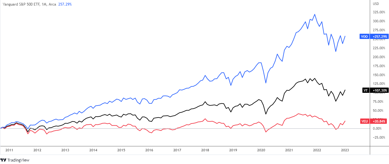
The first chart above depicts the price dynamics since September 2010. Over this long period, the US stock market has outperformed both the global market and the rest of the world.
VOO received +257%, VT received +107%, and VEU received only +21%. Indeed, the gap is huge.
Smart money waits for a market crash before adding or purchasing stocks. In this regard, I've created a new chart below to show how these three instruments have performed from the deep valley in 2020 to the top of 2021.
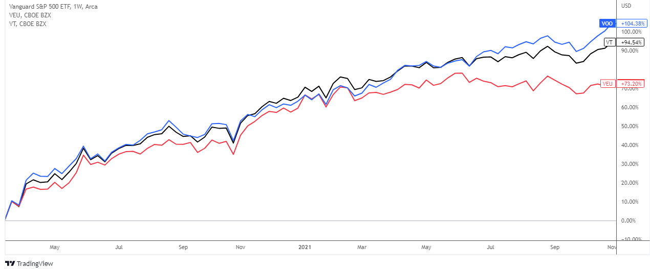
More than half of the time, all three stock markets have demonstrated close dynamics. The gap began to appear in 2021 and continued to grow until the end of the period.
The VOO gained more than 100%, the VT gained close to 100%, and the rest of the world did not set a new high, with the surplus remaining just above +70%.
Let's jump ahead to the most recent trough, which was established in October, and create a new comparison.
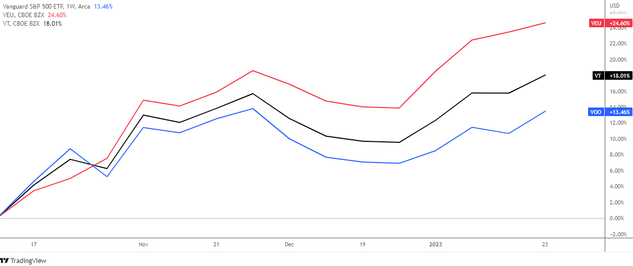
It's amazing to see how the dynamics changed dramatically this time, flipping the positions of the lines in the chart above.
During this period, the stock market outside of the United States (VEU, red line) gained an impressive +25%, while the global stock market (VT, black) scored +18%. The U.S. stock market (VOO, blue) lags behind, accounting for nearly half of VEU's profit (+13%).
A more aggressive Fed has put pressure on its domestic stock market to allow the rest of the world to get ahead.
Let us look closer at the VEU ETF.
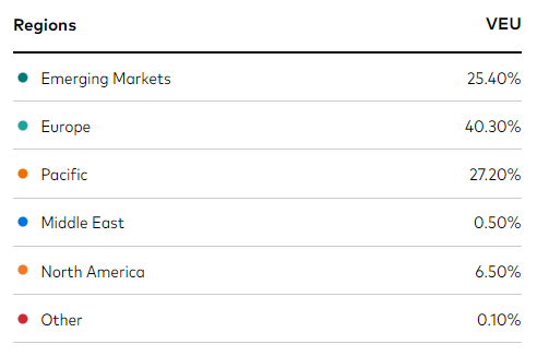
Europe and Emerging Markets are the top two regions in this ETF, accounting for two-thirds of its assets as of 12/31/2022.
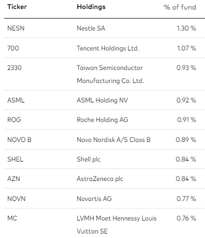
The top 10 holdings are in the table below.
In the VEU chart below, I noticed a well-known powerful pattern.
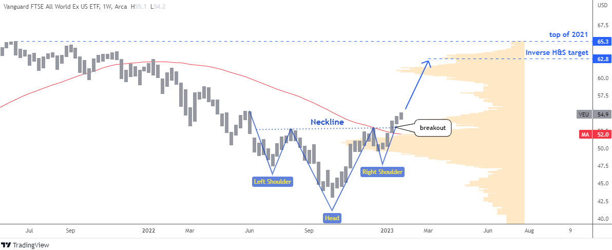
In the weekly chart above, the combination of three troughs, with the deepest one in the middle, has formed the eye-catching Inverse Head & Shoulders pattern (blue). It is a bullish reversal model. This pattern has a beautiful symmetry. The Neckline formed by the top points of the inverse head is ideally flat.
When the price was shaping the Right Shoulder, the largest Volume Profile area (orange) acted as a strong support around the $50 level, so it is smaller than the Left Shoulder.
The price has already broken above the 52-week simple moving average (red) as well as the Neckline resistance. The target is located at the height of the Head added to the breaking point of the Neckline, and it was highlighted at $62.8. Potential gain is around 14% from last week close. The peak of 2021, at 65.3, is the next aim.
Close to the target of the Inverse Head & Shoulders pattern, the next Volume Profile barrier is located between $61 and $62. So, keep an eye on the progress and book a profit if it stalls there.
Intelligent trades!
Aibek Burabayev
INO.com Contributor
Disclosure: This contributor has no positions in any stocks mentioned in this article. This article is the opinion of the contributor themselves. The above is a matter of opinion provided for general information purposes only and is not intended as investment advice. This contributor is not receiving compensation (other than from INO.com) for their opinion.

Great analogy
Dear Mr. Pruskauer, thanks for a warm feedback.
Have a lucky year ahead!