In the blink of an eye, we have reached the middle of the year, and it’s time to see how our third Pendulum experiment worked out.
I’ll start with the poll results from 6 months ago that show your bets.
Chart 1. Poll results

Graph courtesy of INO.com
The majority of you bet on Silver, and you won as you can see in the chart below. It looks like the Nikkei index is not your star whatsoever.
Chart 2. Silver Vs. Nikkei: Early Victory Of The Underdog Metal

Chart courtesy of tradingview.com
In the previous experiment the Nikkei’s gain compared to silver was developing slowly with the climax divergence coinciding with the end of the experiment at the astonishing 40% mark. This time silver (blue) started to pull away from the Nikkei (red) right at the beginning.
In March, the divergence scored more than 14% between the two instruments making the experiment successful. But the final and still early victory came one month later in the middle of April (1.5 months ahead of time) when the Pendulum effect reached its peak at 19%. It's half of the maximum effect reached when the Nikkei beat silver in the previous experiment due to the sloping chart of the index as silver did its job very well.
It’s interesting that the reverse motion of the Pendulum started last month after the two instruments’ lines converged and crossed each other as silver gave up almost all its gains and is now losing to the Nikkei a little bit. They again could exchange their positions in the next round of the infinite Pendulum effect.
Let’s take a look at the recent futures performance and pick out a new Pendulum experiment.
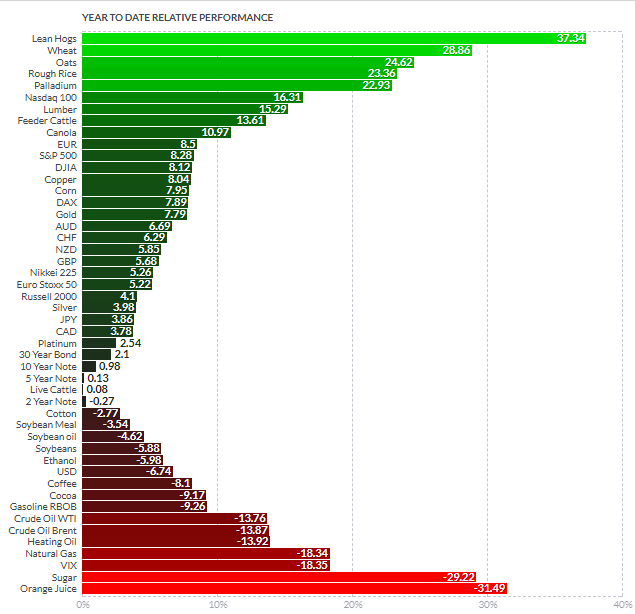
Chart 3. Half Year Futures Performance (2017 YTD)
Livestock and Grains are the leaders of the past half year futures performance. Among the metals, Palladium is a leader with an outstanding 23% gain. By the way, this metal already hit the charts in 2016 as it beat all of the top metals last year. On the opposite side, there is a “King of American breakfasts” – Orange Juice as an anti-hero with a 31% price drop. For the first time, we will watch orange juice during our next experiment.
I updated the long-term chart of palladium in December, and nothing extraordinary has happened as the price couldn’t break above the previous top, and I still expect this metal to go lower.
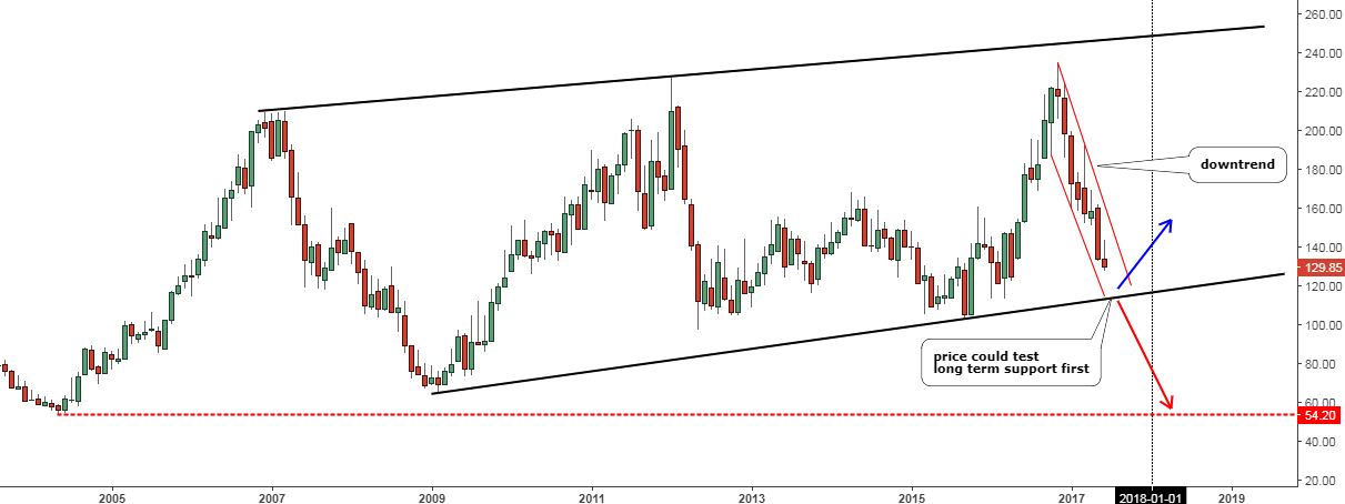
For the first time, I will review the orange juice chart on this blog to share my view before you vote for one of these instruments.
Chart 4. Orange Juice Monthly: Roller-Coaster

Chart courtesy of tradingview.com
Orange juice has high amplitude see-saw swings all the way to the left since the 1970s. It’s a true roller-coaster attraction for commodity traders. The best strategy here is to cover a losing position shortly and don’t look back when the price starts to move after each reversal.
I isolated higher lows and higher tops with the black slightly converging trendlines. Last November the price of orange juice pierced the previous top level ($226.95) and then reversed down ahead of the black resistance. Seven of the last eight months were in the red within the red downtrend. I think we could the price test the black support first. And the reaction of this support is crucial for further price action, would it be a bounce or breakdown I’m not sure at the moment. But one thing is I know for sure – orange juice has enough time to reverse before the experiment expires to beat palladium.
One (palladium) just reversed down; another (orange juice) is still falling. I think it will be harder to guess the winner this time around. Please share your opinion and vote for your winner.
Intelligent trades!
Aibek Burabayev
INO.com Contributor, Metals
Disclosure: This contributor has no positions in any stocks mentioned in this article. This article is the opinion of the contributor themselves. The above is a matter of opinion provided for general information purposes only and is not intended as investment advice. This contributor is not receiving compensation (other than from INO.com) for their opinion.


Folks are opting out orange juice because it is loaded with sugar.