Jim Cramer Finds A Diamond In The (Rough) Oil Patch

Adam Feik - INO.com Contributor - Energies


What a week for oil and energy. Okay, I know... what a 6 months! Ugh!

In case you're living under a rock (or just need a succinct summary of the carnage of late), oil has dropped about 2% or more every day this week except Tuesday, and looks on track to do so again today (Friday, Dec. 12th). All told, WTI oil prices as of mid-day today have dropped below $58, representing a decline of more than 46% since the commodity’s June 20th closing high of $107.95. In that time, natural gas prices and energy stocks have both given up about 25%, based on the US Natural Gas ETF (NYSEArca:UNG) and the Energy Select Sector SPDR ETF (NYSEArca:XLE), respectively. The Market Vectors Oil Services ETF (NYSEMKT:OIH) meanwhile, is off about 38% since oil's slide began.

Interestingly, this week's big shellacking has seen both oil and the dollar move lower, with the DXY index losing a little more than 1%. Natural gas prices are actually moving higher, and UNG's chart looks to the naked eye like this week could mark the beginning of a bottoming formation.

One small group that's bucking the trend

Last week, I highlighted Enbridge Energy Partners (NYSE:EEP), the Houston-based US affiliate of Calgary-based Enbridge (NYSE:ENB). EEP, ENB, and some other pipeline stocks have been (knock on wood) somewhat bucking the devastation in oil and energy. Accordingly, EEP and ENB continue to be among the only energy investments sporting green Trade Triangles in my MarketClub portfolio.

As fate would have it, ENB made impressively good news the last couple weeks, making a big enough splash to get the CEO invited on for a guest appearance on – wait for it – Jim Cramer's Mad Money show on CNBC. Whatever your vibe about Cramer, you ought to take 8 minutes and watch CEO Al Monaco's performance (here). Continue reading "Jim Cramer Finds A Diamond In The (Rough) Oil Patch"

Gold/Silver Ratio Is Going To Hit 109, Are You Ready?

Aibek Burabayev - INO.com Contributor - Metals


The gold-silver ratio was in a downtrend for 10 years, falling from the hard-to-imagine 1991 level's high of 100, to the 1998 local low at the 46 level. The ratio then shaped a reversal double bottom pattern and the price started to elevate firmly after it managed to pass the pattern's neckline at the 60 level. Later, the ratio came up to very strong resistance of the downtrend, which kept the price below resistance from six previous bullish attacks. The price tried its 7th attempt, but failed and only at the end of 2001 it managed to break up the trend. The ratio spent another year in consolidation and then rocketed above the 75 level, reaching 1990 and 1996 peaks.

gold-silver ratio chart

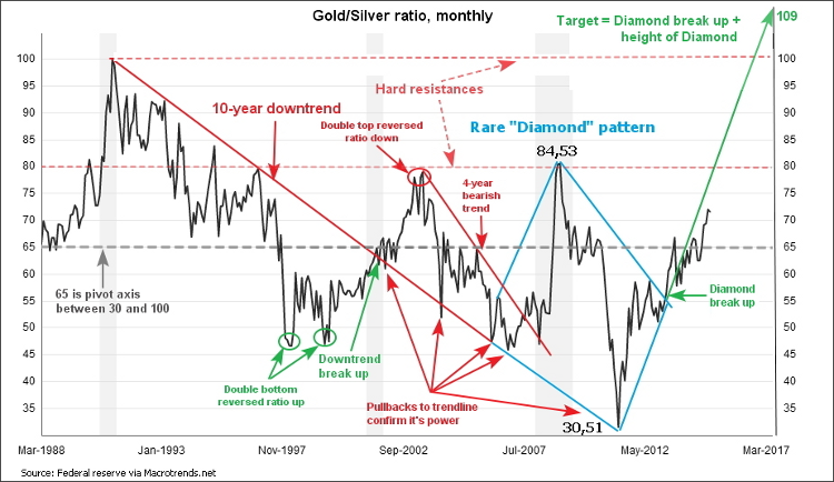
In 2003, the price retraced twice from those highs at the 80 level, drawing a reversal double top pattern. The price quickly crashed like a falling jet and lost an impressive 27 troy ounces, touching the former trendline resistance, now acting as support. Right after that in 2004, the ratio pushed up for a considerable 15 troy ounces, gaining more than half of what was lost in the fall. The price couldn't hold upside and fell into a 4-year medium bearish trend again.

2008 brought the crisis into the world and gold started to be in high demand. It seems like the market forgot about silver during those days, as the ratio charted an almost 90 degree vertical line, soaring like a spaceship. But again and again, the magic 80 level stopped the hysterics and the price softly landed down to the 65 area. The ratio consolidated for two years and in 2010, the price finally broke down with inconceivable acceleration and reached this century's low at the 30 level.

One can notice that the ratio can't hold its gains on both sides of the extremes. Another area worth mentioning is the midpoint between the above mentioned extremes located at the 65 level. We can call it an axis or meridian of the ratio. Price usually holds above or below this level and every time it passes the axis in either direction, the ratio charts small volatility zigzags confirming the power of this meridian.

After the price touched the 30 level low, the bulls entered the market and quickly bought the gold up to 60 level. The ratio then tumbled in consolidation, taking a rest for another shift up to the current 72 level.

Now let's get down to "dessert." I would like you to focus on the "Diamond" pattern, which is drawn in blue to emphasize the rareness of this pattern. Diamond patterns are sculpted by the following price actions: sideways consolidation, extreme development, reverse from extreme, opposite extreme development and again sideways consolidation. All of these market phases happened between 2006 and 2012. "Diamond" is a reversal pattern and the price reversed from this century's low which notably touched the multi-decade downtrend line. The height of the "Diamond" and the breakout point are the most important points of data for target calculation.

As we see, the height of the "Diamond, " which is between 30.51 low and 84.53 high and is worth almost 54 ounces. The "Diamond's" break up point is located at the 55 level in 2013. Now we can add 54 to 55 to get our target at the 109 level. Sounds crazy! But that's the technical outcome of the pattern. It's another 37 ounces from the current 72 level or more than double on investment made. Decent gain!

In my opinion, the target can be hit if we see substantial worsening of the world economy, then gold demand will outweigh silver. There are two main obstacles, first is the usual peak of effective range at the 80 level, as price usually stalls there. The second is the psychologically important 100 level, as it was last time seen in 1991, or 23 years ago, and our target just above this level.

Any pattern is not a dogma. Once price fails to progress upside, we will enter either sideways consolidation or even a downtrend. Below the current level the following supports are important: first is the meridian at the 65 level and the second is the bottom of the effective range at the 45 level.

Lucky trades,

Aibek Burabayev
INO.com Contributor, Metals

Disclosure: This contributor has no positions in any stocks mentioned in this article. This article is the opinion of the contributor themselves. The above is a matter of opinion provided for general information purposes only and is not intended as investment advice. This contributor is not receiving compensation (other than from INO.com) for their opinion.

Buy Qualcomm (QCOM) While It’s Cheap

WilliamCikos_Contributor_ImageBadge350


QCOM Chart

On July 23rd of this year, shares of Qualcomm (NASDAQ:QCOM) stock were quoted at $81.97, representing the highest price they've reached all year. At the time, its P/E ratio was just north of 20. In an overpriced market, for a company of Qualcomm's caliber - whose double digit earnings growth is projected to hold steady in the long term - one would logically think it was a rare bargain at the time.

But the way in which QCOM's priced has moved in recent months has been largely devoid of logic. On Friday, December 12th, the stock closed at $70.59, just 4% above its 52-week low. The price is indicative of a 14% drop which occurred within just 5 months of hitting its high point. That’s a 34% annualized drop in price.

Speculation Has Been Hurting QCOM's Stock Price

...But for any well-known stock, speculative-based price movements never seem to hold steady in the long term.

Whenever a company has at least some level of earnings growth, its stock becomes an attractive target when its price takes a large enough dip to push it into value territory. In the case of QCOM, this would apply at its current price level. Continue reading "Buy Qualcomm (QCOM) While It’s Cheap"

Is The Dollar Overvalued?

Lior Alkalay - INO.com Contributor - Forex


The US economy just seems to get better and better; better than robust retail sales, knockout earnings in payrolls and confident consumers raring and ready to spend more and more. Yet, after a rally that stretched all the way from early May, the last few days have been rather mixed for the Dollar, turning its monthly return against peer currencies into a virtual flat line. What might be the reason for that and should it affect your FX strategy? The answer to those questions is our focus for today.

The Growth Gap

If the outlook for the US economy and the US Dollar are so positive, what then could make investors question their Dollar bullish bets? Continue reading "Is The Dollar Overvalued?"

Befriend The December Volatility!

Matt Thalman - INO.com Contributor - ETFs


As we roll through the second week of December, the markets seem to be going a little crazy as the year comes to an end. From January 1st until November 28th of this year, the Dow Jones Industrial Average had gained 7.02% while the S&P 500 was up 10.6%. But, over the first week and a half of December, the Dow has lost 1.68% while the broader S&P 500 has fallen 2.04%.

Furthermore, the bulk of those declines came earlier this week when the markets closed lower Monday, Tuesday and Wednesday. And not only did the major indexes end the sessions off the mark, but their intraday lows put the indexes down by more than 1.25% on two of the three trading sessions.

The downward pressure being felt earlier this week could easily be blamed on a number of things which I am sure they were by many of the pundits out there; oil prices falling, oil prices rising, issues in Europe and Draghi not doing enough, slowing growth in Asia, weak growth numbers here at home, a poor start to the holiday shopping season, the list could go on and on. But, I personally don't believe any of those reasons are why the market has recently been falling.

The December Dive

Continue reading "Befriend The December Volatility!"