Last week, both metals triggered the signal support lines described in my previous post, therefore we are now in another consolidation phase. Let’s be patient and let the market take a pause to see what shall be further. I will update the metals charts in coming posts.
Meantime, let’s refresh the gold/silver ratio chart to see what’s going on there. I prepared three charts for you, which highlight the current snapshot of the metals, the ratio’s updated outlook and the “Risk Appetite” chart for “dessert”. Bon Appetite!
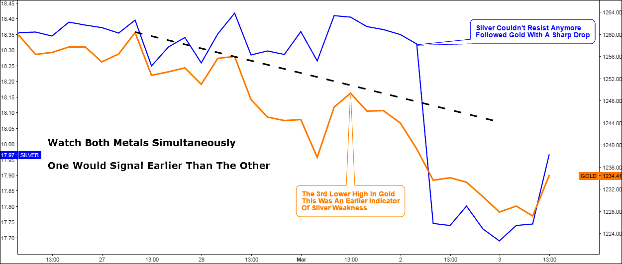
Chart 1. Gold vs Silver 4-Hour: The Strength Of The Chain Is In The Weakest Link

Chart courtesy of tradingview.com
This 4H chart above shows the “moment of crash” of the metals. Gold topped on the 27th of February and then started to shape lower highs with the trajectory of those highs highlighted in black dashed falling trendline. But that wasn’t a case for mighty silver, which has made another two higher closes on the chart ahead of severe drop on Thursday. It couldn’t resist the bearish pressure anymore as gold broke below the 1st of March low on the second day of March. Continue reading "Gold/Silver Ratio: Extended Target Points At $3059 For S&P 500"


