Stock Market Ready For A Pause

Weeks after the Election Rally initiated a moderately strong upside breakout rally, our Custom Index charts suggest the US stock market may be ready for a brief pause in trending before any new trends continue. Global traders and investors jumped into the US stock market just days before the US elections expecting something big to take place. The rally that initiated just days before the US election pushed our Custom Index charts well into the upper range of the 2016 to 2018 upward sloping price channel. This suggests the US stock markets have ended the downward price reversion and are now attempting to extend into the upward price channel – attempting to resume the upward trending that started after the 2016 elections.

Weekly Smart Cash And Volatility Indexes

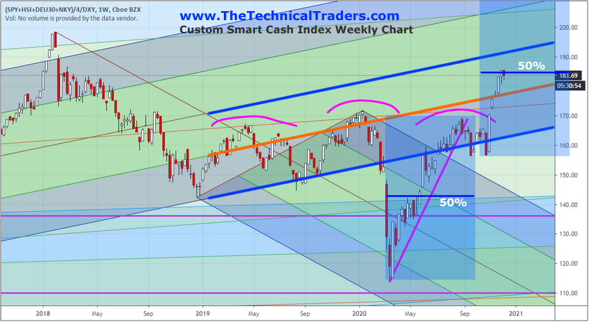
The Weekly Smart Cash Index, below, highlights the impressive rally recently and the upward sloping price channel that is back in play for price. The highlighted range of the upward sloping price channel is actually the lower half of the std deviation range of the 2016 to 2018 price channel. So, as of right now, the Smart Cash Index price level has yet to really breach the middle of this channel and is still only within the lower half of the channel. Still, the support near the lower boundary of this level has been retested two or three times over the past six months and held. This suggests the lower channel level (the lower heavy BLUE line) is now acting as moderate price support.
stock market

The speed of the recent upside price rally on this Smart Cash Index chart suggests that current price congestion may be an indication that the US stock market has reached a point where it will pause and stall a bit before attempting any new rally. From the recent lows near the end of October to the current highs, the current rally represents a 50% Fibonacci price expansion of the range from the March 2020 lows to the highs in August 2020. The 50% expansion range is a very common Fibonacci level that can typically prompt market price pauses or reversals. Continue reading "Stock Market Ready For A Pause"

How To Spot The End Of An Excess Phase - Part 2

In Part I of this research article, my research team and I highlighted the five unique components of an Excess Phase peak and breakdown process. We are sharing this data with you because we believe the US stock market has already meandered 2.5 years past the end of a US Stock Market Appreciation phase and is well into an Excess Phase Peaking process. This becomes very important for traders because risks are much higher in these late Excess Phase stages because volatility is usually 4x to 6x higher than previous phases. Additionally, psychologically, many traders want the rally to continue and deeply believe the end of this phase is “just a pullback in a bigger trend”. This can be very dangerous as traders sometimes continue to buy into deeper price corrections – leveraging their accounts to the hilt thinking “they are going to make a killing when the rally resumes”.

Exploring Past Excess Phase Peak/Breakdown Events

Excess Phases and Blow-Off Peaks/Bottoms can become very addictive for certain people – especially those that have gotten into the trend before the Excess Phase began. These people are often “die-hard” believers that the trend will never stop rallying and can sometimes leverage themselves into very dangerous positions.

If you recall from the first part of this research article, there are five phases to the Excess Phase price decline and we believe each of these five phases is fairly common for all excess phase breakdowns: Continue reading "How To Spot The End Of An Excess Phase - Part 2"

How To Spot The End Of An Excess Phase - Part 1

If you have been following my team’s research posts recently, we have highlighted some interesting new research related to Appreciation/Depreciation phases in the US stock market and how that relates to Gold. Today we will explore another method of identifying the different phases of market trends that appears to show very clear Appreciation/Depreciation phases and extended end-phase blow-off tops and bottoms.

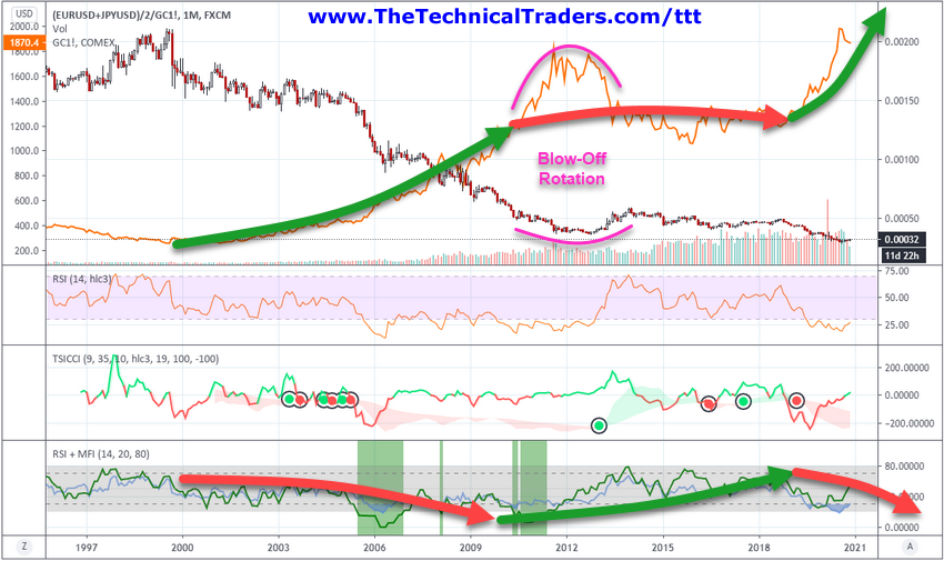
My research team and I believe the current rally in the US stock markets represents an end-phase blow-off top after a 9.5-year Appreciation phase that began in mid-2009. We believe it is very important for traders to understand these larger Appreciation/Depreciation cycles and how the Blow-Off end phases often create extreme volatility and price rotation.

Below, we are using a custom EURUSD/JPYUSD index divided by GOLD as the base Candlestick chart and have applied the real Gold price levels on the chart for visual reference. Near the bottom of the chart, we are showing the RSI indicator, the TSICCI indicator, and the RSI + MFI Indicator that helps to highlight the broad market trends and cycle phases. We want you to pay attention to the GREEN and RED arrows we’ve drawn on this chart showing the Appreciation/Depreciation phases of Gold and the broader US stock markets in EUR/JPY currency form. This method of charting these phases takes a bit of patience and understanding. We are looking for correlations to US stock market trends in relation to precious metals, and we must consider the end-phase process.

Excess Phase

The end-phase process, after any appreciation or depreciation phase, often includes a very volatile “blow-off” period where trends continue beyond the end of the actual price phase. This happens because the momentum of the previous price move has yet to realize the transitional shift in underlying appreciation/depreciation factors. Traders still want the rally in the stock market or metals to continue, so they chase after the excess phase rally until the momentum of the move fails. Continue reading "How To Spot The End Of An Excess Phase - Part 1"

Monthly Dark Cloud Cover Pattern May Be Calling The Top

Research Highlights:

  • A Dark Cloud Cover pattern is a Japanese Candlestick Pattern that is typically associated with major top setups
  • Critical Support on the SPY highlighted by multiple technical analysis strategies suggests 335~335.25 is acting as a major support level
  • If price stays below the $339.95 level, then we interpret the trend as being Bearish. If price moves above the $343.55 level, it is Bullish

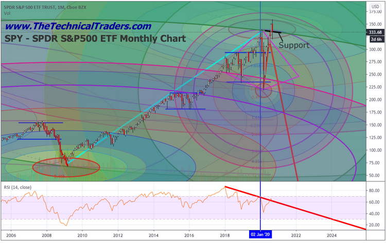
Critical Support on the SPDR S&P500 ETF (SPY) highlighted by multiple technical analysis strategies suggests 335~335.25 is acting as a major support level. The rally in the markets that started late Sunday and carried forward into early trading on Monday, September 28, 2020, suggests the market is attempting to rally above this support level to establish a potential momentum base. My advanced price modeling systems and Fibonacci Price Amplitude Arcs (originating from the 2009 bottom) have clearly identified this area as a critical resistance/support zone.

The first chart below highlights the SPY Monthly chart data and shows the recent peak in price that broke through the major resistance level near 335, then collapsed back below that same level. Prior to this recent collapse, the COVID-19 peak in February also briefly touched this same resistance level – confirming it as valid. We believe the current price activity suggests the markets are attempting to form some sort of price base above this $335 level on the SPY.

Dark Cloud Cover Pattern

As you can see from the recent highs on the chart above, there is a new Fibonacci Price Amplitude Arc range set up by the COVID-19 collapse that may interrupt this Base Setup process. Look for the smaller OBLIQUE on the chart near where the word “Support” is. This is a new Fibonacci Price Amplitude Arc that reflects the most recent price range activity into targeted Fibonacci based price zones. Continue reading "Monthly Dark Cloud Cover Pattern May Be Calling The Top"

Topping Pattern Or Just Consolidation?

The Transportation Index, which typically leads the US stock market by 2 to 4+months, has been unusually aligned with the S&P 500 over the past 8+ months. Recently, though, the Transportation Index has rallied up to recent new all-time highs (over the past 9+ months) and has rotated lower – below resistance near 11,440 (the MAGENTA LINE on the first chart). Our researchers are warning us that any continued breakdown below this level could prompt a bigger downside market move.

Is recent rotation a topping pattern or just consolidation?

Currently, the US stock market has rolled into a sideways/topping pattern. After the peak in metals setup near August 7, 2020, the US stock market continued to rally a bit higher, then rotated lower on September 3, 2020. The Transportation Index rolled over on September 3 but climbed higher less than 5 trading days later – breaking above the highs set before the COVID-19 peak.

We’ve suggested a “Bull Trap” pattern may be forming in the major markets, and we’ve urged traders to be cautious regarding the new price highs and appearance of a continued upside price rally. The Bull Trap pattern, sometimes called a “Scouting Party,” happens when price breaks above resistance (or below support) briefly in an attempt to establish a new trend. If the price fails to find support after breaking above the previous resistance level, it typically rotates lower and collapses back below the resistance level (attempting to find a lower support level).

If our research is correct, the recent rotation in the Transportation Index may suggest a Bull Trap pattern has set up and completed (with the price falling back below the 11,440 level). If this trend continues, we may see a much bigger downside price move where price attempts to find support near 9,800 or 9,200. Continue reading "Topping Pattern Or Just Consolidation?"