Silver surprised us with a strong Santa Claus Rally. It woke up like an ancient volcano and with a booming eruption. Before that, we proclaimed silver to be dormant compared to a vigorous rival, gold.
Everything changed at the end of 2018 as gold gained 10% from the lows and a weak silver tried to catch up to make the same profit at the very end. Bargain hunters couldn’t pass by this clear market distortion and took their chance to book a nice profit of around 4%.
In my earlier post I updated the medium term gold chart for you. Last time I updated the big chart of silver in October, which was titled dramatically “Fly Or Die” as submissive behavior of silver was leaving less and less hope for investors.
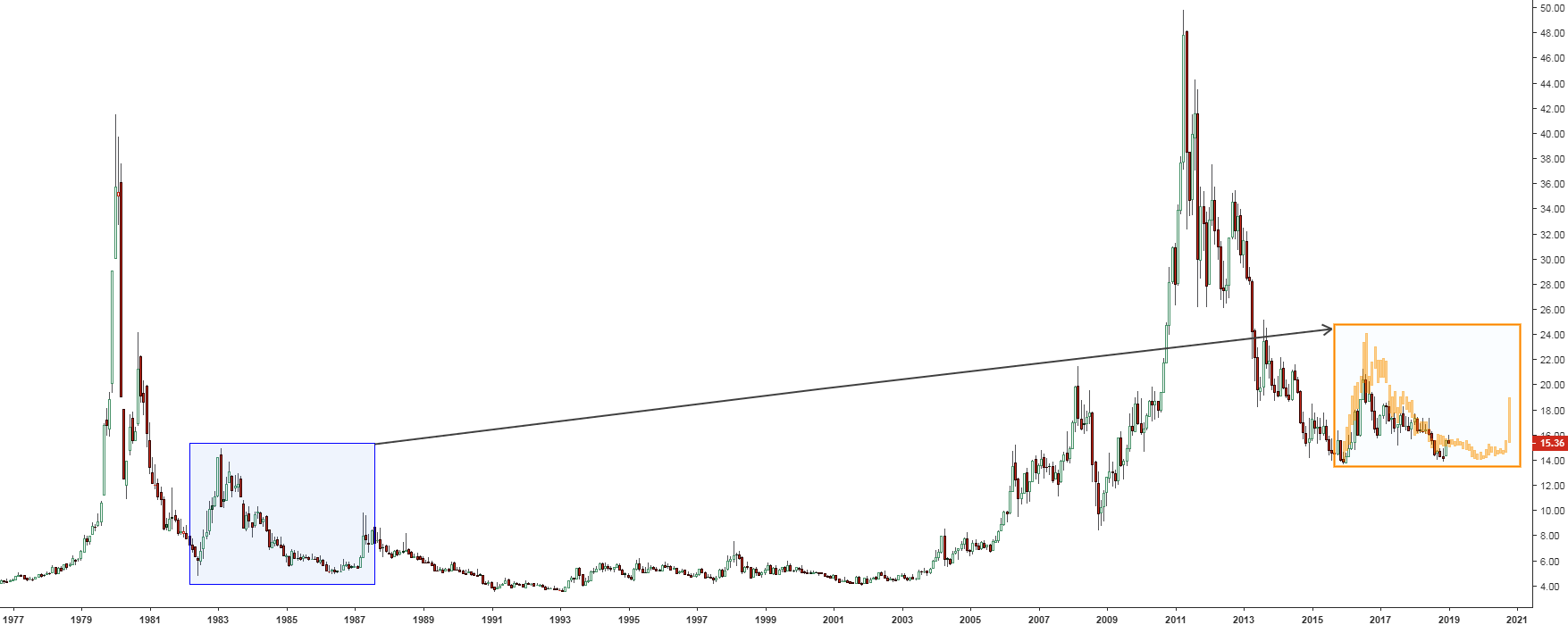
This time I am going to update the silver chart, but using a different approach. You are already familiar with it as I used historical clones with gold and silver before. The latter one was successful. This time it will be extended as I will use two clones instead of one from different historical periods so you can choose.
Let’s start with the distant one.
Chart 1. Silver Futures Monthly: Echo Of the 80s

Chart courtesy of tradingview.com
This chart was built in a high resolution, and I recommend you to click on it to open in a new window to see a larger image in details, especially in the right clone (orange box). Continue reading "Silver Update: 1980s Vs. The 2010s"

