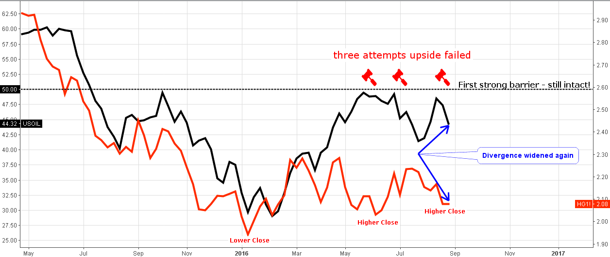
Chart 1. Crude Oil-Copper Correlation: Gap Widened

Chart courtesy of tradingview.com
Another attempt by oil to close above the psychologically important $50 level (black dashed horizontal line) has failed. This was the third and a good try, and it was after a good correction in July, which makes bulls nervous as they lose their patience. Copper couldn’t keep the correlation gains achieved in July as it didn’t follow the rising crude last month and on the contrary, it moved the opposite way below the $2.2 level. The gap between them widened.
It’s not all bad news. There are at least two positive factors:
1) the copper has managed to print higher closes from the January low.
2) the metal still has the correlation gap reserve to catch up with the current oil level above the $2.4 mark.
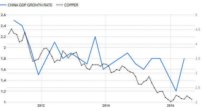
Chart 2. China GDP Growth Rate-Copper Correlation: Metal Shows Sideways For China Economy

China GDP growth rate Q/Q (left scale); Copper price (right scale)
Chart courtesy of tradingview.com
More than a year ago I shared with you the strong correlation between the Global GDP and the copper price. The metal proved to be a leading indicator of the state of the global economy.
This time, I would like to show you the correlation of the China GDP and copper as China accounts for 45% of global copper consumption and the chart above will give us a focused view. I wasn’t surprised that there is a tight, direct correlation of the China GDP Growth Rate (blue line) and the copper price (dark gray dashed line) with rare disruptions. For the past 5 years, the metal was falling with the contracting Chinese economy all the way down from the top in 2011 to the bottom at the start of this year.
In July the Chinese Q2 data came out at +1.8% surprisingly beating the expectations at +1.6% and a previous quarter reading of +1.2%. As statistics shows delayed data, you can see how accurately copper forecasted the reversal to the upside of the GDP growth rate already at the start of the year when the metal has bottomed and headed up ahead of the Chinese economy.
Currently, copper is sitting on the sidelines, and you will read about it below the Chart 3. Therefore, we can see the same stagnation of the Chinese GDP growth rate in the remaining part of this year until copper makes another major move on the chart.
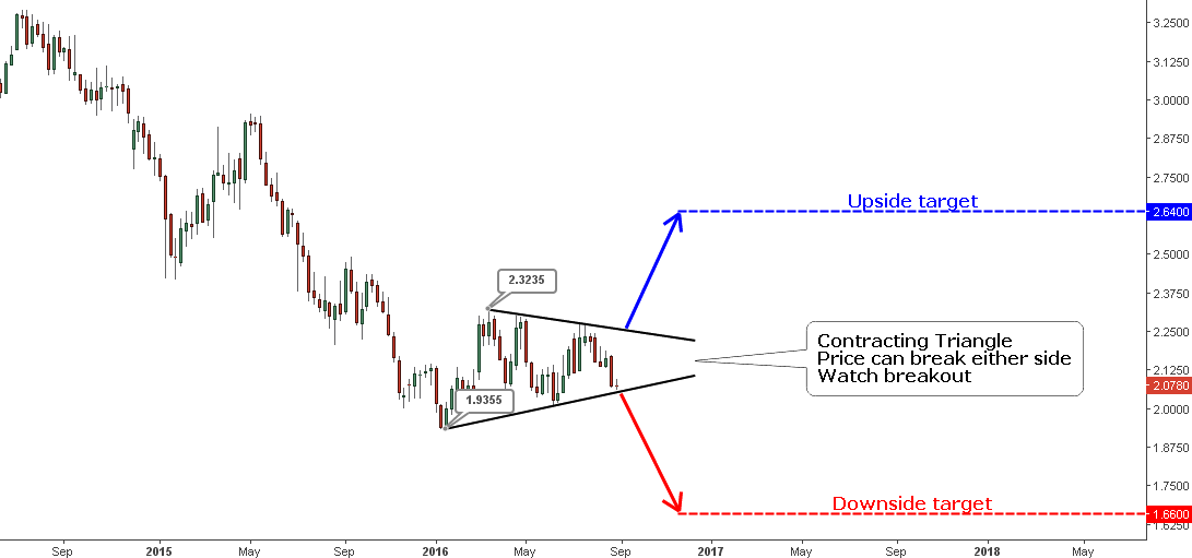
Chart 3. Copper Weekly: Contracting Triangle

Chart courtesy of tradingview.com
Back in July the reversal Inverse Head & Shoulders pattern was detected on the Copper chart. The price of the metal started to elevate according to the pattern’s plan but failed to close above the neckline and broke below $2.1 terminating the pattern. One pattern fades, another one appears the next.
Copper is on the sidelines as lower highs and higher lows shaped the Contracting Triangle pattern (highlighted in black). The pattern can be broken to either side so we should watch the price action closely as it is indicated by the blue and the red arrows.
You already know how to calculate triangle targets. We should add (subtract) the width of the widest part of the triangle (marked with the price tags) to (from) the break point. The upside target is located at the $2.64 mark (blue dashed line), the downside target is set at the $1.66 level.
The validation levels are as follows: on the upside, we should break above the previous high at the $2.28 mark; on the downside, we should dip under the previous low at $2.01.
Intelligent trades!
Aibek Burabayev
INO.com Contributor, Metals
Disclosure: This contributor has no positions in any stocks mentioned in this article. This article is the opinion of the contributor themselves. The above is a matter of opinion provided for general information purposes only and is not intended as investment advice. This contributor is not receiving compensation (other than from INO.com) for their opinion.

