In this post, I will share with you two maps as the S&P 500 consolidates to address two questions that are probably on your mind these days. The first is related to the long-term trend, shall we consider that significant ten percent drop that started at the end of January as a threshold for the long-term Bear Face? And the second question is related to the current situation, will this robust recovery continue further?
Let’s be diligent and answer those questions one by one.
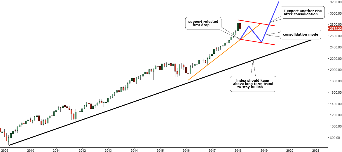
Chart 1. S&P 500 Monthly: Consolidation Not A Reversal Yet

Chart courtesy of tradingview.com
First of all, I would like to draw your attention to the black long-term trendline support, which starts post Great Recession period. The S&P 500 is far above this trigger, and I guess that even the current consolidation could hardly reach it. So, for the long term Bear Face to start sellers should push the index below that trendline, which currently sits at the $2100 mark. As this is not the case now, there is no reason for panic then.
I added the orange trendline support, which starts from the end of the 2015-2016 consolidation. As you see the first drop from the January top, hit precisely that support and was successfully rejected, but I think another attempt could follow later on. Details are on the second chart.
For the visual comfort of understanding the consolidation phase, I put the red parallel channel with a slight downside angle on the chart. As you see, I expect the price to make seesaw moves within it and the second leg of consolidation would finally break through the orange support to hit the downside of the red channel.
But as the consolidation finishes, I think the upside move could resume, and the target for it should be calculated only after that. This market break could last longer than the previous consolidation located above the orange trendline, which took three months in 2016. Weak hands will be shaken out as not all investors could be patient for such a long time.
For swing traders, I dedicated another chart below to answer the second question.
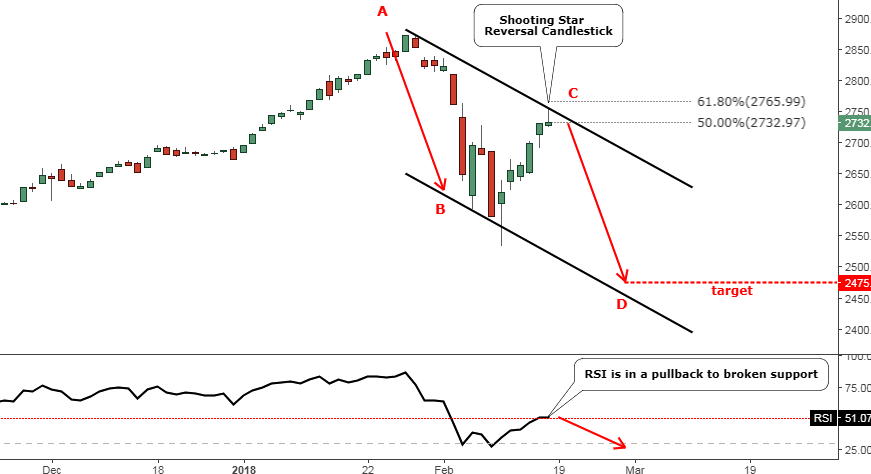
Chart 2. S&P 500 Daily: Beware Of Another Drop

Chart courtesy of tradingview.com
We should keep our minds fresh as the current robust recovery could catch those who fell into a short-term euphoria, especially when you see all green candles on the chart. Be careful as I see this strength as a counter-trend correction within the first leg of the described above long-term consolidation. Indeed, the depth of it is impressive as the index almost hit the 61.8% Fibonacci retracement level. The RSI indicator also looks promising as it recovered from the extremely oversold area to test the 50 resistance level.
I spotted a bearish reversal candle on the daily chart above called a “Shooting Star” this past Friday. It is most often found in an uptrend. This candlestick is made up of a candle with a small lower body, little or no lower wick, and a long upper wick that is at least two times the size of the lower body. In our case, we have the upper shadow that is four times the size of the body.
This signal is traded in two ways. The riskier one is to sell right at the market open on Tuesday and the second method watches for the confirmation first, which requires the next daily candlestick (Tuesday, February 20) to close below the body of the Shooting Star at the $2727. You can choose the one you prefer according to your own trading rules.
The AB/CD concept points at the $2475 level as a target for the upcoming weakness where CD segment = AB segment. The black downtrend channel confirms that target as it is sitting on the downside of it.
Intelligent trades!
Aibek Burabayev
INO.com Contributor, Metals
Disclosure: This contributor has no positions in any stocks mentioned in this article. This article is the opinion of the contributor themselves. The above is a matter of opinion provided for general information purposes only and is not intended as investment advice. This contributor is not receiving compensation (other than from INO.com) for their opinion.

