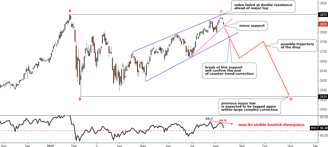
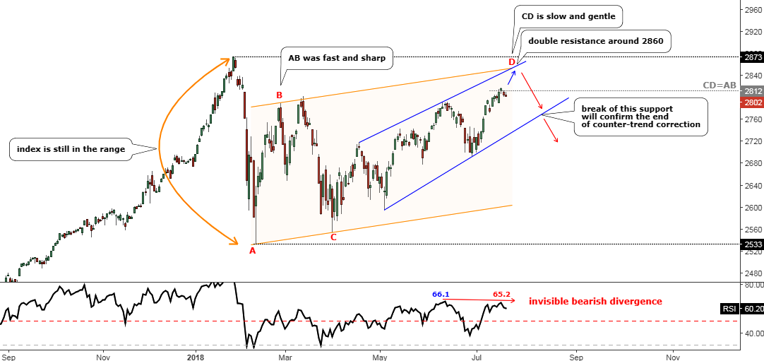
Last August I was thinking of the S&P 500 index and wondered if its uptrend had been exhausted on its way to the upside. The price was at the $2833 level, and it failed to break the earlier top of $2873. The RSI showed the Bearish divergence and the index started to drift lower. I thought it was a complex correction and another drop to hit the lower bound of the $2533-$2873 range was considered to be imminent. The majority of you supported this idea.
Let’s check the updated chart below to see what happened next.
Updated S&P Daily chart tailored in August 2018.
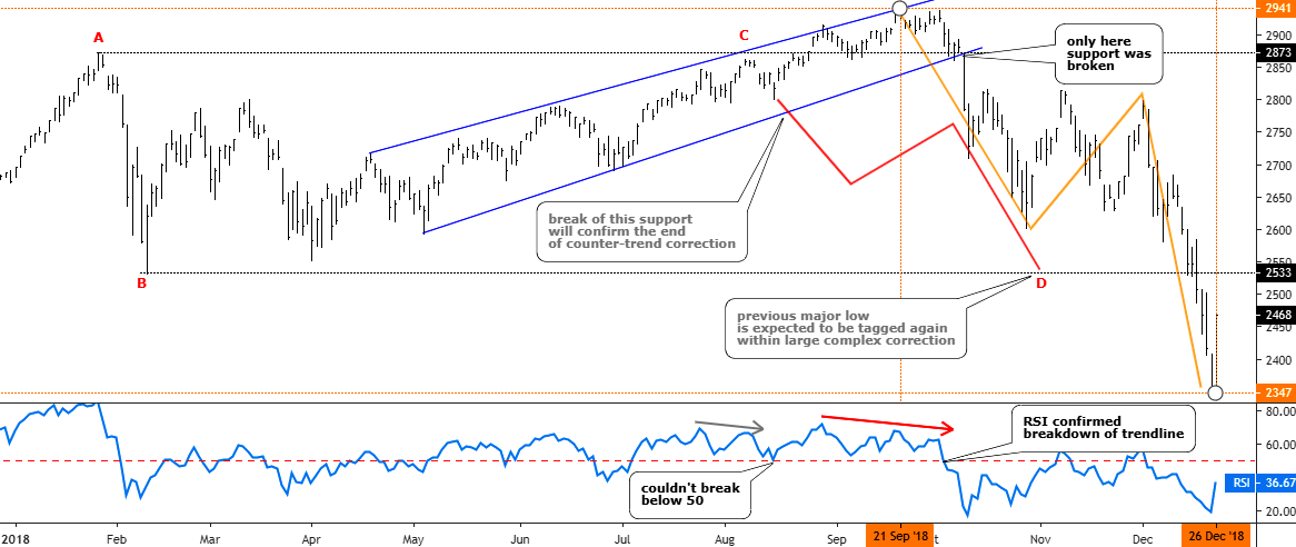
Chart courtesy of tradingview.com
As we can see from the chart above the idea itself was good as the price not only retested but just smashed the so-called “bottom” of the range. The actual CD segment, which initially was thought to be equal to AB segment, had reached the ratio of 1.75 exceeding the next most common after 1:1 ratio of 1.618 (Fibonacci ratio) amid the panic sell-off. The trigger, which was set on the downside of the blue uptrend, was right as the index didn’t look back until the very bottom after it fell out of that blue uptrend. That move was accurately confirmed with a breakdown of the 50 level on the RSI sub-chart. The predicted zigzag structure of the drop also appeared to be correct as it is natural market behavior when one market stage changes the other. And talking about where we were right, I also would like to show you the ballot results on the timing of the bottom of the drop. Continue reading "S&P 500: Drag & Drop?"