
Hello traders everywhere. As the slide to lower levels continued on Wednesday, I couldn't help but notice that these current levels looked familiar to me, so I did some investigating. I started by looking at yearly charts for the three main indexes, and it became quite clear as to why those levels looked familiar. As it stands, the S&P 500 is only 19 pts away from the opening of trading on Jan. 2, 2018 where it opened at 2,683.73, currently trading around the 2700.00 level. The DOW is only 180 pts away for it's yearly open at 24,809.35, currently trading around the 25,000 level. Meanwhile, the NASDAQ has quite a bit more room between its current trading levels at the 7,200 range and its yearly open of 6,937.65 or 332 pts. But the way it's been getting hammered lately case in point today, it won't take long for it to reach that level if the slide continues.
Does this mean that all of the record highs that we've seen this year are all for naught?
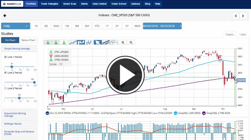
Key Levels To Watch This Week:
- S&P 500 (CME:SP500): 2,894.83
- Dow (INDEX:DJI): 26,951.81/24,077.56
- NASDAQ (NASDAQ:COMP): 8,107.38
- Gold (NYMEX:GC.Z18.E): 1,222.80
- Crude Oil (NYMEX:CL.Z18.E): 69.84
- U.S. Dollar (NYBOT:DX.Z18.E): 94.47
- Bitcoin (CME:BRTI): 6,637.89
Every Success,
Jeremy Lutz
INO.com and MarketClub.com
Considering Short, Mid and Long term Chart perspective, I think, across the Globe, Blood bath in Stocks is not even started just, Full or main picture yet remains pending to get start so far. This is purely at present, “What chart tells”, so later it may found Tagged reason therefore like “Trade War”, “Currency Crisis” or “Geo Political uncertainties etc.
Except some in-between bounces and relief rallies, we are ahead of finding forth coming wicks, months, quarters and years worst.... worst and worst only, and even far more deepen harsh and vicious then of 2008 nightmare. I know that my prediction is quite uncomfortable and disliking, so also I am fully doubtful that up to which extend my such observation will be accepted or not.
As far as Financial Sector is concerned, I think "Hope" and "Optimism" are widely sprayed and most favored words, but unfortunately, both proven as worst and the most damaging enemies of the participants.
The YTD chart's looks horrible. Why people are bothering to squeeze the last few remaining drops of blood from this 9 year bull is beyond me............... SELL SELL SELL SELL
Looking for stocks in low price, 3 to 6 dollar, that make money.