One year ago I shared with you the similar dynamics of the top gold stocks ranked by ROE. There were five tickers: ABX (Barrick Gold), SBGL (Sibanye Gold), IAG (IAMGOLD), GSS (Golden Star) and HMY (Harmony Gold Mining). I want to update on their price dynamics to show you which of your bets played out after one year.
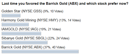
Before we get down to the results, below is the distribution of votes for each stock for you to recall those bets.

For the second time in a row, the majority of you bet on Barrick Gold (ABX) despite that this company was among the top losers a year ago. Another interesting fact is that the Golden Star (GSS) was the least favorite, although it had shown the best result last time. This is what we call mysterious investors’ sentiment.
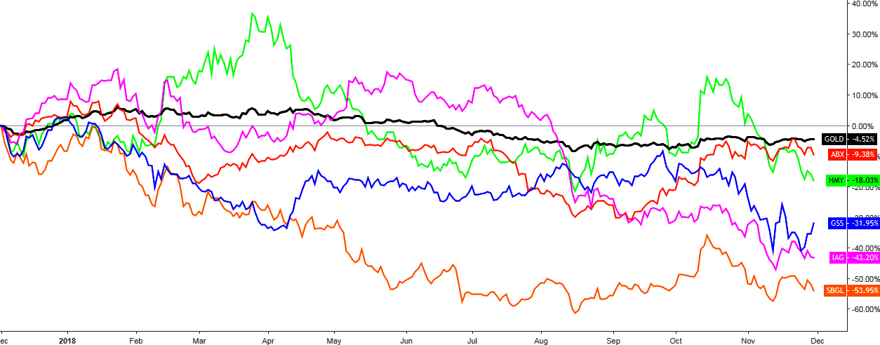
Chart 1. Gold Stocks Vs. Gold: Unmatched

Chart courtesy of tradingview.com
A year ago gold (black) was stronger for 4.5% than it is now, and this is the best result as of today as gold stocks are showing even worse one-year dynamics on the comparative chart above. In other words, owning gold was the best alternative for the past year compared to being a stock investor.
The good news is that your bet on Barrick Gold (ABX) (red) has paid off as it has been the best performing stock among five companies even if the result is -9.4%. The next is Harmony Gold Mining (HMY) (green) with -18%, the third is the former superstar Golden Star (GSS) (blue) with -32%, IAMGOLD (IAG) (purple) ranked the fourth with -43.2%, and the top loser is the Sibanye Gold (SBGL) (orange), which lost more than half of its value (-54%).
It looks like the entire sector fell prey to negative investor sentiment. When I filtered all gold companies with a market cap above $300 million and positive performance for the past year I could find only three companies that could deliver out of thirty-three. I put them in the table below for your information.
- Kirkland Lake Gold Ltd (KL)
- SSR Mining Inc (SSRM) (former Silver Standard Resources)
- Seabridge Gold Inc (SA)
Source: finviz.com
As your favorite stock is ABX, I prepared a separate chart analysis for this stock hoping that it could be of interest for you.
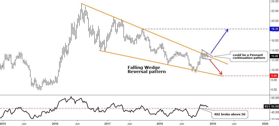
Chart 2. Barrick Gold Weekly: On The Edge

Chart courtesy of tradingview.com
ABX has a very clear and neat chart structure compared to other gold stocks, and it shouldn’t surprise us as this ticker is the most liquid gold stock in the market with an average volume of 18 million shares.
I detected two patterns and highlighted them for you on the chart. The bigger one is a Falling Wedge reversal pattern, which is contoured with orange converging trendlines. This price model is bullish for ABX, but it is yet to be completed. Once it has been broken, there is a chance that the price could retest the former top of $23.47 where we would get almost 100% price growth. Pretty nice potential outcome!
The price is currently sliding on the upside of the Falling Wedge making a series of false breaks followed by small setbacks inside of the wedge. This short-term sideways moves shape another pattern, which is very tiny compared to the first one. I highlighted it in blue, and it is called a Pennant continuation pattern. If the price breaks out of it to the upside, then we can see it hitting the last September’s top about $18.35, which would give a hefty gain of 43%. The RSI currently supports the breakup as it already moved above the crucial 50 level and in spite of sideways moves on the price chart, it keeps above that level.
The red down arrow points at the bottom of the Falling Wedge pattern at $8.8 in case the stock would suffer severely from another drop in the gold price.
Intelligent trades!
Aibek Burabayev
INO.com Contributor, Metals
Disclosure: This contributor has no positions in any stocks mentioned in this article. This article is the opinion of the contributor themselves. The above is a matter of opinion provided for general information purposes only and is not intended as investment advice. This contributor is not receiving compensation (other than from INO.com) for their opinion.

how about just saying neutral