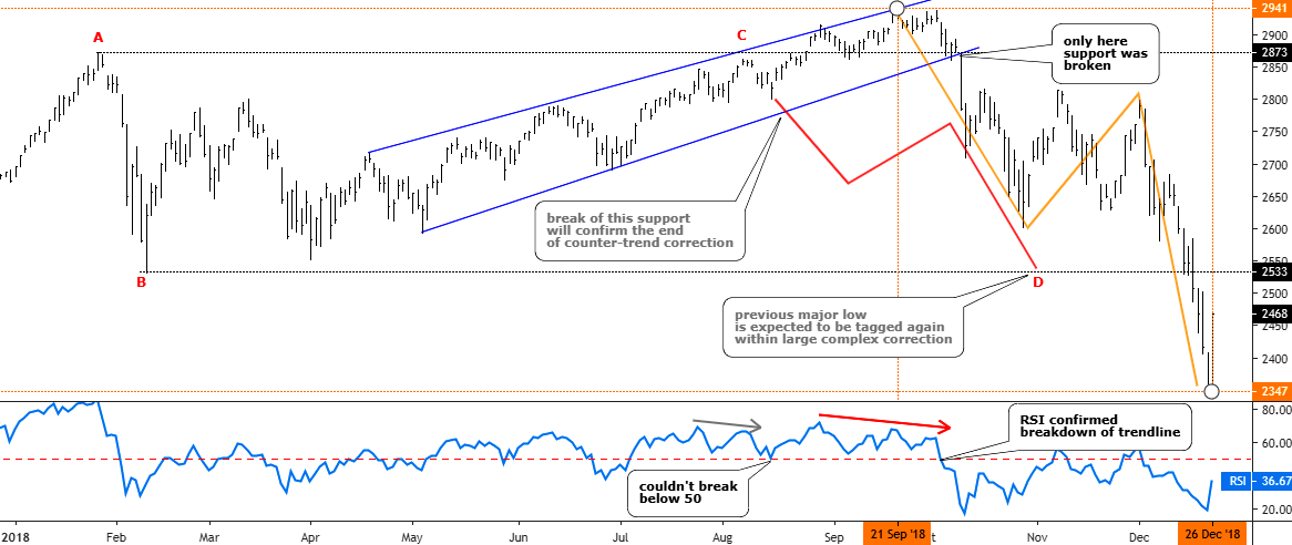
Last August I was thinking of the S&P 500 index and wondered if its uptrend had been exhausted on its way to the upside. The price was at the $2833 level, and it failed to break the earlier top of $2873. The RSI showed the Bearish divergence and the index started to drift lower. I thought it was a complex correction and another drop to hit the lower bound of the $2533-$2873 range was considered to be imminent. The majority of you supported this idea.
Let’s check the updated chart below to see what happened next.
Updated S&P Daily chart tailored in August 2018.

Chart courtesy of tradingview.com
As we can see from the chart above the idea itself was good as the price not only retested but just smashed the so-called “bottom” of the range. The actual CD segment, which initially was thought to be equal to AB segment, had reached the ratio of 1.75 exceeding the next most common after 1:1 ratio of 1.618 (Fibonacci ratio) amid the panic sell-off. The trigger, which was set on the downside of the blue uptrend, was right as the index didn’t look back until the very bottom after it fell out of that blue uptrend. That move was accurately confirmed with a breakdown of the 50 level on the RSI sub-chart. The predicted zigzag structure of the drop also appeared to be correct as it is natural market behavior when one market stage changes the other. And talking about where we were right, I also would like to show you the ballot results on the timing of the bottom of the drop.

Bingo! The majority of you hit it right as the index bottomed right at the end of 2018 on 26th of December, 2018 at the $2347. I am impressed by how often you make the right call!
The only thing that was wrong in that call is the timing of the reversal to the downside as the idea was based on the approach of a perfect range.
Such historical analysis is useful for an understanding of what does work and what does not. Triggers work, guessing NOT.
Now let’s move to the current situation as the title for this post makes a warning.

Chart courtesy of tradingview.com
The index eyes the former top to break it at the $2941 and we are just several steps below that level. There is not much momentum in the market these days as it has been seen during the very first move up from the bottom. The orange uptrend clearly confirms this as the S&P 500 was on the upper side of the orange trend above the red mid-channel up until last month. Then the price dropped below it and later failed to overcome that barrier again. Recently the distance to the mid-channel even increased as the price now sits on the downside of the trend. It all looks like some market power drags the S&P 500 to the former top before it will finally drop the index then.
The Momentum indicator, which compares the current price with the price that was 10 days ago, shows a Bearish divergence as its reading established a lower high compared to the higher high on the price chart. The indicator is flirting with the crucial zero level, which means a sluggish market. Below the 0 the chances of the drop will increase.
The trigger for the possible upcoming drop was set at the $2784 level where the earlier consolidation has been completed. The target is set at the bottom of 2018 at $2347.
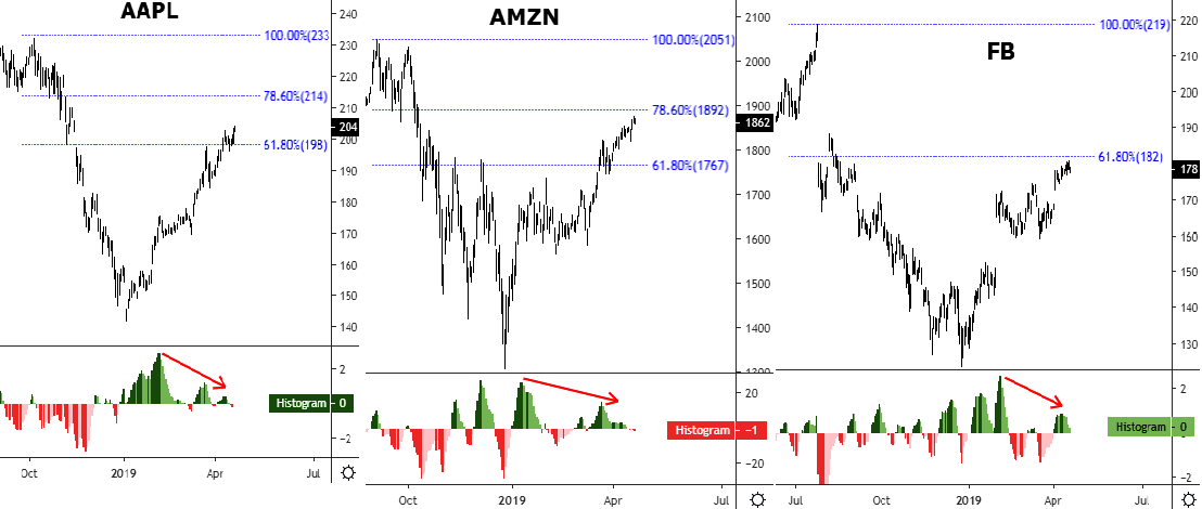
I prepared another daily chart for you to show you where my concern about the S&P 500 started to emerge where almost 9% of the index is depicted.

Chart courtesy of tradingview.com
These 3 behemoths account for almost 9% of the S&P 500 index. When I opened their charts recently, I noticed that they don’t look as robust as the index does. The latter almost approached the previous peak, and I guess it’s just a matter of time when it will tag that high. These tech giants show something different. I added Fibonacci retracement levels on all three charts as for me their moves up look more like corrections.
Facebook is in the weakest position as it couldn’t overcome even the 61.8%. Apple has a stronger position as it managed to advance more deeply. And the Amazon is the strongest as it almost reached the next retracement level of 78.6%. All of them have another similarity on the MACD sub-chart – there is a Bearish divergence clearly seen as lower peaks of MACD contradict with higher tops on the price chart. The Amazon already has a negative reading of MACD, which is a Bearish warning.
This miscorrelation of price behavior of these three large components of the index raised doubts about the strength of the uptrend in the S&P 500 itself.
Intelligent trades!
Aibek Burabayev
INO.com Contributor, Metals
Disclosure: This contributor has no positions in any stocks mentioned in this article. This article is the opinion of the contributor themselves. The above is a matter of opinion provided for general information purposes only and is not intended as investment advice. This contributor is not receiving compensation (other than from INO.com) for their opinion.
