The U.S. dollar index (DXY), aka “King,” has a clear structure in its chart as it moves accurately according to the plan posted at the beginning of the month. Most of you supported the idea that the dollar will show another drop.
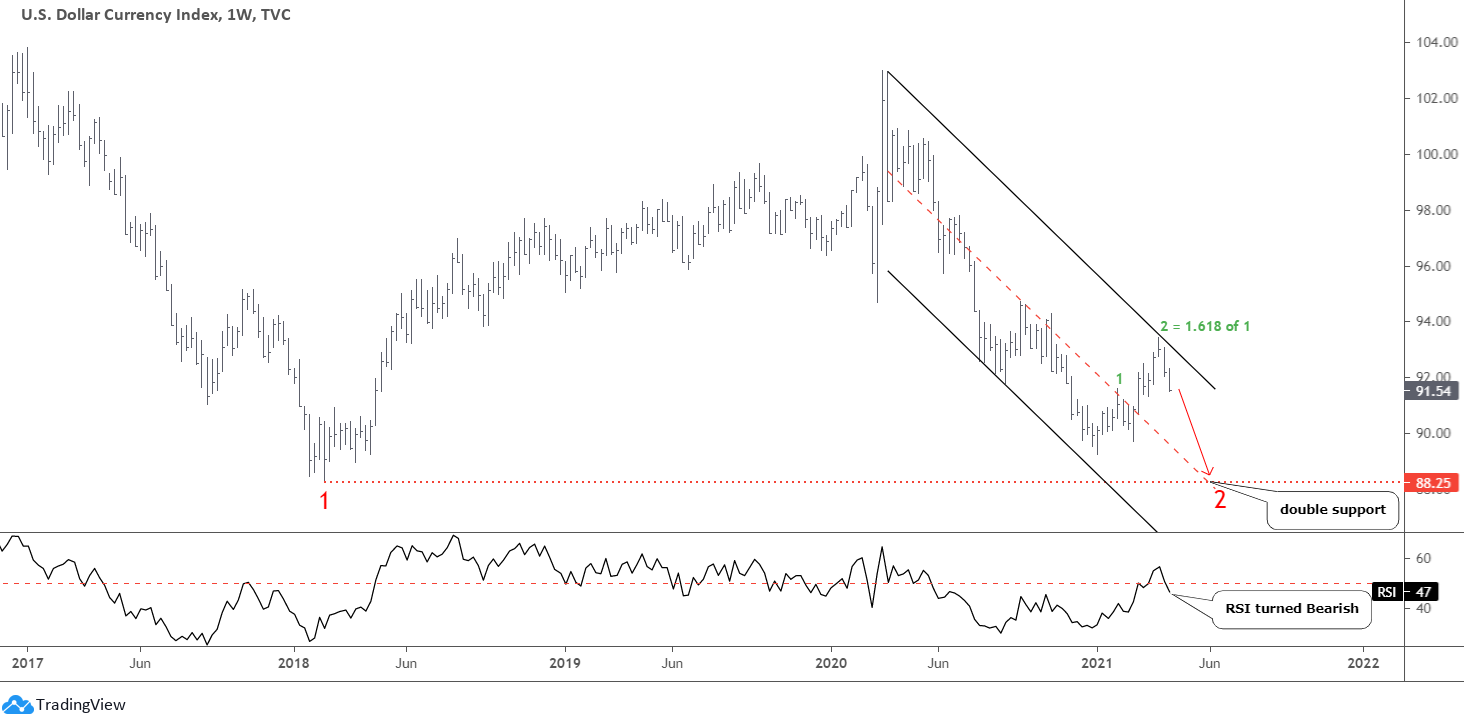
The green leg 2 of the pullback traveled 1.618 of the distance of the first green leg up and touched 93.44 at the top. Then, the price quickly reversed down to drop like a rock. The last week’s bar closed at the minimum as selling pressure persisted. I switched to a weekly time frame to show you how accurately the current second leg down repeats the path of the first leg down.
This time, after the price went deep down, I built the black downtrend channel through the recent peak. We can see the magic of the trend here as the mid-channel accurately intersects the valley of the first leg down at 88.25 to offer double support for the price.
The RSI turned Bearish following the brief roll over the crucial level. It confirms the downward outlook.
This predictability of the dollar dynamics made me reconsider the gold chart below.
It is the right time to switch to a bigger time frame on the gold chart to find some clues, as this metal met all the minimum requirements of a completed correction.
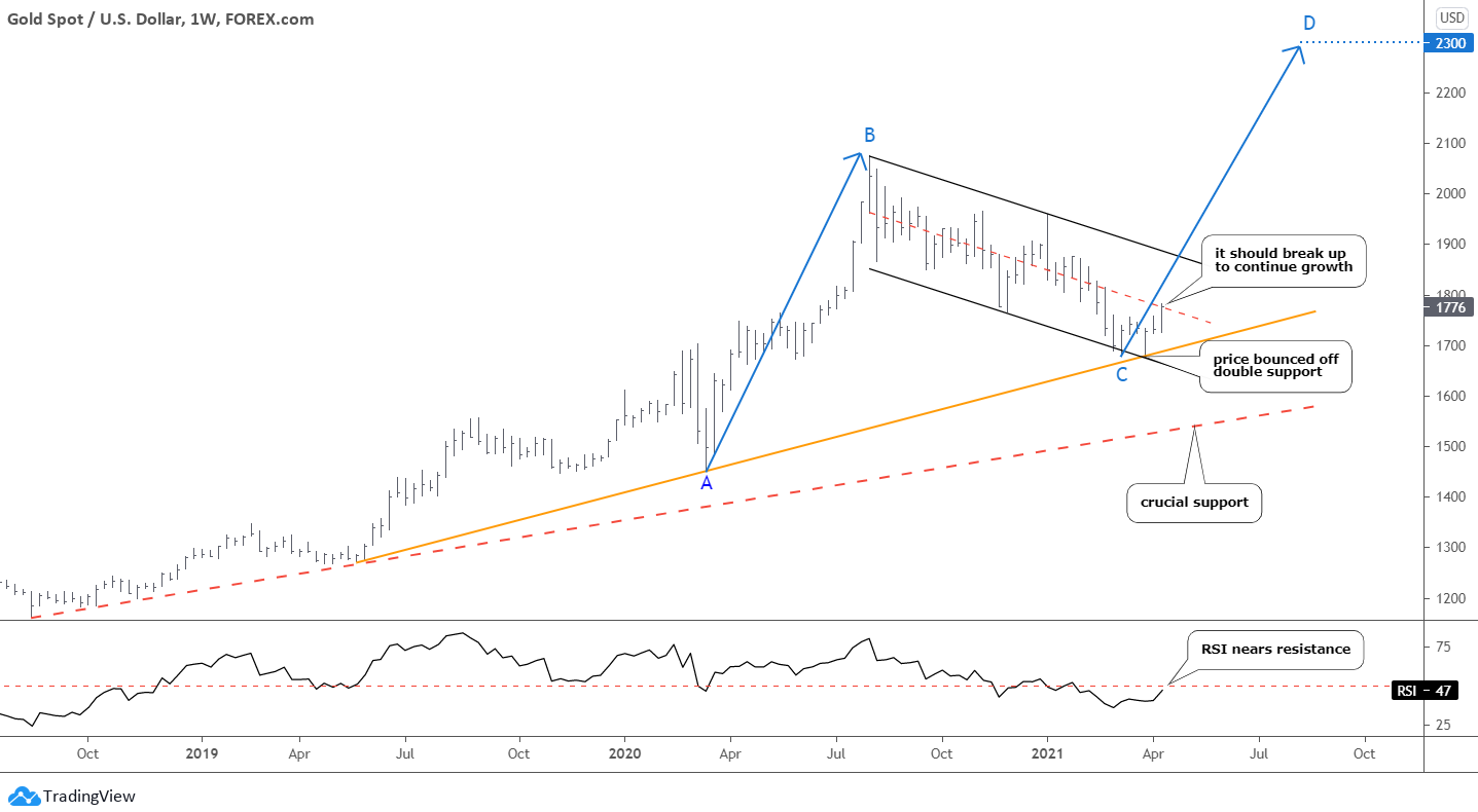
The weekly chart managed to answer the question of why the gold bounced right after a strong collapse that was meant to retest the previous low. I built the orange trendline support, which intersected the downside of the black downtrend channel at the touching point with the price. It worked perfectly to reverse the drop.
The red dashed trendline support below is crucial. I built it through the earlier valleys, and if the price would break down to that support, it could trigger a severe drop.
The expected massive drop of the dollar index could fuel another rally in precious metals. This current move up could be the early stage of it. The price stopped right on the red dashed mid-channel resistance last week. It should overcome that barrier to continue the growth.
In January, I already have shown you the map with three different paths. The red path with another drop and further reversal was your second favorite choice. It played out these days, and it is incredible that the target of it accurately coincides with my current calculations as I used the random touchpoint for the C point. I zoomed out the chart, and the target for the D point was still there at $2300. This is where the CD part would travel an equal distance of the A.B. segment.
The RSI should break above the crucial 50 level as it nears that resistance.
The invalidation level sits in the valley established in March at $1677. The risk/reward ratio stands at a high level of 5.3.
You did not support my last outlook of another drop in the gold price. The dollar’s plan plays out accurately, and this made me recast the chart.
Silver's structure was another catalyst to make me think differently about gold. The Falling Wedge pattern that I spotted earlier this month changed the game for precious metals and confirmed the dollar’s path to the downside as well.
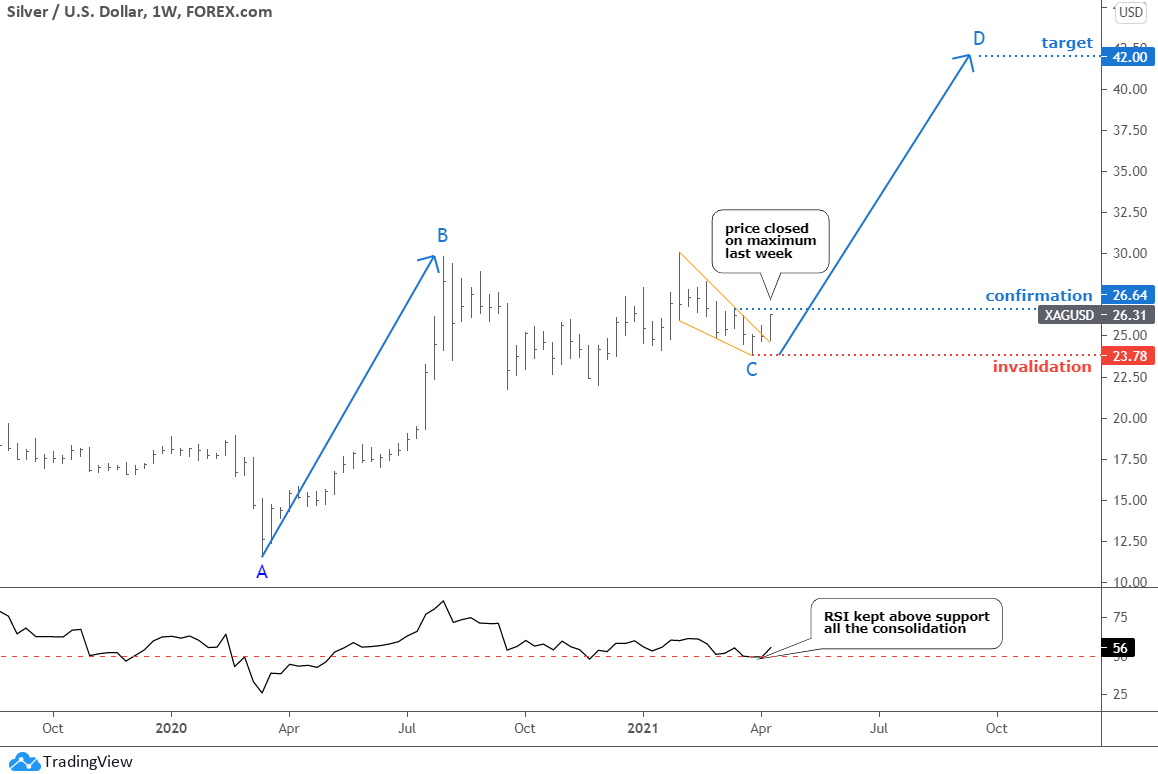
I posted three paths last time, and the green path was eliminated when the price broke out of the orange Falling Wedge pattern. I took off the red path of another drop after the dollar index fell heavily.
The BC consolidation has an upward slope, and the C point was established higher. Therefore, the calculated target is even higher than initially set in January at $38. The current CD segment targets the $42 area based on the equal distance with the A.B. part.
The RSI in the silver chart has been stronger than in the gold chart as it kept above the crucial level through the entire huge consolidation. After looking at this RSI sub-chart above, it is not surprising that the price could not drop so much.
The risk should be limited below the recent low of $23.78. The risk/reward ratio is huge at 6.2, and it is higher than gold’s ratio.
This map above was your second favorite choice, and I think the green path of another drop within the Falling Wedge pattern was the most liked as many wanted to buy silver cheaper.
Intelligent trades!
Aibek Burabayev
INO.com Contributor, Metals
Disclosure: This contributor has no positions in any stocks mentioned in this article. This article is the opinion of the contributor themselves. The above is a matter of opinion provided for general information purposes only and is not intended as investment advice. This contributor is not receiving compensation (other than from INO.com) for their opinion.


I appreciate your chart work and I think you’re right on. Personally I would appreciate more candlestick analysis.
Thank you . Stay well
Dear Mr.DePalma,
Thank you for a warm feedback and good wishes.
I used candlestick analysis at the start here on the Blog. These days I prefer chart structure analysis as I spot consolidations where we can find opportunities for continuation or reversal. So far, so good.
Best regards, Aibek