In this post, I'll go over the charts for palladium, gold and silver, but first I would like to start with palladium futures as it has the most potential gain to reach this round. At the start of May, I shared with you the map with equal opportunities for this champion metal to either break up or down. Here is how you saw the future for palladium in the graph below.

The majority chose the “break down” option, although with a minor advantage, but this bet played out as the metal’s price dipped one more time in the third leg down of a large correction. You were right again!
Now, let’s get down to the hot opportunity that I spotted for you on the palladium futures daily chart as it’s worth watching on the Gold & Silver Primetime.

Chart courtesy of tradingview.com
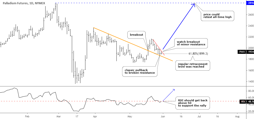
The chart structure of palladium futures on the daily time frame could indeed be posted in the trading textbook as it is neat and smooth. I put detailed explanations here and on the chart as this metal gives such an excellent opportunity for education.
After the third drop down into the 61.8% area, the price bounced up and quickly broke above the orange trendline resistance. Then, the classic pullback followed to retest the broken trendline. It reached the regular level of Fibonacci retracement of 61.8% already and bounced there. Watch if the price could break above the minor red resistance, the follow-through buying could emerge then, to push the price to retest the all-time high of $2816, which means 45% gain. It’s a whopping profit! That’s why palladium is the main card in this post.
The RSI also pulled back to the crucial 50 level after the breakout, and now it is ready to fuel this long-range missile called palladium.
The next is gold, as the structure has changed.

Chart courtesy of tradingview.com
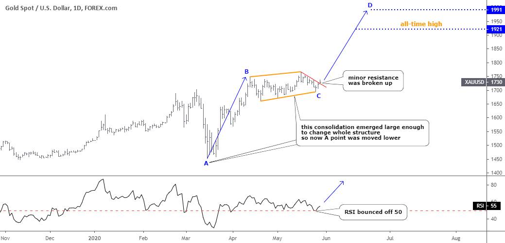
This metal had several options to be deployed on the chart: medium size consolidation down, Rising Wedge pattern (https://assets.ino.com/img/sites/ino/email/11409.jpg) with moderate upside potential and even a total reversal. I was mildly optimistic based on the silver’s progress and chose to show you the upside option of the Rising Wedge pattern, which was invalidated soon as the price broke down the pattern sinking below $1700. The first option of medium size consolidation (orange) played out instead. It coincided with the extended consolidation that emerged on the silver chart below.
The consolidation mentioned above emerged large enough to be considered as a junction for the whole move up, which started in the middle of March from $1451 and peaked in the middle of April at $1748 (AB segment). Therefore, we can set the CD segment’s target in the equal distance of the AB segment first. It falls on the $1991 mark above the all-time high of $1921. It looks like gold is going back on the track while silver is almost exhausted on its move up. It means that the gold/silver ratio could finish the retracement after hitting all-time high beyond 100 oz.
The RSI shows the market behavior perfectly as the whole consolidation was kept above the crucial 50 level, even during the final drop last week. That’s a simple yet useful indicator.
The price already broke up the minor red resistance and is going to proceed higher.
Ok, it’s time for a silver chart, which is clean and clear.

Chart courtesy of tradingview.com
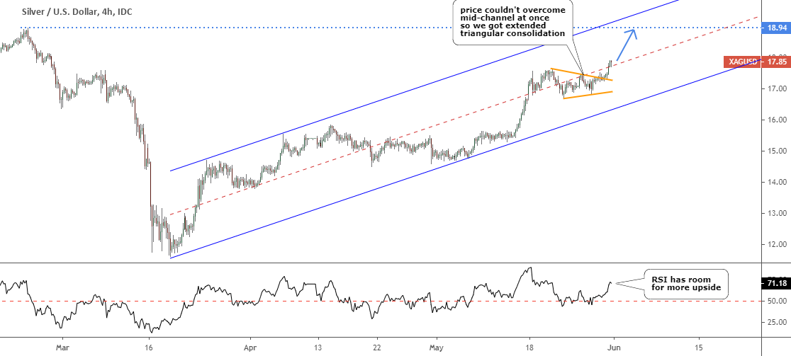
This metal goes in line with my expectations, and it follows the algorithm that I preset for it. The consolidation phase was detected correctly. The mid-channel barrier also played out as I put it as a trigger for the upside move. The silver couldn’t overcome it at once, so the consolidation extended to shape the Contracting Triangle pattern (orange) with another drop-down, which coincided with the same weakness on the gold chart above.
The RSI kept well as it didn’t dip too much below 50 and quickly gained higher to support mid-channel breakout on the price chart.
The final stage could be underway as there is almost one dollar left to book into the silver’s pocket.
I will skip voting for silver this time as nothing changed in its structure, and you already bet on it before.
Intelligent trades!
Aibek Burabayev
INO.com Contributor, Metals
Disclosure: This contributor has no positions in any stocks mentioned in this article. This article is the opinion of the contributor themselves. The above is a matter of opinion provided for general information purposes only and is not intended as investment advice. This contributor is not receiving compensation (other than from INO.com) for their opinion.

Hi Aibek,
I am actually responding belatedly to your post on intermarket correlations that are important for gold. With respect to the TIPS yield, which is the best market-based proxy for real interest rates, what you should do is construct a chart at the FRED web site that shows the gold price overlaid with the inverted 5-year TIPS yield (simply multiply it with "-1"), which transforms the negative correlation into a positive one. Then use the time slider to zoom in and out a little bit, as that will make the strength of the correlation very obvious.
Kind regards, PT
Dear Pater Tenebrarum,
I hope you are well. I guess you are talking about the post titled "Visualizing Correlation: Gold Vs. Other Instruments" at the following link https://www.ino.com/blog/2020/01/visualizing-correlation-gold-vs-other-instruments/. I shared then the TIPS chart vs Gold at https://assets.ino.com/img/sites/ino/email/11124.jpg
I followed your kind advice and built the graph, you could find it at https://ibb.co/3c750Fd
This time it covers 17 years vs 10 years before and is more smooth and I see the strong correlation there.
It appears that on shorter time frame we can find periods of miscorrelation while on the zoomed out chart it looks stronger.
Thank you for a hint and now readers could see it at the above link also.
The readers choice ( https://www.ino.com/blog/2020/01/visualizing-correlation-gold-vs-other-instruments/#VotePoll ) fell on the S&P 500, then DXY, then ignoring correlations, then JPY and only then TIPS.
Have a good one, Aibek