Wonderland

By: Gary Tanashian of Biiwii.com

“If I had a world of my own, everything would be nonsense. Nothing would be what it is, because everything would be what it isn’t. And contrary wise, what is, it wouldn’t be. And what it wouldn’t be, it would. You see?” –Alice in Wonderland

Silver out performs gold as both rise with Treasury bonds, which are in turn rising with stocks, as Junk bonds hit new recovery highs while USD remains firm as inflation expectations are out of the picture. This is highly atypical, maybe even unprecedented.

Some, deeply dug into their particular disciplines and biases, might say it is dysfunctional, as this backdrop simply does not make sense using conventional methods of analysis. Why again did I name this service Notes From the Rabbit Hole?

When the S&P 500 was robo rising month after month, year after year as it did from 2011 to 2015, you did not need the market report with the funny name because all was linear and as it should be. The same actually, could be said for gold. It was linear and as it should be in its relentless downtrend. Casino patrons simply ride the trends!

But today things are making sense simply because we don’t have a need to make them make sense as linear thinkers would do; we go with the indicators and charts. Continue reading "Wonderland"

A Path Toward Inflation

Yes, it’s another inflation post going up even as inflation expectations are in the dumper and casino patrons just cannot get enough of Treasury and Government bonds yielding 0%, near 0% and below 0%.

Feel free to tune out the lunatic inflation theories you’ve found at nftrh.com over the last few weeks.  But if by chance you do want to look, here’s a visual path we have taken to arrive at the barn door, behind which are all those inflated chickens, roosting and waiting.  All sorts of animals will get out of the barn if macro signals activate.

Gold led silver ever since the last inflationary blow off and blow out in early 2011.  The gold-silver ratio rose through global deflation, US Goldilocks, good times and bad.  There was no inflation problem, anywhere.  Then early this year silver jerked leadership away from gold and now for the second time the ratio of gold to silver has broken below the moving average that has defined its trend (it did so in 2012 as well).

gsr

Why is this significant?  Well, try on 2010 for size (see chart below).  I for one happily managed the gold-silver ratio up spike in 2008, buying gold miners as they crashed.  As gold (monetary, risk ‘off’) topped vs. silver (commodity/monetary, relatively risk ‘on’) we expanded the bullish view to commodities as well.  But then came the bottoming pattern that was not a bottoming pattern.  To this day I believe that the macro was preparing for a next leg up and some serious new destruction before Ben Bernanke, the “Hero”, sprung into action and ruined the beautiful Inverted H&S pattern that long-time NFTRH subscribers will remember me making a big deal about at the time. Continue reading "A Path Toward Inflation"

Various Markets; Weekly Views

By: Gary Tanashian of NFTRH

It occurs to me that in public writing I tend to bludgeon people with macro fundamentals (like gold vs. positively correlated markets, yield relationships and even confidence in global policy makers), market indicators (VIX, Equity Put/Call, Gold-Silver ratio, Sentiment, Participation, etc.) and other views beneath the surface of things. So much so that I sometimes forget that people might like to see simple nominal charting as a frame of reference.

We update charts like these every week in NFTRH, but I have done relatively few for public review. So here it is, a simple weekly chart update of various markets, with very limited commentary interference from me.

US Stock Market

As you can see, US indexes have so far held critical support. Best projected case would be a bounce to SPX 2000 (+/-). The market continues to roll over on the intermediate trend as of now.

spx, ndx and dow

If the above is suspect to bearish, the broader US indexes are just bearish. Lower lows and lower highs abound and resistance is noted. Continue reading "Various Markets; Weekly Views"

Semiconductor Equipment Sector Update

By: Gary Tanashian of Biiwii.com

NFTRH 322 covered the usual range of markets, from US to global stocks to precious metals and commodities to currencies and indicators.  It also included an extended economic discussion about the realities of the strong US economy and its dangerous underpinnings.

The economic segment began with this look at the Semiconductor Equipment sector, which was our first indicator on economic strength exactly 2 years ago and will be an initial indicator on economic deceleration when the time is right.

Excerpted from the December 21 edition of Notes From the Rabbit Hole, NFTRH 322:

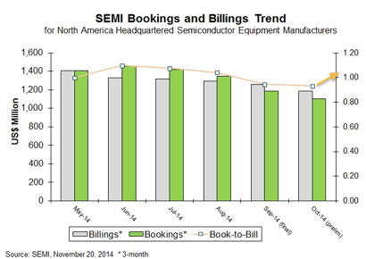
Checking the Semiconductor Book-to-Bill ratio (b2b), this all-important forward looker came in pretty decent for November.  Per the data we reviewed in an update last week, the bookings, which is the most important component, was pretty good at $1.22 Billion compared to October’s $1.1 Billion.

The graph from SEMI does not include the November data.  I added an arrow showing the current level of the b2b.

semi.b2b

Our original graph is marked up as well to show the longer trend.  There is a spike up happening and this may or may not be related to an overall year-end sales spike in some high end capital equipment that happens like clockwork at the end of each year in Machine Tools (ref. sales graph below).  I do not have the level of knowledge about the Semiconductor Equipment industry to speak authoritatively about its more structural capital spending cycles.  So this is just a possibility to consider. Continue reading "Semiconductor Equipment Sector Update"

Economy Post-'Jobs’ Report; Real or Memorex?

Now it gets interesting because early in the bailout process the Fed talked about achieving certain employment milestones before hiking interest rates.  Here we are at the 10th consecutive month with 200,000+ job gains (321,000 in November) and the jobless rate down to 5.8% and still there is a question on when or whether ZIRP will be withdrawn?

Well I am a visual learner so I for one can never get enough pictures to inform my thinking.  Pardon the redundancy in this chart’s frequent appearances in NFTRH

sp500
Source: SlopeCharts

The rectangular red box is zero interest rate policy (ZIRP), which is 6 years old this month.  If we play it straight we would be expected to believe what the mainstream believes, that the “Great Recession” is a thing of the past and that something built of abnormal policy can proceed per normal metrics and assumptions when abnormal policy is removed.  I don’t buy it. Continue reading "Economy Post-'Jobs’ Report; Real or Memorex?"