Copper On Big Time Frame Charts: $0.6 or $6?

There is an age-old question asking: How do you determine if a trader is biased? Show him a chart and ask where he thinks the market would go and then show him the same, but reversed chart and if the answer is the same, then this trader is indeed biased. We call such a trader a Perma-Bull or a Perma-Bear. The market sentiment is often split even as there are a lot of biased traders and market is then trapped within a range as there is no dominant opinion among the participants.

Every day I see how the trading community spreads opposite signals in any instrument creating an overwhelming sea of information where it’s hard for novice traders to focus and make a trading decision. Different levels of experience and fantasy generate the diversity of chart patterns and models. People change time frames and squeeze or expand charts; all of this affects the perception and therefore, the final decision.

Let’s perform an educational experiment with two patterns that I found on different time frames for the same instrument, copper. I will add two separate charts with those patterns followed by explanations. I am eager to see what you think about the outlook for this instrument after reading and voting on the pole at the end of the article. Continue reading "Copper On Big Time Frame Charts: $0.6 or $6?"

Copper To Retest $1.94 After Breaking Support

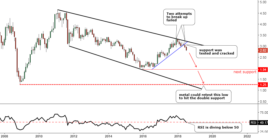
Last September I posted a monthly chart of Copper futures to warn you that the metal has been approaching the area of strong multi-year resistance. In that very same post, I set specific triggers to watch for further price action.

Recently, one of those triggers was broken, and now it’s time to update the chart.

Chart. Copper Futures Monthly: Crucial Support Was Broken

Copper
Chart courtesy of tradingview.com

The global chart structure hasn’t changed, and I posted its full reconstruction adding some new annotations to highlight the most recent price action. Continue reading "Copper To Retest $1.94 After Breaking Support"

Copper Update: 1-Year After The Election Of Donald Trump

Aibek Burabayev - INO.com Contributor - Metals


American Dream

One year has passed since President Donald Trump was elected to office. That month I wrote a post about copper’s ultimate monthly performance compared to other commodities thanks to the new president’s promises of huge infrastructure rebuilding.

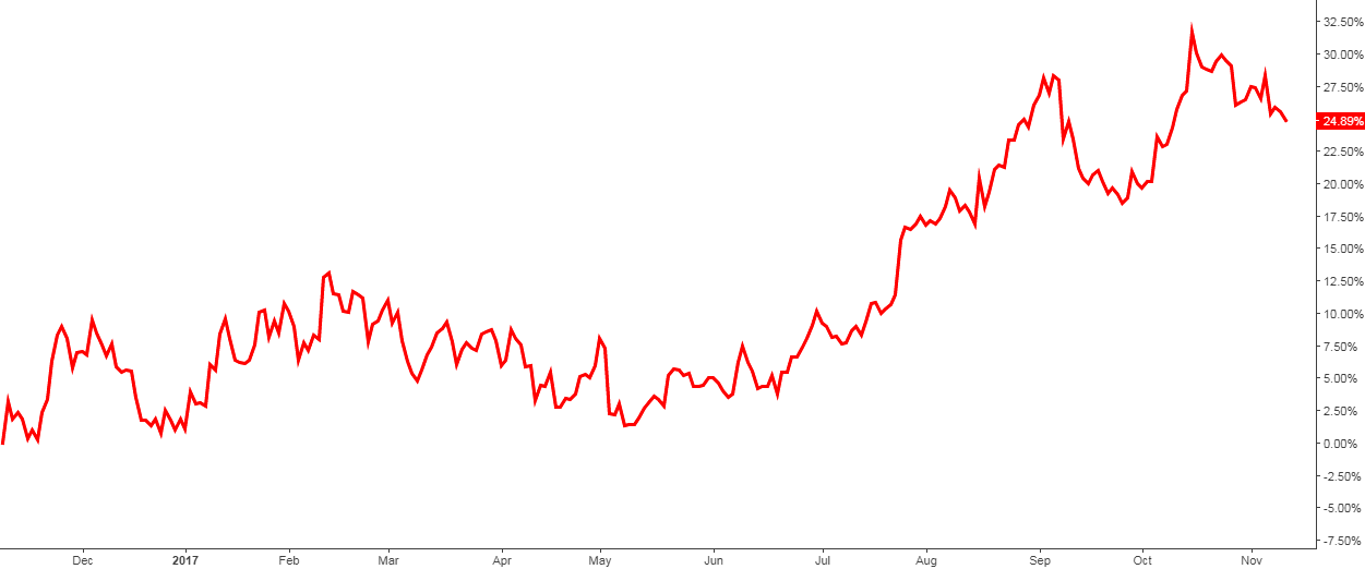
Below is a 1-year performance chart of copper to see how the metal has been doing since Election Day.

Chart 1. 1-Year (from November 8th, 2016) Copper Performance

Cooper Performance One Year
Chart courtesy of tradingview.com

Cooper gained a hefty 25% for the period with a peak of around 33% that it hit last month. In the post-election months copper exploded to the upside, but then the euphoria in the market was changed with profit taking erasing earlier gains. Continue reading "Copper Update: 1-Year After The Election Of Donald Trump"

A Tumbling Copper Could Hit The Floor

Aibek Burabayev - INO.com Contributor - Metals


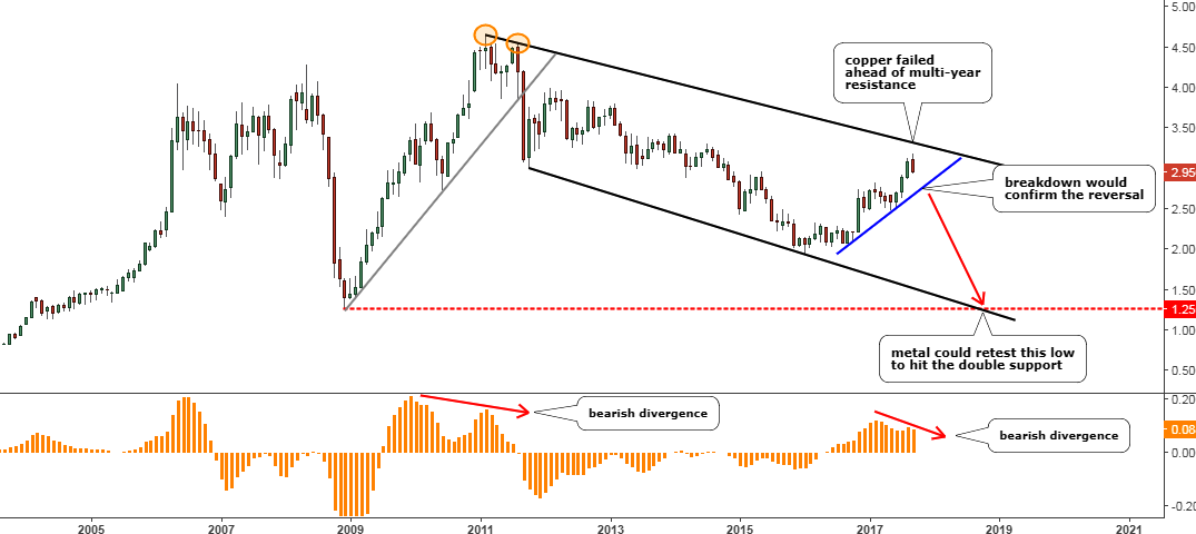
Greed is one of the strongest human motivators. It is easy to get greedy, but it is hard to push it down after it gets extreme. The main point of my previous update in August was to focus your attention on the price action in the $3 area as the price could hit this psychological level and then retreat. My advice was to book profits and wait to see what would happen next.

I hope that you heeded my advice and didn’t get greedy as copper was pushed down below the $3 level very quickly.

In the same post, I thought that this upside move in the metal that had started last year could just be a consolidation before another drop down. In the chart below I go into more details about it.

Chart 1. Copper Monthly

Monthly Chart Copper
Chart courtesy of tradingview.com
Continue reading "A Tumbling Copper Could Hit The Floor"

Copper Eyes $3 Amid Upbeat Chinese Data

Aibek Burabayev - INO.com Contributor - Metals


Back in May, I posted an update for copper where I shared my concerns about the possible negative impacts of the cooling Chinese economy. At the same time the technical chart didn’t confirm those concerns and on the contrary, showed a possible upside move for the metal.

In this post, I would like to share some macro economic charts and an update of the technical chart.

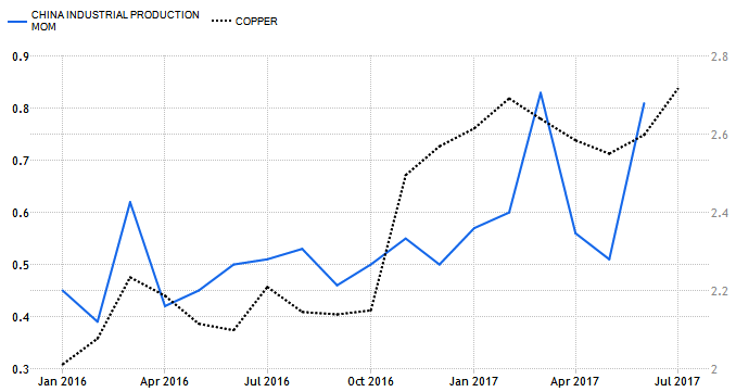
Chart 1. Copper Vs China Industrial Production (Monthly)

China Industrial Production vs. Copper
Chart courtesy of tradingeconomics.com

I chose the period of the chart above from the start of 2016 intentionally to highlight the time when the metal began to consolidate after a huge drop down. Continue reading "Copper Eyes $3 Amid Upbeat Chinese Data"