Do Quarterly Charts Hold The Key?

Hello MarketClub members everywhere! With the markets closed tomorrow for the Easter holiday, today is the end of the week. The question now is, how comfortable are investors going to be over this long 3 day weekend?

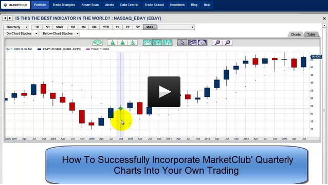
One of the tools I love using in MarketClub is the quarterly charts. I'm pretty confident in saying that very few traders ever watch these charts, but they should. They can provide you with a broad overall picture of the long-term trend that you just can't see on daily and weekly charts. I think you'll be surprised by what the quarterly charts are revealing today.

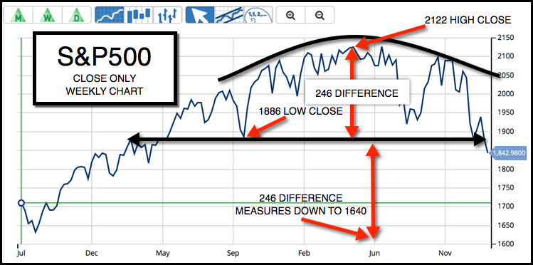
Below I have outlined last week's close, as well as key levels for the PSAR. Perhaps by the time you read this post the market will have already broken the Parabolic support levels. If that is the case, I would expect further weakness in the market next week. Continue reading "Do Quarterly Charts Hold The Key?"

This Indicator Is A Winner For Long-Term Traders

It has been one heck of a week to say the very least and it is not over yet. I want to take a look at a tool that I'm pretty confident in saying that very few traders ever watch. The tool I'm discussing is MarketClub's quarterly charts. If you have not seen this MarketClub feature, you may want to check it out, particularly if you are a long-term trader.

I'm going to be looking at the S&P 500 to see just how close the quarterly chart is to turning negative. I'm also going to be looking at a textbook example of a downside measurement on the S&P 500.

I will also be analyzing Apple and Yahoo, both of which could be in for a pretty bumpy ride.

Let's begin by looking at the S&P 500 (CME:SP500) and the textbook example I mentioned earlier for measuring a down move. I'm using a close-only weekly chart and you will see exactly how I measure the move.

Weekly Chart of S&P 500 (CME:SP500)

Next let's take a look at this long-term quarterly chart of the S&P 500 and as you can see it is poised to possibly break the positive long-term trend that has been in place since October of 2010. Continue reading "This Indicator Is A Winner For Long-Term Traders"

Is This The Best Indicator In The World?

It's hard to believe that the third quarter of the trading year is coming to a close today. It has been quite a quarter, especially the last week of September when the market volatility has been picking up.

One of the tools I love looking at in MarketClub is the quarterly charts on all the markets. These charts were created to show you the big picture, as we know that investors can get sucked into short-term thinking and trading and "cannot see the forest for the trees." The biggest stand out feature for quarterly charts is their ability to clearly show the direction of the big trends. And that is really how you make the big money in trading by staying with the big trends.

Day trading can be looked upon as "very sexy," but it's not where the big money is. Arthur Cutten, a well-known trader and investor in the 20s and 30s, was asked how he made so much money trading and he answered the question this way, "By sitting." Continue reading "Is This The Best Indicator In The World?"