Silver Slows Saving Gold From Collapse

Chart 1. Gold Daily: Former Support Retested, Another Spike Is Possible
pullback
Chart courtesy of tradingview.com

Gold has finally reached both the AB/CD target and the former support area of $1237 (gray dashed line) as it was forecasted last month in this chart. The metal hit the maximum of $1243 on the 26th of October and then dropped like a rock as was also anticipated after the completion of a pullback. Last Wednesday the price established a low of $1212 losing $31 (-2.5%) from the top. But at the end of last week, gold restored almost all of its losses, closing just below the former support at $1233.
Continue reading "Silver Slows Saving Gold From Collapse"

Gold & Silver: Fly or Die

The precious metals are busy finishing the anticipated pullback to the former support, which is almost within our grasp on the short-term charts. So, let it go and in the meantime we can look into the bigger charts with higher time frames to update the outlook beyond the short-term horizon.

Chart 1. Gold Monthly: 1122/1375

Gold Shines
Chart courtesy of tradingview.com

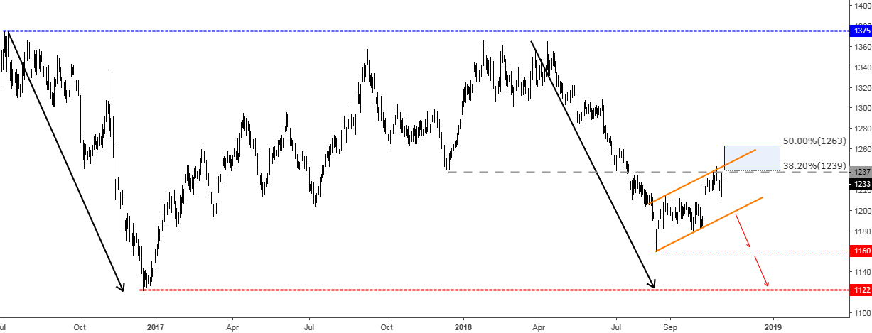
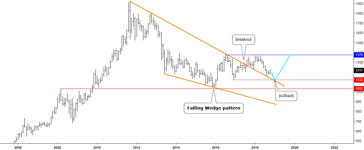
The monthly gold chart above answers some critical questions. The first one, why gold reversed ahead of $1000? The answer is the red horizontal line, which was set at the 2008 top and acted as strong support and breakdown of it would unleash severe volatility into the market as the next level of serious technical support is located in the $700 area (2006 top/2008 bottom). Continue reading "Gold & Silver: Fly or Die"

Gold & Silver: Get Ready For A Final Shot

Chart 1. Gold 4-Hour

LLLL
Chart courtesy of tradingview.com

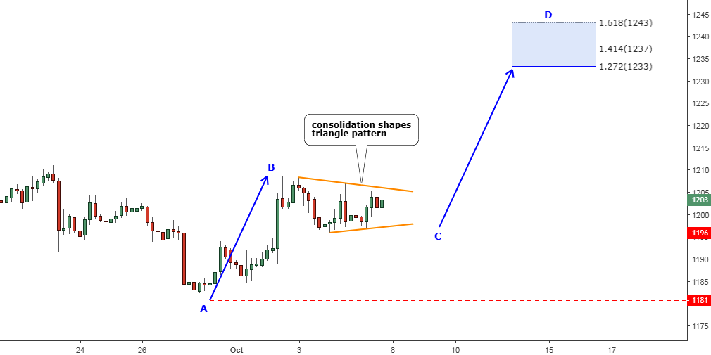
Gold has already booked more than $20 from the low established on the 28th of September at the $1181. Now, there is no doubt that the pullback I mentioned in the middle of September has been in progress.

After hitting the $1209 area, gold halted its move to the upside and started a consolidation. I marked that move as the AB segment (up blue arrow). I always mention the tricky nature of corrective structures as it may vary on the fly. The shape of consolidation could be as a counter-trend zigzag, could fit into a rectangle or form a triangle. The latter has been shaped in our chart above as the combination of lower peaks and higher troughs. I highlighted it with the converging trendlines (orange). Continue reading "Gold & Silver: Get Ready For A Final Shot"

Gold Bounced as Silver Broke Downtrend

Both triggers were pulled in the precious metals since my last post about gold and silver. I hope it is interesting for you to see how you voted about the metals price action in that article.

Let’s start with the gold votes below.

Gold Bounced

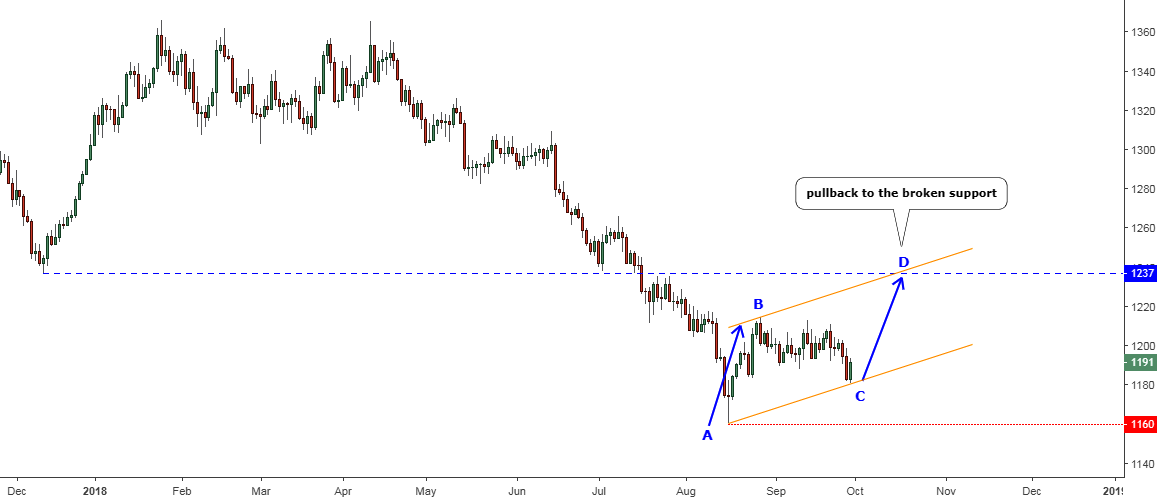
Most of you (54%) thought that gold would resume the drop. It was a slight edge over the other option where you chose the completion of the pullback. Let’s check in the chart below to see what actually happened with the gold price since then.

Chart 1. Gold Daily: Second Leg Of A Pullback

Gold Bounced
Chart courtesy of tradingview.com

The price of gold has finished the consolidation highlighted with the thin red down arrows in the earlier chart between the B and the C points of the blue AB/CD segments. The simple measurement pointed at the $1180 level, where I said the CD segment should start. Indeed, the gold has hit the $1181 low within the BC part and then bounced up towards the end of the last week to close at the $1191. This is the magic of simple math, which occurs in the charts again and again. Continue reading "Gold Bounced as Silver Broke Downtrend"

10-Year U.S. Treasury Note Yield Eyes 3.33%

Last week I promised to update the outlook for the U.S. interest rate, which has a strong impact on every asset class including precious metals.

More than a year ago I shared with you my concerns about the future of gold once the “era of rising rates” would come. The 10-year U.S. Treasury note yield (10Y) was at 2.2%, and large investment banks forecasted 3% yield for the near future at that time.

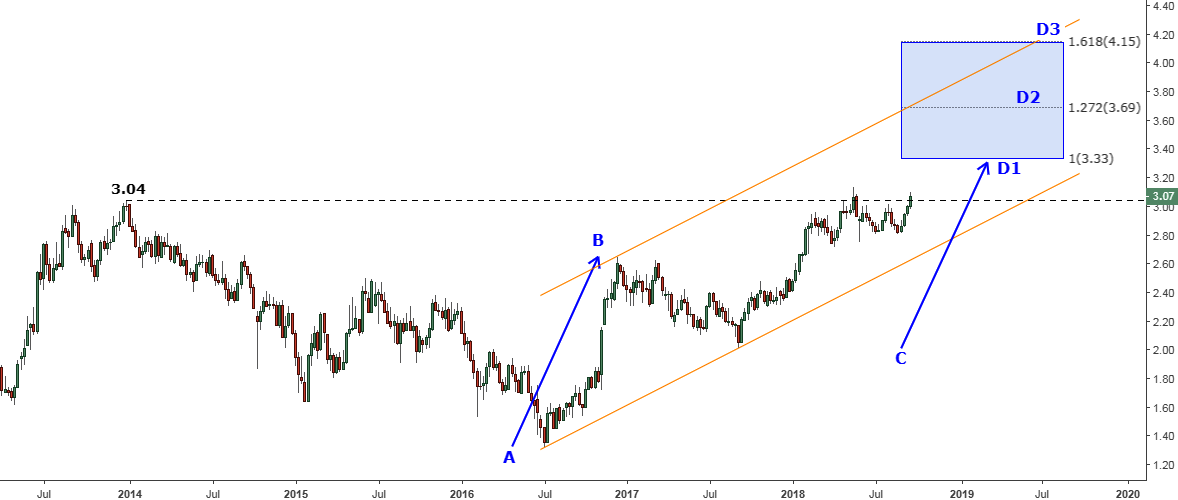
Indeed, that future has come in one year the 10Y is above the 3% now, and it doesn’t look like it’s the final stop. To see what could be the next I’ll share with you two charts starting from a short-term view.

Chart 1. 10Y Weekly: 3.33% And More

10-Year U.S. Treasury Note Yield
Chart courtesy of tradingview.com

This chart above observes the past five years to envelop the earlier top of 3.04%, which is under a second attack as the first one this past May couldn’t peg it. The yield closed last week at the 3.07%, and this time it could finally overcome the barrier to reach the target.
Continue reading "10-Year U.S. Treasury Note Yield Eyes 3.33%"