Silver Monthly: Symmetric Triangle

Aibek Burabayev - INO.com Contributor - Metals


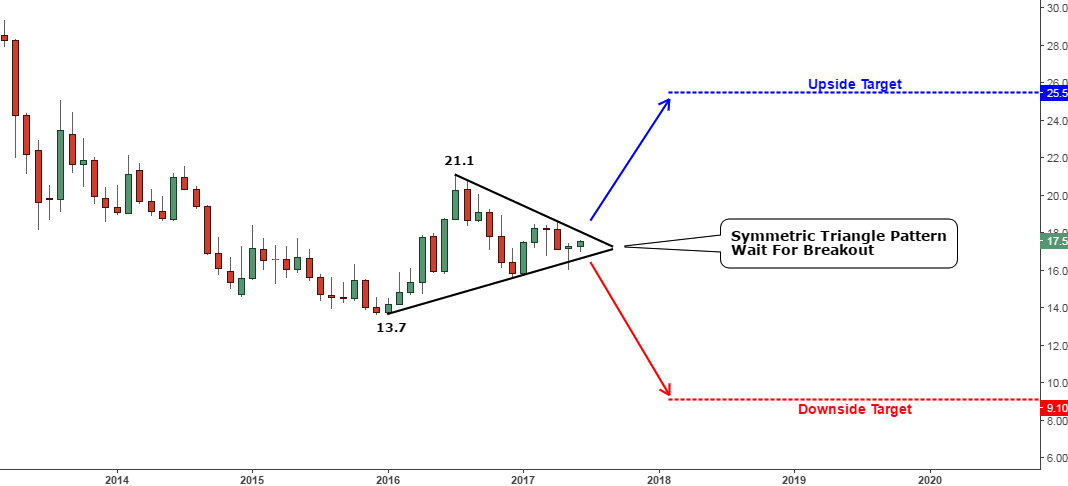
It’s amazing how an updates’ timing can coincide with an interesting chart pattern that’s shaping up or trendline reactions. This time I spotted a Symmetric Triangle pattern as I was preparing this monthly update. I am happy to share it with you in the chart below.

Chart 1. Silver Monthly (Zoomed): Symmetric Triangle
Silver Monthly ChartChart courtesy of tradingview.com

The market got stuck for more than one year inside of the black Symmetric Triangle pattern. It shows that neither bulls nor bears could change the balance of the market as price volatility on the monthly chart faded and we reached the apex of the triangle where the trendlines converge. Continue reading "Silver Monthly: Symmetric Triangle"

Silver Update: The Backup Plan

Aibek Burabayev - INO.com Contributor - Metals


In this post I’ve updated the charts to reflect the recent dramatic changes in the silver market.

Chart 1. Silver Weekly: Triple Support

Weekly Silver Chart
Chart courtesy of tradingview.com

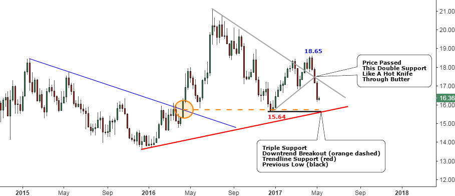
On the weekly chart above, there is a mixture of reconstructed trend lines (gray lines) set in the previous update and newly added lines, which highlight the important support levels nearby.

The silver price has passed the double support (gray former resistance + gray support) set at the $17.5 mark like a hot knife through butter two weeks ago. The three red bearish weekly candles from the top erased all of the earlier gains and even broke below the previous low at the $16.84 mark. Continue reading "Silver Update: The Backup Plan"

Silver Update: The Time Is Up

Aibek Burabayev - INO.com Contributor - Metals


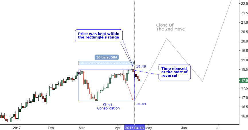
This post is dedicated to silver as the projected period of consolidation set in my previous Gold & Silver post finished last week on Tuesday, the 18th of April. Let’s see the result of that “Cloning” experiment below.

Chart 1. Snapshot Of Experiment Result: Good Range Wrong Timing

Silver Chart
Chart courtesy of tradingview.com

The chart above is a snapshot of the projected graph within the “Cloning” experiment posted earlier. As we see the price didn’t follow the red down arrow and reversed higher up to the top of the rectangle where it was blocked successfully. And the anticipated down move started right at the end of projected period missing the time target. Continue reading "Silver Update: The Time Is Up"

Silver Stocks: Favorite Failed To Deliver... Or Not?

Aibek Burabayev - INO.com Contributor - Metals


Dear readers, thank you for sharing a moment to leave your stocks preferences below my previous post! Some of you even trusted me to analyze some high-tech stocks, I am honored, and maybe one day I will find time to do it. Silver stocks and gold stocks are in your focus as I understood. This post is dedicated to the silver stocks.

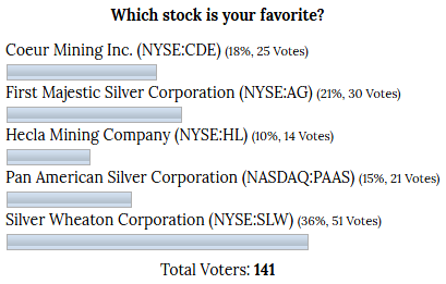
This February I analyzed the top silver stocks (by market cap) and brought you some interesting and potentially profitable disparity that I found on the chart. After the comparison chart I asked you to pick your favorite stock among the top five and below is the graph of the voting results.

Graph 1. February 2017 Stock Pick Voting Results

INO.com Poll

The majority of you chose Silver Wheaton Corp. (NYSE:SLW) as your favorite. First Majestic Silver Corporation (NYSE:AG) ranked second and Coeur Mining Inc. (NYSE:CDE) was the third. Let’s see how those stocks behaved after the vote in the chart below that covers the period from the vote till now. Continue reading "Silver Stocks: Favorite Failed To Deliver... Or Not?"

Gold & Silver: History May Repeat

Aibek Burabayev - INO.com Contributor - Metals


People record history from ancient times only to find that nothing is new in this world and everything repeats in cycles, waves, high and low tides, and therefore it is quite useful to have those historical records to project the future as it is another human propensity.

It is always a big challenge to be the first in doing something as you face uncertainty, and those who go next can learn from the achievements and mistakes of the pioneers. A few days ago, my eyes caught an interesting similarity in the chart history of gold’s price, which could give us a clue of an upcoming price development and I am happy to share it with you below.

As you may already notice from time to time I post different experimental charts, which use a variety of uncommon approaches in analyzing the markets to expand the scope of our vision. In this post I used the clones of the historic moves, which could shed light upon future moves.

I squeezed the charts to let both legs of the current upside move to fit in the snapshots, that’s why I would recommend you to open both graphs in a separate window for a comfortable view. Continue reading "Gold & Silver: History May Repeat"