Silver Is In Fashion But Not For Investors

Aibek Burabayev - INO.com Contributor - Metals


This week I have prepared a Silver macro data analysis with diagrams and added a technical outlook for "dessert".

Supply and Demand
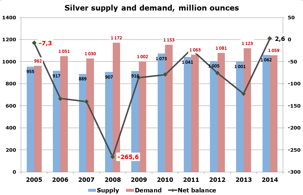
Silver Supply and Demand

Chart: Aibek Burabayev; Data source: GFMS, Thomson Reuters / The Silver institute

Back in 2005, both supply and demand for Silver were below 1 billion ounces (Boz) and were well balanced with a small deficit of 7.3 million ounces (Moz). Since then they have risen with different speed and in 2014 both broke up that level. As seen on the chart above, the supply of Silver is quite stable with a narrow 889-1073 Moz range in past 10 years. 2010 (growth in mining and scrap supply) and 2014 (10 year record mining production) are the highest years of supply. Continue reading "Silver Is In Fashion But Not For Investors"

Gold Ratios: One Is Free, The Other Is Next!

Aibek Burabayev - INO.com Contributor - Metals


Gold/WTI Ratio: Free To Fly!

Gold/WTI
Chart courtesy of Tradingview.com

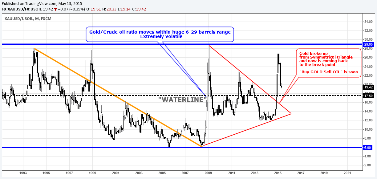
Today for the first time I will analyze this crazy ratio. Just look at the monthly chart above, compared to the dead market in the direct Gold/US dollar cross it is so wildly volatile. It jumps to either side easily like a bullet ricocheting.

This ratio is contained within a very wide range between 6 and 29 WTI barrels per troy ounce of Gold, highlighted in two blue parallel lines. For 12 years, Gold had been weakening compared to WTI Oil (highlighted by falling orange trendline). In between, only once in 1998, we can see a false break up of the downtrend which quickly lost its momentum and the ratio fell back below the line. Gold was falling despite the growing Gold/USD price. The metal almost doubled its price, but at the same time it appeared at the bottom of the ratio and what is more surprising is that when Gold tripled its USD price, it again touched the bottom at 6 barrels per troy ounce. Indeed, it was an Oil boom, not a Gold boom. Continue reading "Gold Ratios: One Is Free, The Other Is Next!"

Gold And Silver Monthly: Monumental

Aibek Burabayev - INO.com Contributor - Metals


Comparison of Dollar Counterparts

4H Dollar Chart
Chart courtesy of Tradingview.com

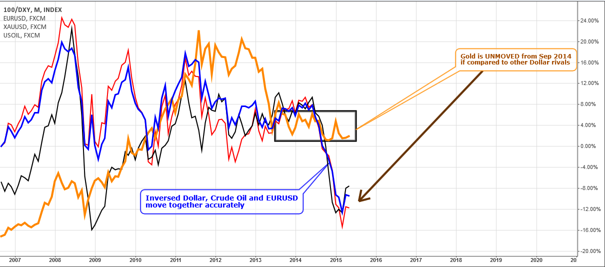
In the above monthly comparison chart, I put in all of the main Dollar rivals and the Dollar index itself, which is shown inverse (100 was divided into DXY). As we can clearly see, all instruments fell dramatically last summer and didn't stop in the autumn of 2014. The black rectangle shows the area where Gold started decoupling with the rest of the Dollar counterparts. It was last September when Gold stopped falling. EURUSD is the most precise copy of the Dollar Index. Crude oil had slightly different behavior last month with less downside momentum. Therefore, all trade setups for more than half a year couldn't be accurate if they were based on pure Dollar dynamics. Gold stalled in the past waiting for a clear and powerful signal to break out of current the sideways action. The main question is, Continue reading "Gold And Silver Monthly: Monumental"

Gold And Silver: Just K.I.S.S!

Aibek Burabayev - INO.com Contributor - Metals


Old friends and new guests, thank you very much for the comments and discussions regarding my post last week. One thing was clear… you prefer classic trend line charts! I will try to keep it short and simple from now and on. I will keep Elliott Wave for more liquid and crowd trending markets, like stocks and indices, where they work better.

Gold


Chart courtesy of Tradingview.com

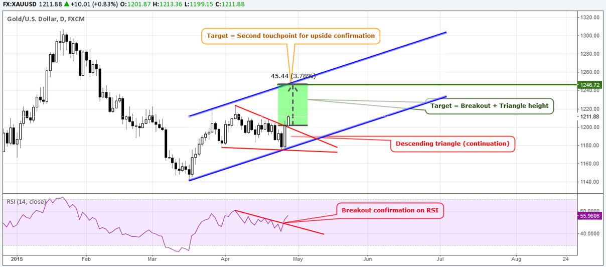
Last week Gold was very tricky compared to the other Dollar rivals. For example, the Euro and Crude oil are creeping up, while Gold did the opposite and squeezed out buyers. Yesterday, sellers couldn't escape either and got stopped out.

The price touched the downside for the second time and Gold shaped the Descending Triangle pattern which is highlighted in red. A breakout happened today above $1200. It means that we will watch the continuation of an uptrend (highlighted in blue). The target is calculated as a sum of the breakout and the height of the Triangle, which is located at $1246 area. Continue reading "Gold And Silver: Just K.I.S.S!"

Silver Price Could be Headed to $12

Written by: Octafinance.com

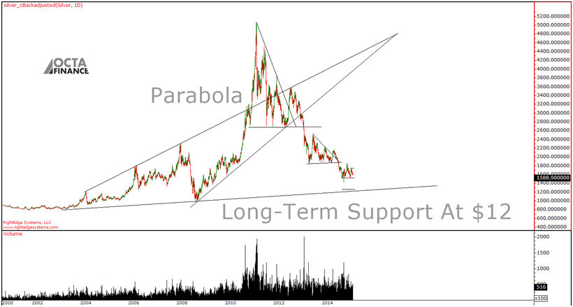
Even though we are long-term bullish on gold and silver we are negative medium-term. The Silver chart shows a technical setup with a possible target of a $12 per ounce.

Long-Term Silver Price Chart Still Positive

There is so much to see on the silver chart that we feel obligated to share our interpretations for the future price movement. We will start with the big picture. The whole move of 180%+ from $18 to $50 between 2010 and 2011 had only a minor correction. When the price crossed the upper channel of the long-term chart going back to 2002, it alerted us that silver is out of sync with normal markets.

Source: Rightedgesystems + Octafinance Interpretations

Of course as with any parabolic movement, the trend was not sustainable. Silver couldn’t break $50 per ounce barrier and sellers' came. The CME also increased the margins which forced all longs to cover (sell), as the sentiment was more than positive “98% of all traders were bullish silver” according to the Daily Sentiment Index (DSI). What happened after that is obvious from the chart, silver experienced a few technical setups that all broke down, reverting the parabolic movement to the upside down. Now based on the long-term support line formed during the last 13 years, we have a support around $11-$12 per ounce. Continue reading "Silver Price Could be Headed to $12"