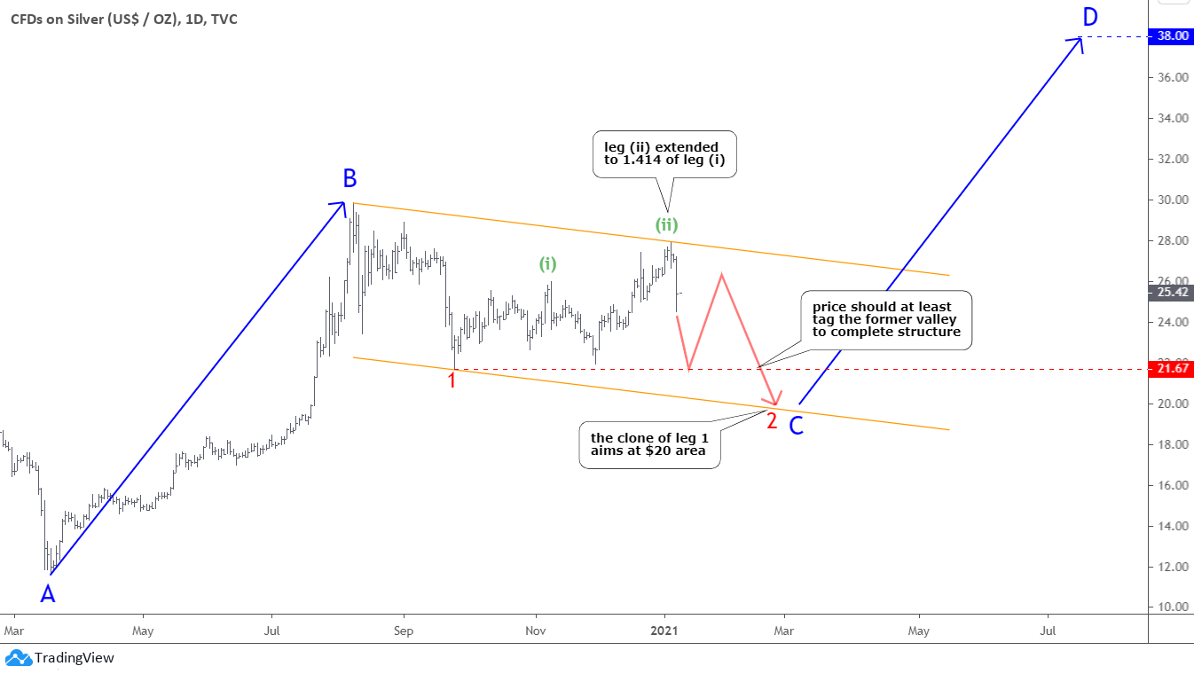
There is a quote from my post in November of 2020 - "Silver could spoil this party where the stars aligned for DXY and gold." I've meant that the uncompleted chart structure in the silver graph could signal a more complex correction despite the bullish move as it was just the junction between larger downside moves. These words turned prophetic as a poisoned silver arrow hit precious metals badly last week.
Hold on tight; the roller-coaster ride carries on.
Let us start with the silver chart below, and you will see why I chose it to be the first.
You saw this chart a month ago when I was questioning "Could Santa Only Visit Gold?" as I doubted the non-stop rocket move for silver.
It is the exact same chart with an updated price graph. The green leg (ii) of the joint moved exactly as projected in December. It just traveled a longer distance equal to 1.414 of the green leg (i). That is why I turned the orange trend channel higher. Continue reading "A Poisoned Silver Arrow"


