Silver And Palladium Update: False Hope

The price action in the silver futures has given a false hope to bulls this month.

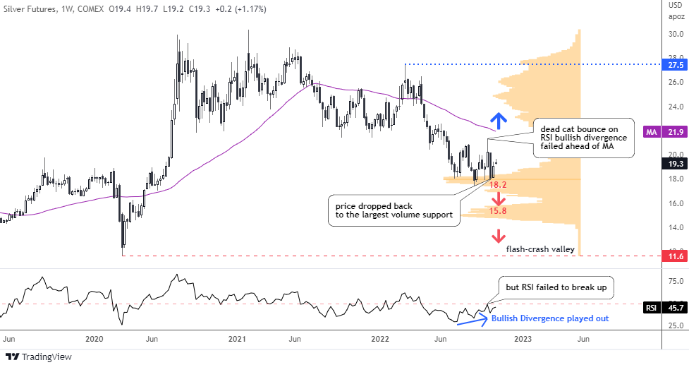
The largest volume support (orange) has offered a solid support for the silver futures price lately. It is located between $17.4 and $18.2. The price has tested it three times already and failed to break it down.

Silver Futures Weekly

Source: TradingView

The RSI has built a Bullish Divergence during the second touchdown at the end of the summer. The reaction was an imminent reversal to the upside. It was promising price action for the bulls as the futures price soared from $17.4 up to $21.3 by the start of this month to book the gain of almost four bucks (22% growth).

Afterwards, the same indicator has failed to break above the 50 barrier in spite of a strong impulse and so did the price rally. It stopped more than half dollar below the moving average (purple).

The price dropped back to the largest volume support after above mentioned failure but bounced then. It has managed to score more than one dollar from the latest valley of $18. This puts the silver futures between the hammer ($21.9, moving average resistance) and the anvil ($18, volume support).

The chart structure of the recent rally looks corrective. This means that the weakness of the price should resume. The next support is located at the following volume area of $15.8.

There are no other significant levels to catch the “falling knife” of silver except the “Flash-Crash” valley in $11.6. The drop to the latter could build a larger corrective structure visible on a bigger map.

The invalidation of the bearish outlook would come with the breakup of the moving average above $21.9.

Last time, your most popular answer was that silver futures would stop at $16. The next bid was bullish. None of the bets have played out as yet. Continue reading "Silver And Palladium Update: False Hope"

Gold Update: The Breakdown

It’s all about persisting inflation at the end of the day. All markets watch how the Fed tries to fight it as aftershocks of rate decisions are observed in bonds, stock market, foreign exchange, precious metals and even crypto.

US Inflation vs Fed Rate vs Real IR

Source: TradingView

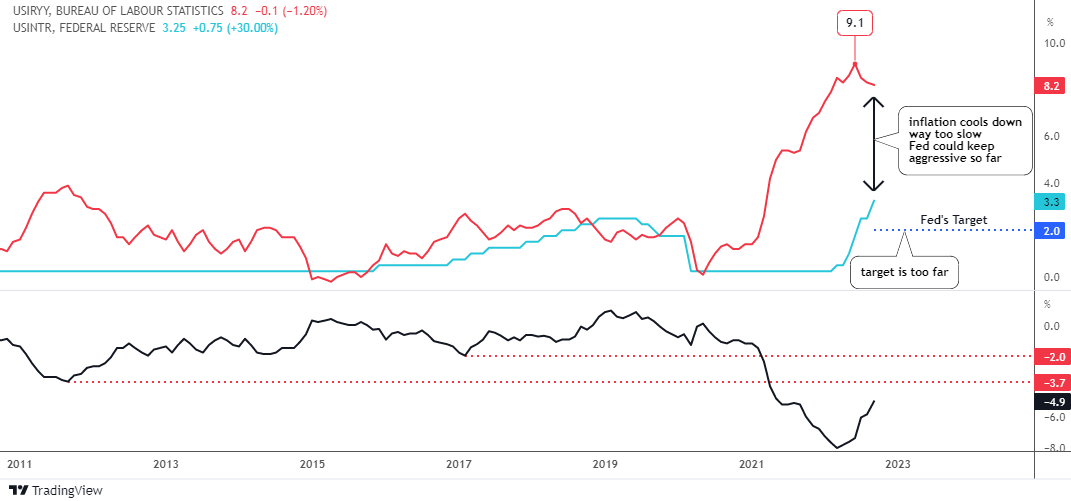
The graph above visualizes that “fight of the night”. Indeed, we witness some progress of the Fed’s efforts in the falling U.S. inflation (red line) numbers from the peak of 9.1% in the summer down to the latest data of September at 8.2%, which was still above the expected 8.1%.

The 3% increase of the Fed rate (blue line) brought inflation down only by 0.9%. It is way too slow, as the inflation target of 2% is still way too far, hence the Fed could keep their aggressive tightening mode.

Surely, there is a time lag between the Fed action and the inflation reaction. However, the time is ticking away as inflation is like a fire - the earlier it's extinguished the better.

The real interest rate (black line, down pane) crossed over the August top above the -5.1%. The next resistance is at -3.7% (valley of 2011) and it is highly likely to be hit soon as it is only 1.2% away. The valley of 2017 in -2% is almost 3% away, which means a huge Fed rate hike or a big drop of inflation. We can’t rule it out anyway.

Where do you see the yearly U.S. inflation by the end of the year?

View Results

Loading ... Loading ...

Indeed, these interest rate projections above could make precious metals life tough. Let's check the gold futures chart below. Continue reading "Gold Update: The Breakdown"

Familiar Pattern in the AMD Chart

The Fed’s tightening puts hard pressure on the broad stock market and chip makers are not the exception. The strong labor market statistics and ongoing inflation pressure supports the hawkish mode.

If one thinks that the sell-off might be over, there is a chart below that I spotted a disastrous model for a well-known chip maker Advanced Micro Devices, Inc. (NASDAQ:AMD).

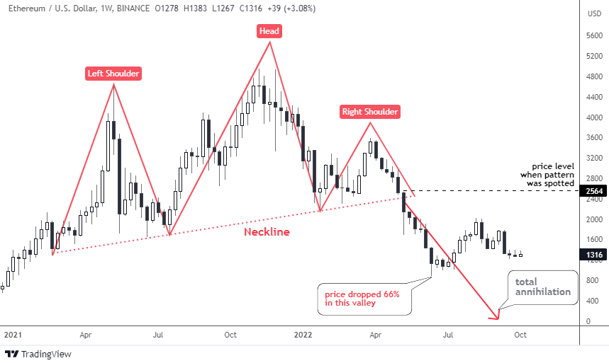
You definitely know this chart pattern I spotted for you. It is a Head & Shoulders reversal model. Last time this notorious chart pattern appeared in my posts was in May on the chart of Ethereum cryptocurrency. I updated it for you below to illustrate the historical sample.

ETH Weekly Updated

Source: TradingView

As soon as the price crossed below the Neckline beneath $2,400, Ethereum collapsed as it had lost a tremendous 66% down in the valley of $884 in June from the post level of $2,564.

This is how this model has played out before and that is what we could expect in the next chart of AMD below.

AMD Weekly

Source: TradingView

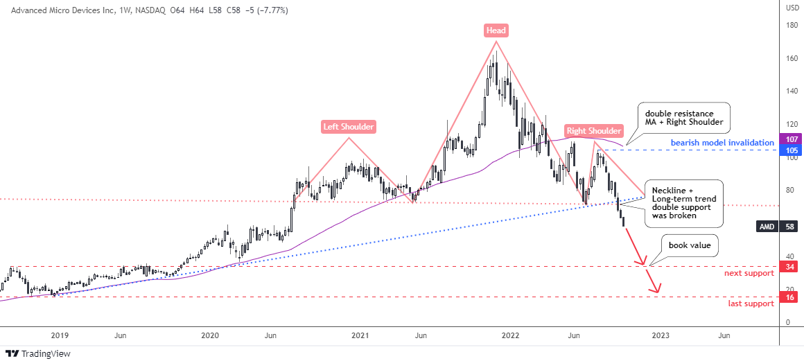
The Head & Shoulders pattern (pink) here is more balanced compared to up-sloped model in the Ethereum chart. The Neckline touch points are located almost exactly at the same level of $72, hence it is a flat line. The Head is quite tall above the wide Left Shoulder and the narrow Right Shoulder. The top of a latter offers a strong resistance and the invalidation point. Continue reading "Familiar Pattern in the AMD Chart"

The Dollar Has Hit The First Target

The king currency has finally hit the first long-term target of $114 that was set in the summer of a distant 2019 when it traded around $96.

That aim wasn’t clear then as the dollar index (DX) looked weak in the chart. The short-term structure was similar to a pullback after a heavy drop.

The majority of readers did not believe the DX would ever raise its head as you can see in the 2019 ballot results below.

Ballot Votes

However, I had found a bullish hint in a very big map, and I warned you “Don't Get Trapped By Recent Dollar Weakness”.

Back in August, you had already been more bullish on the dollar as you voted the most for the target of $121.3 in the earlier post. This confidence is due to the certain position of the Fed, which resolutely fights the inflation, lifting the rate aggressively round by round.

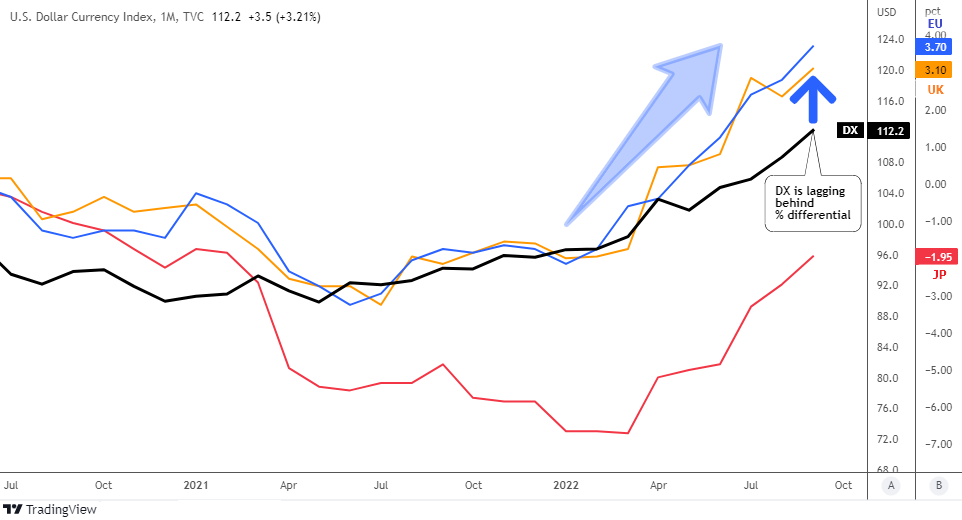
Let me update the visualization of the real interest rate comparison below to see if the dollar still has fuel to keep unstoppable.

DX Monthly vs Real IR

Source: TradingView

The real interest rate differentials are shown on the scale B: blue line for U.S. - Eurozone, orange line for U.S. – U.K. and the red line for U.S. – Japan. Continue reading "The Dollar Has Hit The First Target"

Crude Oil Closes the Gap

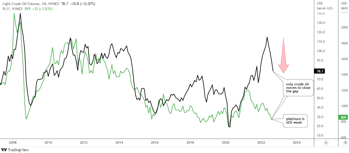
Back in July, I shared with you a chart of Market Distortion where I put together crude oil and platinum futures. I spotted a disruption of a strong correlation pattern between these two instruments that has been lasting for a quarter of a century.

That post drew your attention with strong support and feedback as readers shared their valuable comments. Below is the graph showing the distribution of your opinion on how the divergence would play out.

Ballot Votes

The majority of readers chose the option that implies the equal move in the opposite direction of both instruments to meet somewhere in between - crude oil should drop to $75 and platinum futures should rocket to $1,200. The second largest bet was on the widening gap.

I prepared for you an updated chart below to see what happened after two months.

Oil Futures vs Platinum Futures Monthly

Source: TradingView

None of the bets have hit it right, although your main choice is still the closest. Indeed, the crude oil futures (black line) did its job fully to close the gap as it almost touched the $75 area. The lowest handle hit was $78 so far.

The counterpart, as it often happens in human relationships, did not meet the other part halfway. The platinum (green line) is still weak as it can’t raise its head to the upside.

Should crude oil do the job for both and drop even lower like a rock to catch up with the metal? Or is platinum quietly accumulating power for a rally? Continue reading "Crude Oil Closes the Gap"