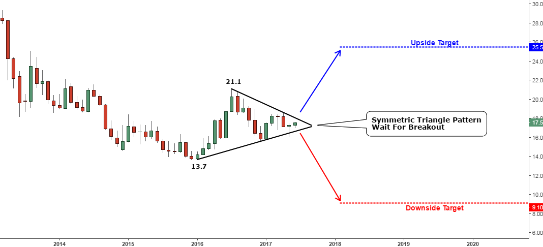
Monthly charts show major price development and are crucial in determining the long-term trends. It is slow to change and I update it once the price reaches the important level or makes a breakout or reversal. The last time I updated the monthly chart was last August when the price reached the multi-year trendline resistance.
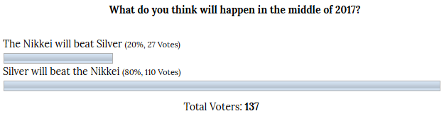
I had assumed three possible scenarios of price action and the least interesting second scenario of consolidation plan worked. I had set the margins of consolidation within the $1100-1400 range and some readers thought it was too wide, but as you can see now it played out perfectly – the actual range is $1122-1367 for the past period.
The trendline resistance falls lower and lower in the long run and now the price meets it again. That’s why added an updated monthly chart below.
Chart. Gold Monthly: Crossroads
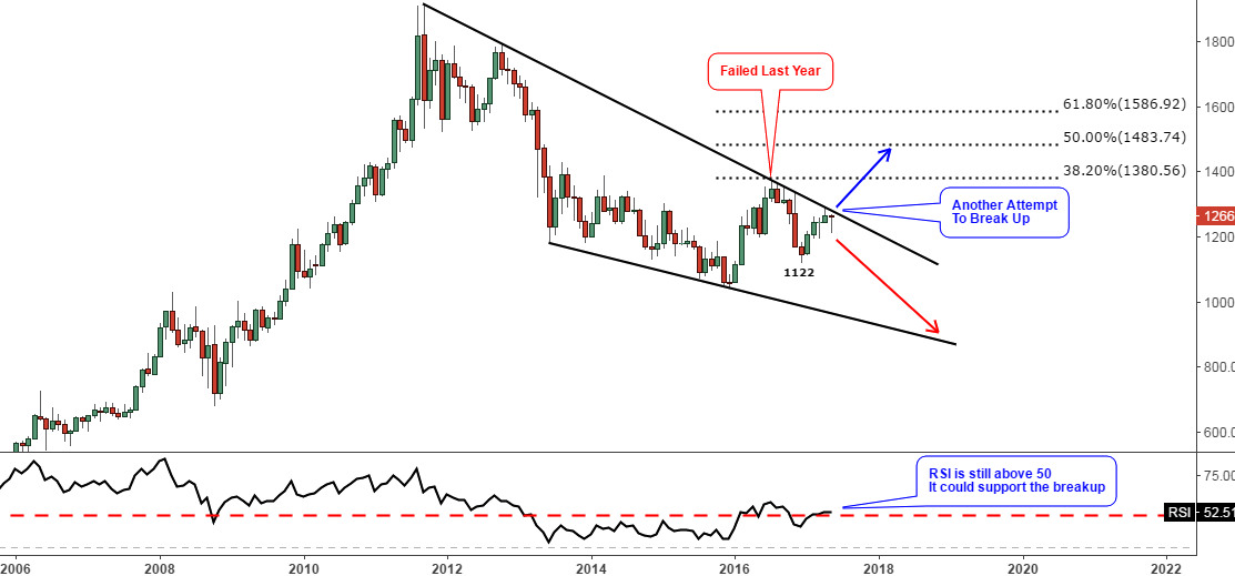 Chart courtesy of tradingview.com
This time we have the same situation as in the past year. Last July the price had tried to push through the black resistance line, but failed and there was hope that in the next month the breakup could be done and we all know what happened next. Last month the price also tried to overcome the barrier but failed. Nevertheless, the hope is still there as always in such situations. This month’s candle tells us that the price first dropped down from the open at $1267 to $1214 low and is now reversing losses and is yet to cover them all. Continue reading "Gold Faces Multi-Year Resistance Again" →