This is the summary of the second experiment that I started in the middle of 2016 where we put the ultimate loser – the stock index of struggling Japanese economy against the top gaining favorite metal – silver.
Chart 1. Voting results July 2016: The Majority Bet Against The Success Of Experiment!
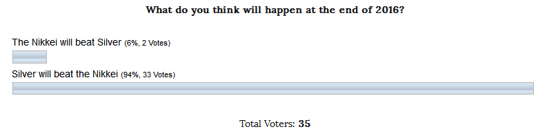
Above is the result of the voting for these totally different instruments from 6 months ago. This time, congratulations are only to me as an experimenter as I voted for the Nikkei (every time I vote for experiment success, not for an individual instrument) and to another single person (total two votes for the Nikkei), who went against the majority. If you are reading this post please write your name in the comment, let the community meet you.
I think, this time, the majority was ultra-biased and bet on silver. I am afraid to imagine what would be the voting results if gold was the among bets 🙂 Previously, the votes split almost even with a minimal advantage in favor of palladium.
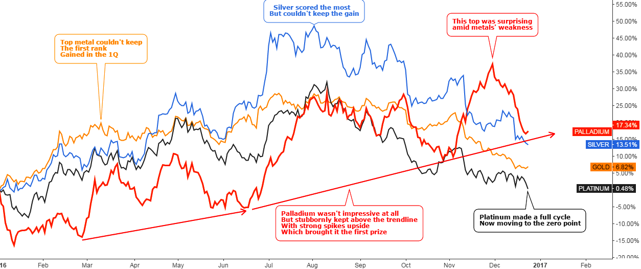
Chart 2. Nikkei Vs. Silver: The Worst Performing Japanese Stock Index Defeated The Top Gaining Metal
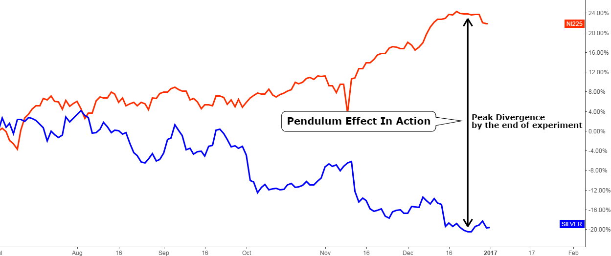
Chart courtesy of tradingview.com
I think we witnessed the maximum divergence at 22% between these two instruments when I posted a snapshot of the experiment last October. But the final outcome is just astonishing! The Nikkei hit above the +20% handle while the silver also hit the 20% mark but with a minus sign. It is easy to calculate that the divergence peaked above the 40% mark. It means that for the past half year those who sold the silver and bought the Nikkei could book more than 40% of the trade in 6 months.
This is the second straight success of an experiment! I think it was lucky to choose that very period of 6 months for an experiment during which the Pendulum Effect of the market has enough time to take action. And another amazing regularity, which is clearly seen on the chart: the maximum divergence of instruments at the end of an experiment.
Let’s push the Pendulum again to have more records for more reliability.
Chart 3. Comparative Histogram Half Year Futures Performance (January 3rd, 2017)
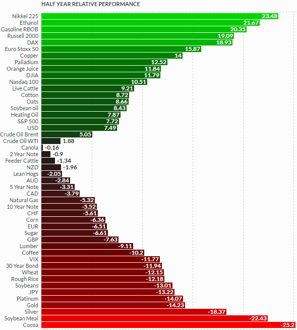
Chart courtesy of finviz.com
It looks like the Nikkei is the futures’ superstar for the past half year as it beat not only silver, but all the rest of the futures and topped the ranking. It transformed from the “complete non-entity” into a “superhero” just in 6 months amid the Bank of Japan’s asset purchases.
Silver finished 3rd from the end of the list and showed the worst performance among metals in the second half of 2016.
It is ridiculous, but we should put them against each other again in a new Pendulum experiment. Please vote at the end of the post for one of these instruments to show me your preference.
I already posted the fresh silver chart last month and this time I will update the Nikkei chart which was posted last October.
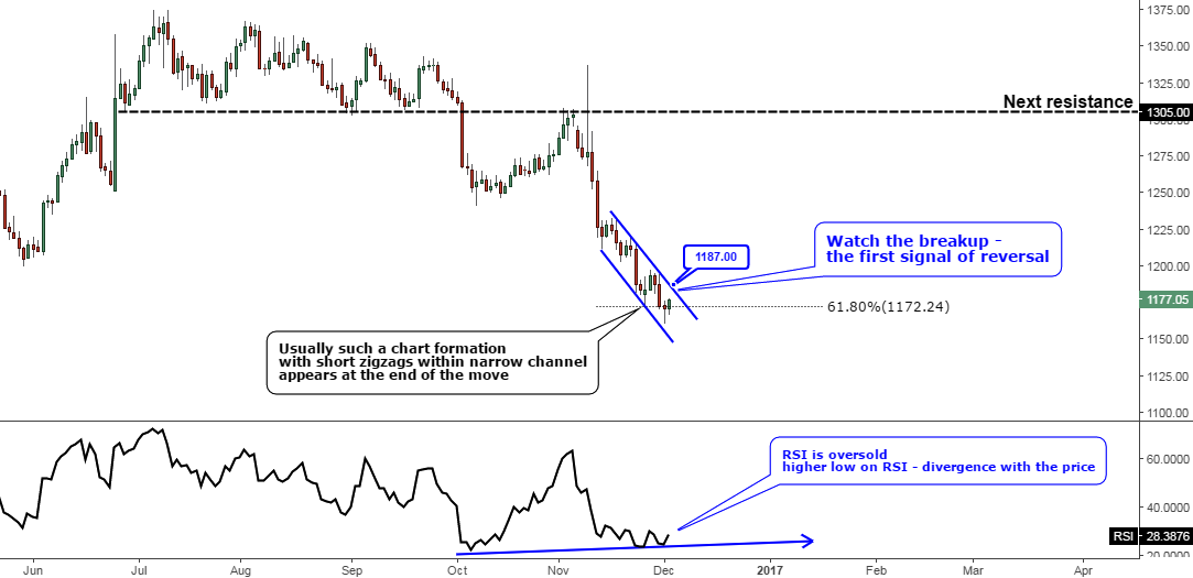
Chart 4. Nikkei Weekly: Magic 78.6%
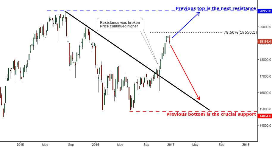
Chart courtesy of tradingview.com
The Nikkei index is in the giant range set by the 2015 top at ¥20953 and the 2016 bottom at ¥14864. This instrument is very good for positioning as it moves actively like a shark, which needs to move steadily to breathe and stay alive.
Last October we witnessed a breakup of the resistance (black), after that we can see that the price continued higher in the direction of the break. Price rocketed ¥17k to ¥19k level, but then it stalled ahead of 78.6% Fibonacci retracement level set at ¥19650 mark. The index has lost more than a half thousand already after reversal. This setback can start another drop down to the broken resistance at least or even lower to the range’s bottom highlighted in-dash red horizontal line. The break above the 78.6% Fibonacci level opens the way to the previous top at ¥20953.The risk/reward ratio favors short entry as resistance is closer than the support.
Intelligent trades!
Aibek Burabayev
INO.com Contributor, Metals
Disclosure: This contributor has no positions in any stocks mentioned in this article. This article is the opinion of the contributor themselves. The above is a matter of opinion provided for general information purposes only and is not intended as investment advice. This contributor is not receiving compensation (other than from INO.com) for their opinion.