Anatomy Of The Gold Market

Well it was quite a weekend here on the East Coast with a record-breaking blizzard that closed down Washington DC today and made digging out from the 30-some inches of snow quite an interesting challenge. For those of you who live on the East Coast like us, we hope that you and your loved ones were all safe over this dangerous storm.

Now let's take a look at the gold market. This market has been in a bear market for the last four years, almost the exact opposite of the equity markets that have been going up for the last six years. It appears technically that gold is once again coming into style as more investors are becoming leery of the equity markets and the value of their holdings and money in general.

A great deal of this uncertainty has been created by the Federal Reserve Board and the European Central Bank which seemed to have run out of ideas and tools. It appears to this observer that in the last few years these two central banks have literally been winging it on a hope and a prayer. I hope I am wrong on the one as it will make 2008 look like a walk in the park.

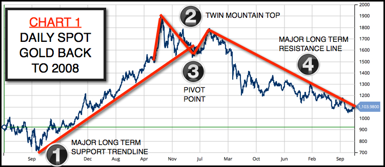
8 year daily chart of gold

CHART 1

Looking at the long-term chart of gold, you see a MAJOR LONG-TERM SUPPORT TREND LINE that supported gold for several years before it was broken (see figure 1 on the chart). After breaking below the support line, the gold market again tried to rally, but failed (you can see this in figure 2), which created a TWIN MOUNTAIN TOP. Once through (figure 3) the PIVOT POINT, it was all over for gold as it moved into a major bear market that has now lasted just over four years.

The big question is … has the bear market in gold come to an end? Continue reading "Anatomy Of The Gold Market"

Weak Euro Keeps Gold Afloat

Aibek Burabayev - INO.com Contributor - Metals


One of our readers asked if I would do a Gold/EUR analysis when I posted my last Gold/$ update. Today I will cover this instrument and show its comparative dynamics for a broader view from the opposite side of the Atlantic.

Chart 1. 5-year Comparative Dynamics: Gold/Dollar Vs. Gold/Euro

5-year Comparative Dynamics: Gold/Dollar Vs. Gold/Euro
Chart courtesy of tradingview.com

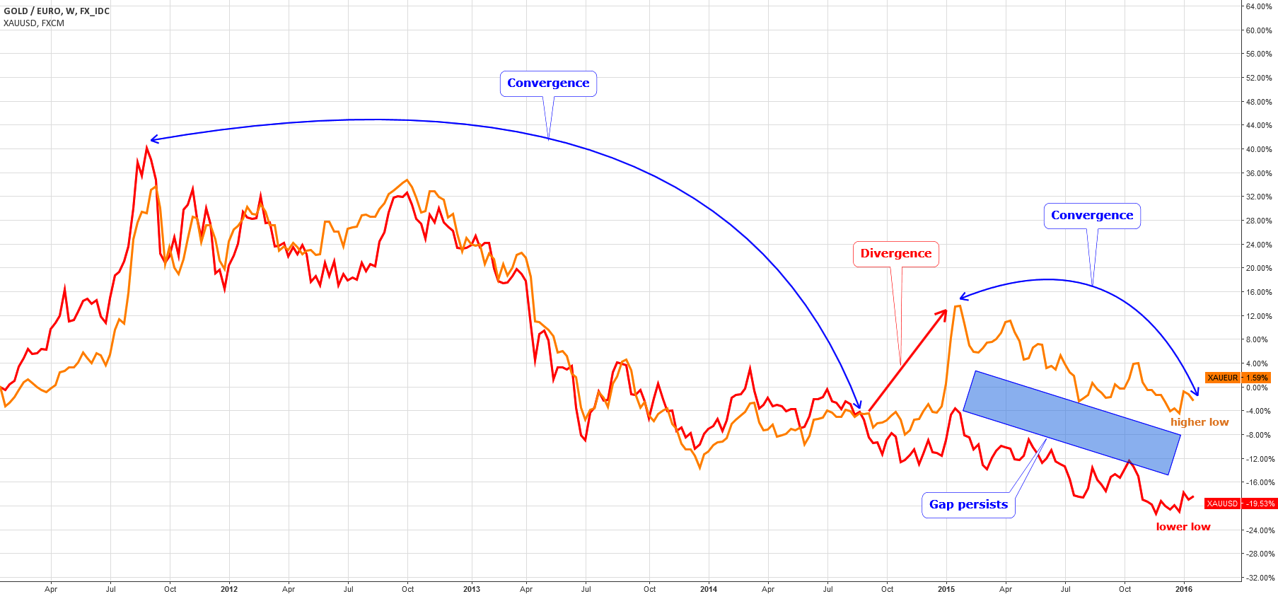
As seen on the chart above, both Gold crosses have a very strong correlation over the past 5 years. Same peaks and troughs, US gold slightly overshot the European gold at all-time high in 2011; however, it proved to be short-lived.

At the end of 2014, we can see the sharp divergence of crosses (highlighted in red arrow) amid a deep devaluation of the EUR which caused a rocketing of Gold/EUR beyond the 1100 EUR mark. The elevation was short and in 2015, we saw a sharp drop back down in both markets.

There are two things worth mentioning: Continue reading "Weak Euro Keeps Gold Afloat"

When Perception Meets Disillusionment

Perception, in my mind, is one of the most powerful forces in the market. Perception can help drive the market up or down and currently that direction is down.

Disillusionment happens when investors become so stressed out that they become disenchanted with the market, remember 2008? That is what I think is beginning to take place right now in the markets.

Let me give you an example with a well-known stock. Just two weeks ago Amazon was flirting with the $700 level and investors were falling over themselves to get into the stock that they thought was going to go much higher (perception). Now here we are 14 days later and Amazon has dropped over 20%. Did Amazon's business change dramatically overnight, are the prospects suddenly bad now for Amazon? The answer is no, what did change was perception. Almost overnight everybody who wanted to get into this stock became stressed and disillusioned and then wanted out. Continue reading "When Perception Meets Disillusionment"

Aussie Dollar: Short to Long View

Lior Alkalay - INO.com Contributor - Forex


Two weeks ago investors in the Aussie Dollar were on the receiving end of a sweet surprise. The official unemployment rate dropped to 5.9%, smashing analysts’ expectations. That suggested the Reserve Bank of Australia’s latest easing cycle, which began about a year ago, might soon be ending.

But before you jump on the Aussie bandwagon, you need the right strategy.

Aussie Outlook Looking Brighter

The truth is that the whiff of optimism had been long overdue for the Aussie Dollar. Even before the unemployment data there had been tentative signs of stabilization in the Australian economy.

Key Points Of Improvement

Continue reading "Aussie Dollar: Short to Long View"

Palladium Has Justified Expectations

Aibek Burabayev - INO.com Contributor - Metals


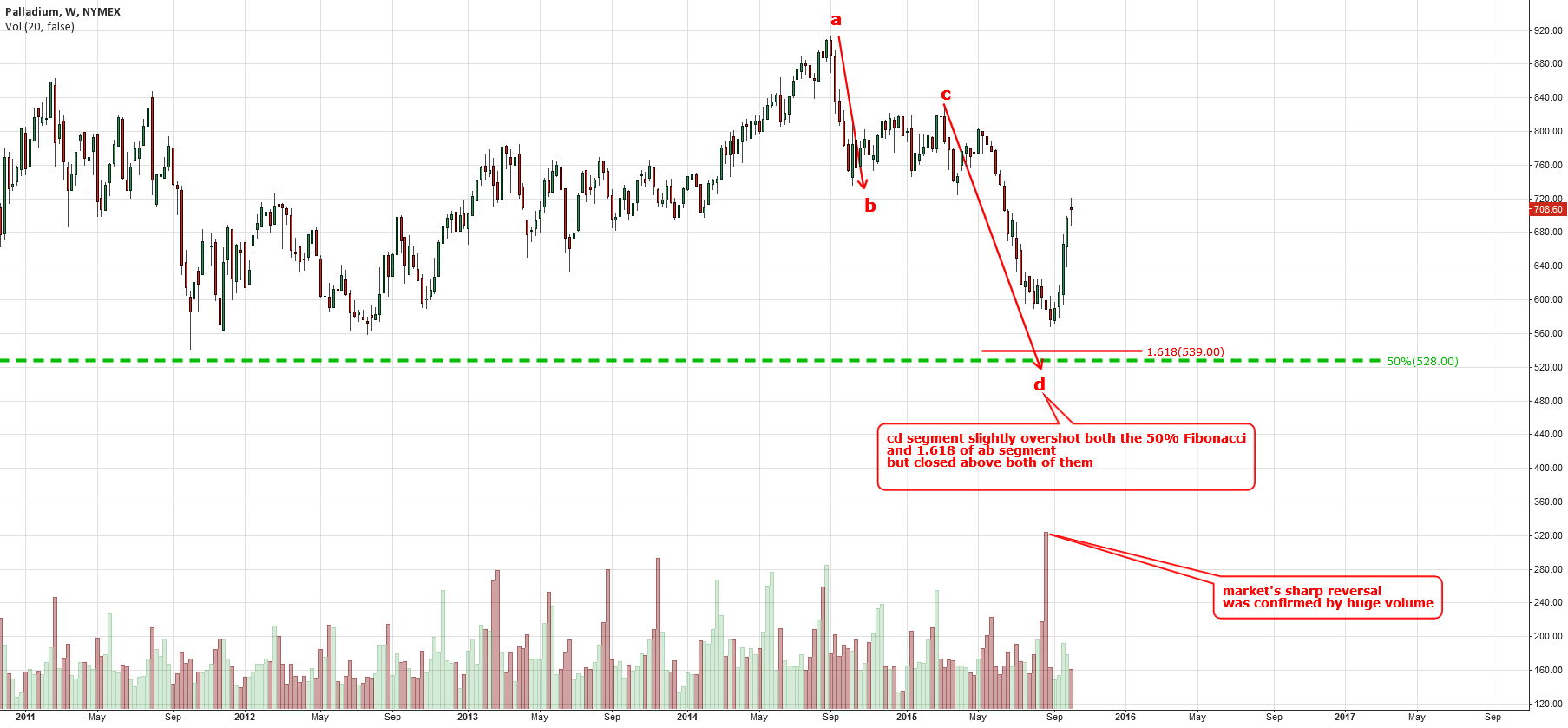
In my previous post about Palladium, I had used a different look for the technicals by implementing the ab/cd concept and Fibonacci ratios together. In that post, on the monthly chart I had assumed that the 50% Fibonacci retracement level ($528) could hardly be cracked by sellers and had confirmed it by using the weekly chart where the cd=1.618 of ab ends almost at the same level ($539).

Below is the weekly chart with details to show how the reversal has happened.

Weekly Chart (second month): Reversal Assumptions Has Proved To Be Right

Weekly Chart of Palladium (NYMEX:PA)
Chart courtesy of TradingView.com

The price of Palladium has slightly overshot the 50% Fibonacci level ($528) down to $520. It’s amazing, but these ratios work like Swiss watches: precise and reliable and, of course, there are a lot of market players who use them every day. Continue reading "Palladium Has Justified Expectations"