Let's Read The Coffee Grounds To Understand Gold

Aibek Burabayev - INO.com Contributor - Metals


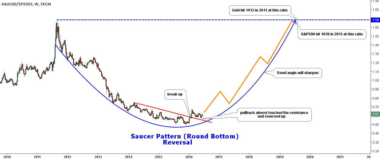
Sometimes we find a revelation in different things or places. Extending the range of our focus is quite helpful. From time to time I watch stock charts to find some interesting setups and to let my eyesight get a refreshing break from commodities and forex.

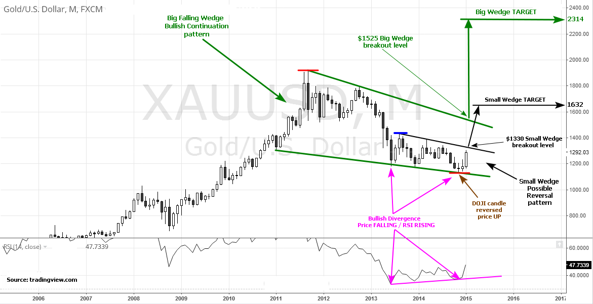
Last night I was browsing through some stock charts and my eyes caught a familiar structure on one of them. It was a chart of the iPath Bloomberg Coffee Subindex Total Return ETN (NYSE:JO). This instrument has a very interesting structure of complex correction on the chart. And today I would like to share with you an educational chart with a sample of a complex correction, which could take place in gold. It is better so see it once than to hear about it many times. Continue reading "Let's Read The Coffee Grounds To Understand Gold"

Gold Vs. S&P 500: Fly To Safety?

Aibek Burabayev - INO.com Contributor - Metals


Chart 1. Gold Vs. S&P 500: Saucer Reversal Pattern

Gold Vs. S&P 500: Saucer Reversal Pattern
Chart courtesy of tradingview.com

The Gold/S&P 500 ratio made a new high this past February breaking above both the August 2015 and October 2014 maximums. It has finally managed to surpass the depressing red resistance. The break was strong and violent pushing the ratio from 0.51 low to 0.68 high. After it runs out of steam we always witness a pullback ( the market digests the price action), the ratio returned to the point of the break at the end of May and now is starting the next round up.

This is a very healthy market move as the price pulled back, but hasn’t broken below the starting point. The first higher high and higher lower are in place now. Once we get a new higher high, we can draw an uptrend with confirmed touch points. Continue reading "Gold Vs. S&P 500: Fly To Safety?"

If This Same Pattern Repeats, Watch Out!

For the past nine weeks, the Dow and S&P have been repeating a pattern that if repeated this week, will spell trouble for the markets. The market has been going up and down in a somewhat regular fashion. If you look at a weekly chart of the Dow and S&P, you can see that they have not had two consecutive weeks closing in the same direction, either on the downside or the upside.

Last week we saw the indices close higher for the week and if the pattern repeats, this should be a down week with a lower weekly close.

Here are the key levels to watch today. Should these levels be broken, I would expect the markets to accelerate to the downside. Continue reading "If This Same Pattern Repeats, Watch Out!"

Gold Update: Total Recast

Aibek Burabayev - INO.com Contributor - Metals


Dear INO.com readers,

Today Gold hit the $1300 level and I updated my chart for Gold, as it was price trigger for my previous bearish scenario.

In my first article last December I charted the line graph for Gold with a descending triangle pattern detected on this metal. My projection for the mentioned pattern was bearish with quite bold target levels.

What is up today?

The main rule for success is to not to be biased and always challenge yourself with making a brand new analysis from time to time, and surely when market is not going your way.

Today I prepared an absolutely new Gold graph to put fresh eye on it, now with candlesticks.

Gold Chart, small and big wedge chart patterns.

This time I detected a very interesting chart pattern called the “wedge.” This type of patterns is outstanding as it has an ambiguous impact on the market with either a continued or reversed outcome. Luckily, we have two wedges on the same time frame at once. Both are the falling wedge type because of the descending highs and lows. The big one is highlighted in green and the small is in black. Apart from it, we have two more rare technical species on the chart. Continue reading "Gold Update: Total Recast"

Ready Or Not, Copper Could Halve Its Value!

Aibek Burabayev - INO.com Contributor - Metals


Dear INO.com readers,

January turned out to be a harvest month for decent gain opportunities. This week, let's discuss copper which could lose half its weight this year. Impressive! Let's figure out how.

On the chart above, you'll see a monthly candle graph for COMEX high grade copper futures. As you can see, copper isn't phlegmatic at all, see-sawing up and down from below $1, up to almost $5 and again down for the past dozen years. And of course, that's why it is one of the best choices fo speculative traders.

2008 was a disastrous year for copper, free-falling from a $4.26 high to the $1.25 level and losing 70% of its value. Bad news for miners and brilliant for bear traders!

This reddish metal started 2009 as a rocket. Not to overload the graph, I didn't put Elliot waves on the bullish run. Two cycles completed on the way up from $1.25 to $4.55, where the fifth wave stalled with the top done at the $4.65 level at the start of 2011. 2.5 years of total growth thanks to QE. You should have noticed that fall is very short lived compared to unhurried growth, as fear is stronger than greed everywhere in the markets. Continue reading "Ready Or Not, Copper Could Halve Its Value!"