Dollar Index, Gold And Silver Updates

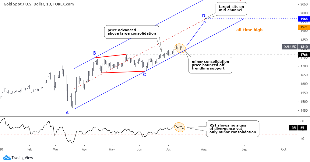
The market moves in zigzags and not in a straight line as it takes a break from time to time to accumulate enough power to continue with the trend. In my post last week, I mentioned the US dollar index (DXY) as one of the drivers of the precious metals rally. This time I would like to share the daily chart of it below as I spotted a reversal signal there, which could affect precious metals.

Dollar Index

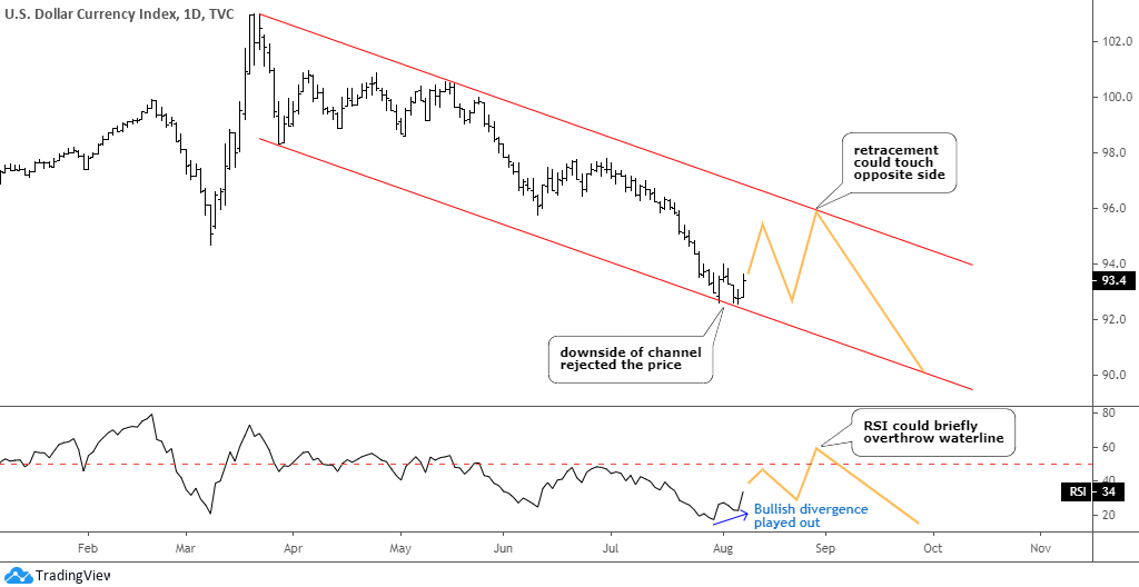
The DXY price was rejected right at the contact point with the downside of the red downtrend channel. The price tried that support twice on the 31st of July and the 6th of August but failed to break below. This, again and again, demonstrates the power of simple trend channels.

The other move was very sharp to the downside within two equal zigzags pushing the price from 100.9 to 92.5. The DXY was oversold, and now it could enter the retracement stage to let traders book some profit covering shorts, and contrarian traders might enter longs here playing on the trendline rejection. The price could touch the opposite side of the trend channel around 96 as this could be not a minor, but a large corrective structure as we saw such last time only this April. Continue reading "Dollar Index, Gold And Silver Updates"

Gold & Silver: The Volcano Awoke

Before we get down to the charts, let's look around to see what pushed the precious metals higher as gold posted a new all-time high last Friday at $1985, just shy of the next thousand. The silver price more than doubled since its severe crash in March. Indeed, the precious metals "volcano" awoke erupting its power on fiat, which has been printed heavily. I warned about this trigger in my April post called "Gold Could Fly Over A Helicopter Throwing Money". More than three months have passed since then, why "volcano" erupted only now?

Among the reasons, an escalating trade war and the COVID-19 pandemics. It's all about the relationship between the two largest economies and the health of each of them. US gross domestic product fell at an annualized rate of 33% in the second quarter, said the Commerce Department last Thursday. It's the largest fall on record dating back to the 1940s. The hope for a quick rebound is escaping as economists don't see the recovery to the prior peak until 2022. This contrasts with a V-shaped rebound of the Chinese economy, which showed 3.2% growth in the second quarter after a -6.8% crash in the first one. But that is not enough to restart the global economy as each player matters.

I guess the main driver for the sharp rally of the top metals was the smell of a possible cold war or even a real military collision between the US and China, that appeared recently. I hope it won't happen, but investors are hesitant to bet when this turmoil will end, so they rush to the safe-haven metals to wait through this uncertainty. At the same time, the US dollar index has been sold off dropping from its multi-decade peak at 104 that was hit in March down to the current 93 level. The nearest support is located at 88, the valley that was established in February of 2018. This leaves the room for the top metals to grow even more.

Let's get down to the updated charts, and the daily gold chart will be the first. Continue reading "Gold & Silver: The Volcano Awoke"

Gold And Silver Could Diverge

At the beginning of this month, I shared a warning alert as the silver chart had a Bearish divergence. The trigger was set below 50 on the RSI. It wasn’t activated, and gold and silver moved higher. Moreover, silver finally hits the target. The majority of readers kept a bullish outlook and got it right.

I prepared an update for you with the bonus chart at the end, so stay tuned.

Let’s start with the daily gold chart.

Gold Chart

Gold is slowly moving to the upside. It hasn’t shown any bearish signs as of yet. The metal finally elevated above the top of the preceding large consolidation beyond $1766 (black dashed line), eliminating the option of another leg down within an even more extended consolidation. Continue reading "Gold And Silver Could Diverge"

"Diamond" Pattern Pushed Gold To Sky Vs. Silver

I appreciate active readers of the Blog for leaving valuable comments on Gold and Silver posts. Recently, there have been a lot of thoughts shared not only about the metals itself but also about its relationship reflected in the dynamics of the Gold/Silver ratio. I think it’s time to talk about it in this post. Please feel free to enrich this piece with your valuable thoughts in the comments section.

Back in December 2014, I shared only the third post here on the Blog. The title was more appropriate for a science fiction novel as it promised the “journey to the Moon” for the Gold/Silver ratio as it was going to hit the 109 ounces. Below is that very chart from the distant 2014 to refresh the memory.

gold silver

The idea was based on the “Diamond” pattern spotted on the monthly chart (blue). The target was reached more than five years later on the 16th of March this year. The total gain is equal to 109 - 72 = 37 troy ounces of silver per troy ounce of gold or 51% in five years.

Let’s see in the weekly chart below the ratio dynamics after that post. Continue reading ""Diamond" Pattern Pushed Gold To Sky Vs. Silver"

Following The Gold Stocks Leaders As The Fed Prints

Gold stocks have led the market for a year, and with economic deceleration and Fed policy response that leadership looks to continue [edit: today’s ‘in the bag’ bounce-back Jobs report does little to alter the economic deceleration theme]

We have been on a bullish gold mining view for over a year now. Over that time there have been three interruptions, the downward-biased consolidation from August to November 2019, the flash crash (and very constructive gap-filling mission) in March and most recently the pullback that logically began in May as broad stock market relief started to fan out to more and more momentum chasers who’d finally gotten the hint that the Fed means to devalue the US currency (in competition to a degree with its global counterparts seeking to do the same), making cash a non-viable investment position (other than for risk management to the bullish asset market atmosphere).

The daily chart of HUI shows a successful support test, purely up trending moving averages, all gaps filled but the breakaway gap (a ‘breakaway’ does not need to fill any time soon as it changes or reasserts a trend; there is also an old gap from 2016 near 100 that we need not worry at this time), RSI now positive and trending up above its EMA 20, MACD triggered up and positive and neither of them showing overbought readings. Ah, the beauty of a routine correction within an uptrend. All systems on this daily chart are technically ‘go’.

Gold Stocks - HUI

What’s more, the HUI/SPX ratio is now on an uninterrupted 1-year uptrend. With the come-lately players (institutions, hedge funds, black boxes, Ma ‘n Pa and knee-jerking herds of all stripes) having moved on to perceived greener pastures due to the broad stock market’s May-June outperformance the gold miners are again taking leadership. Continue reading "Following The Gold Stocks Leaders As The Fed Prints"