Dollar Index, Gold And Silver Updates

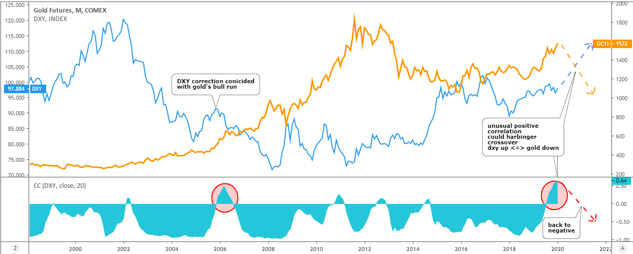
The market moves in zigzags and not in a straight line as it takes a break from time to time to accumulate enough power to continue with the trend. In my post last week, I mentioned the US dollar index (DXY) as one of the drivers of the precious metals rally. This time I would like to share the daily chart of it below as I spotted a reversal signal there, which could affect precious metals.

Dollar Index

The DXY price was rejected right at the contact point with the downside of the red downtrend channel. The price tried that support twice on the 31st of July and the 6th of August but failed to break below. This, again and again, demonstrates the power of simple trend channels.

The other move was very sharp to the downside within two equal zigzags pushing the price from 100.9 to 92.5. The DXY was oversold, and now it could enter the retracement stage to let traders book some profit covering shorts, and contrarian traders might enter longs here playing on the trendline rejection. The price could touch the opposite side of the trend channel around 96 as this could be not a minor, but a large corrective structure as we saw such last time only this April. Continue reading "Dollar Index, Gold And Silver Updates"

Visualizing Correlation: Gold Vs. Other Instruments

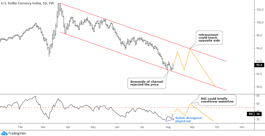
Some of our regular readers kindly shared their opinion about the gold market correlation with other instruments in the comments section under my previous post. I think it could be interesting for all of us to see what is going on there if we check the correlation between gold and other instruments.

I prepared the visualization of it for you below. The dollar index and the 5-year TIPS (Treasury Inflation-Protected Securities) were named in the comments, and I will add two other top instruments, so please stay tuned.

Let’s start with the Dollar Index (DXY).

Correlation
DXY: blue, left scale / Gold: orange, right scale / Correlation coefficient: turquoise, sub-chart - Chart courtesy of tradingview.com

For more than 20 years, these two instruments were mostly in a negative/mirrored correlation. It just changes from extremely negative to zero correlation with rare spikes into positive territory. Continue reading "Visualizing Correlation: Gold Vs. Other Instruments"

This Pioneering Chart Pattern Is Still One Of The Best

By: Amber Hestla, Michael J. Carr

The head-and-shoulders (HS) top is one of the best-known patterns in technical analysis. This pattern was first written about in 1930 by a financial editor at Forbes magazine who described how the HS forms and how it can be traded.

Many readers are familiar with the HS pattern. On a price chart, there will be three peaks in price at the end of the uptrend, with the center peak (the head) being higher than the other two. The peaks on the sides (the shoulders) should be about equal in height. Continue reading "This Pioneering Chart Pattern Is Still One Of The Best"

Quarterly chart changes give hints to future trends

At the end of each quarter, I like to see how the market has performed in comparison to the last quarter. Seeing as we are nearing the end of Q2 of 2009, we are starting to crunch the numbers.

So here goes:

Data for the end of Q2 is based on intra-day prices traded on Friday the 26th, of June.

Continue reading "Quarterly chart changes give hints to future trends"